After three weeks of the online course Data Visualization and Infographics by Knight Center I’m still very happy that I decided to participate. Alberto Cairo and Scott Murray make a good duo. It’s refreshing to hear Alberto’s solid, learned opinions, and Scott has this talent of lowering the barriers to learning.
This week, we have mostly been binding data to SVG rect elements. Related to this, as a side project of my own, I’ve practised the topic with the logo of the city of Mikkeli. It’s a delightfully colourful skyline, built from rectangles of the same size, with a color palette size of 8. The logo appears on the web site in two places: a tiny one in the header

and a much bigger one in the footer.
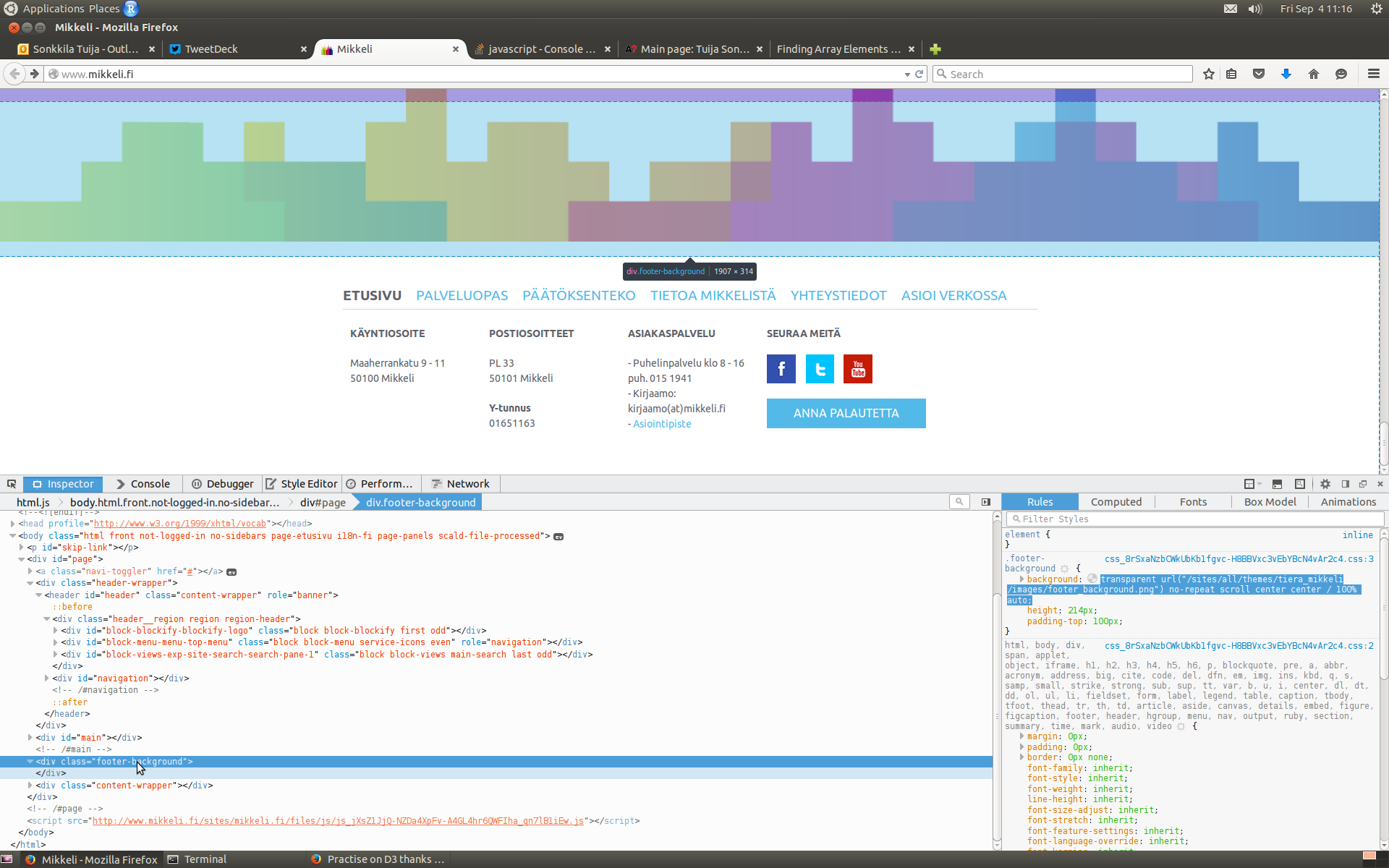
First, colors. To get values that’d be at least to the right direction, I took a screenshot of the page, uploaded it to Gimp, and copied the hex values that the color picker tool returned.
Apologies for the graphic designers of the logo! It may well be that the logo follows the CMYK color model, not RGB at all.
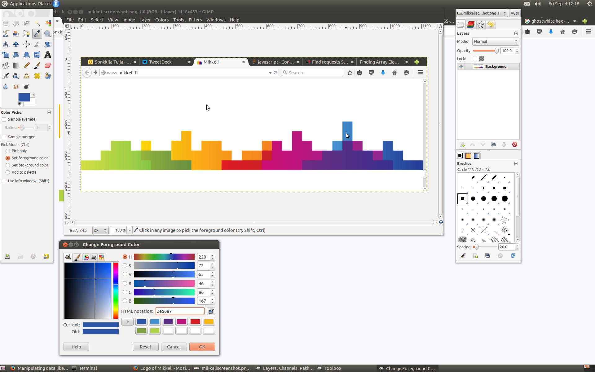
Next, data. I pasted the hex values to a spreadsheet, reflecting the 5 x 32 rectangle structure of the logo. Background of the final web page would be ghostwhite (#f8f8ff) so I choose the same to fill the sky behind the skyline, although Mikkeli has #ffffff on their page. Sorry about that, too.
As an example, in the screenshot below, I’ve highlighted the cells that represent the first greenish block of rectangles, starting from the left.
When I had data in CSV, it was time to figure out how to bind them to SVG elements.
It took me quite some time to realize that uploading data with d3.csv(), the way we had done in the course so far, and which seemed legit in my case here too, does not in fact preserve the order of the original spreadsheet columns. The result is an array of objects, but the order of them is not defined. Thanks to good advice, I reverted to d3.text() in uploading, and then parsed data with d3.cvs.parseRows() into an array of arrays – and there is order!
After this step, the rest was relatively easy. Note, relatively. I had reasoned though, that I better wrap every row of rects inside a group, so that I could define new coordinates for them in one go. First row would start from x=0 y=0, second from x=0 y=[height of rect], third x=0, y=[height of 1+1 rect], etc.
The way the horizontal positioning of rectangles is determined within groups, is explained (much better than I could do) by a helpful StackOverflow member like this:
Then, for each group, you can add the rectangles, adjusting the horizontal position only (the vertical position was already set in the containing group). Here, you need to bind the inner array elements to each rectangle.
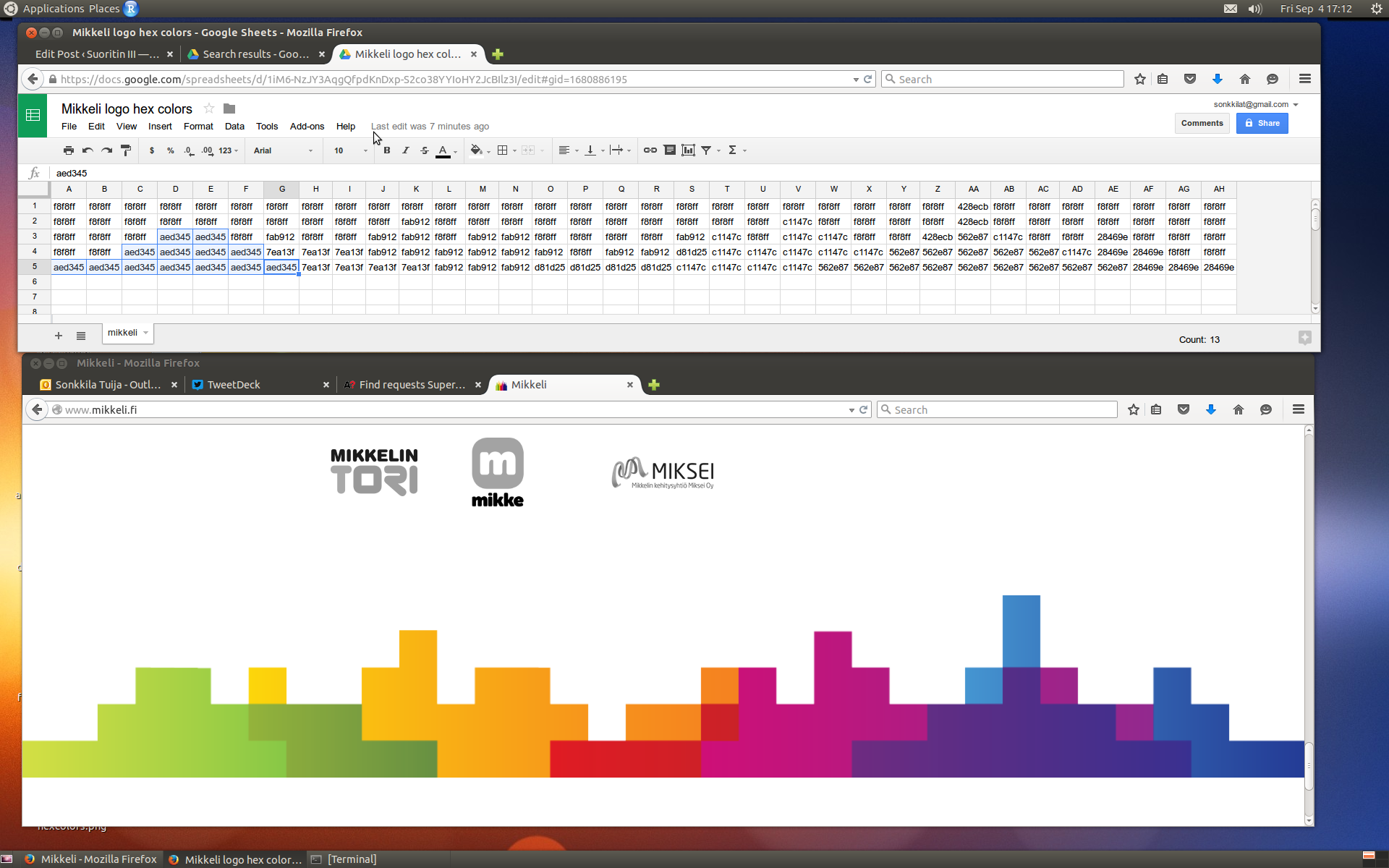
Thank you, Mikkeli! Here is my take on your skyline. All the best!