Tag Archives: leaflet

Streets of Helsinki

Helsinki streets on a map

Walking is fun, and there are always new ways to move forward, literally. Some people (not unlike me) have had this silly idea to walk all the streets of Helsinki, in alphabetical order. Johannes Laitila is one of them, and his blog is a good read (in Finnish). Recently Sanna Hellström, the head of Korkeasaari Zoo and former member of Helsinki City Council, mentioned in Twitter that since last fall, she had started to follow in Johannes’ footsteps.

Sanna’s tweet made me think about the size of her plan.

Spatial data of addresses of Helsinki are available from the city’s WFS API, via e.g. the key data site of Helsinki Region Infoshare. Of course addresses are not quite the same thing as streets but will do. Because addresses can refer to almost anything urban, I filtered them with a list of Official street names, the domain name of which tells something about the pragmatism of my home city; the name translates to Plans for cleaning.

The number of unique address names in my filtered data is 3788. The total sum of the geographical distances of individual addresses is 783 km (486 miles). There are some caveats though. Firstly, not all streets are populated by addresses from start to finish. In my home suburb Kulosaari for example, the two longest streets are Kulosaarentie and Kulosaaren puistotie. However, the former starts as a motorway exit road and meets its first address only after a few hundred meters. The latter is equally without addresses a long stretch from both ends. Secondly, distances are not calculated by the street level, so the meters you walk are bound to be more than what the figure says, except in those rare cases where the street forms a straight line.

Anyway, let’s assume a very rough error rate of 20 km to end up to a convenient total length of 800 km. To put that in perspective, Sodankylä, the venue for the legendary annual Midnight Sun Film Festival in Finnish Lapland, is about 800 km North from Helsinki. Given a modest rate of 5 km walking per day, starting about now, I’d reach Sodankylä in time for the next festival. In Helsinki, were I to walk one or two streets every weekend, the project of Walking Them All would be finished in 15 years.

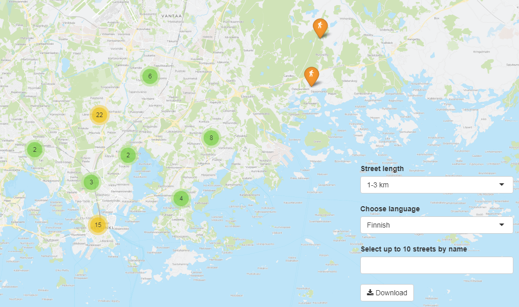
What does Helsinki look like, street-wise?

The opening state of the interactive web app hkistreets that marks the first and last address on every street, shows how the bulk of them is spread along the North-South axis. Helsinki sits on a tip of a peninsula with a slight bending towards right. This North-Eastern area is fairly new. In 2009, a slice of Sipoo was annexed in Helsinki.

Notice the few markers above the sea. Helsinki occupies 315 islands, and from these, a couple have got an address which reveals that there’s something else on the island than just summer cottages, if anything. Rysäkari for example, the most Southern island, is a former military base, and a future tourist attraction (news in Finnish).

Most of the streets of Helsinki can be walked in 5 minutes if you are in a hurry; over 90% are under 500 m (1640 feet). 6% have only one address which means that they are an obscure lot. Either the street do is short or in fact it is some other place of interest (to be cleaned) like the centrally located square Paasikivenaukio 2 with the 40 ton granite statue of the former President of Finland Juho Kusti Paasikivi. 2% are under 1 km, and 0.9% between 1 and 3 km.

Only two streets in Helsinki are longer than 3 km. Mannerheimintie is a giant, almost 14 km, and known to all, whereas Jollaksentie (5 km) in South-East is a less visited suburban stretch. At the end of it, you are close to the last big unbuilt island of Helsinki, Villinki.

Google Street View does not cover all coordinates in Helsinki, as neat as it would be – sometimes because my coordinates are too far from streets – so popup links will often hit a black screen. Technically, I guess I could scrape all targets beforehand and only serve those that have something to look at, but Google TOS might not like it so I’ll let that idea be.

The R source code is available at Github.

2015 on 1917

Kulosaari (Brändö in Swedish), an 1,8 square km island in Helsinki, detached itself from the Helsinki parish in early 1920’s, and became an independent municipality. The history of Kulosaari is an interesting chapter of Finnish National Romantic architecture and semi-urban development. It all began in 1907 when the company AB Brändö Villastad (Wikipage in Finnish) was established – but that’s another story. In 1949, the island was annexed again by Helsinki. Today, Kulosaari is cut in half by one of the busiest highways in Finland. The idealistic, tranquil village community is long gone. Since late 1997, Kulosaari has been my home suburb.

One of the open datasets provided by Helsinki Region Infoshare, is a scanned map of Kulosaari from 1917. Or rather, a scheme which became reality only in a limited extent. As long as I’ve known a little about what georeferencing is all about – thanks to the excellent Coursera MOOC Maps and the Geospatial Revolution by Dr. Anthony C. Robinson – I’ve had in mind to work with that map some day. That day dawned when I happened to read the blog posting Using custom tiles in an RStudio Leaflet map by Kyle Walker.

Unlike Kyle, I haven’t got any historical data to render upon the 1917 map but instead, there are a number of present day datasets available, courtesy of the City of Helsinki, e.g. roadmap and 3D models of buildings. How does the highway look like on top of the map? What about buildings and their whereabouts today? Note that I don’t aim particularly high here, or to more than two dimensions anyway; my intention is just to get an idea of how the face of the island has changed.

Georeferencing with QGIS is fun. I’m sure there are many good introductions out there in various languages. For Finnish speakers, I can recommend this one (PDF) by Latuviitta, a GIS treasure chamber.

georeferencing

The devil is in the detail, and I know I could’ve done more with the control points, but that’s a start. When QGIS was done with number-crunching, the result looked like this when I adjusted transparence for an easier quality check.

qgistransparence

Not bad. Maybe hanging a tad high, but will do.

Next, I basically just followed Kyle’s footsteps and made tiles with the OSGeo4W shell. I even used the same five zoom layers than he. Then I uploaded the whole directory structure with PNG files (~300 MB) to my web domain where this blog resides, too.

Roadmap data is available both in ESRI Shapefile and Google KML. I downloaded the zipped Shapefile, unzipped it, and imported as new vector layer to QGIS. After some googling I found help on how to select an area – Kulosaari main island in my case – by rectangle, how to merge selected features, and how to save the selection as a new Shapefile.

Then, to RStudio and some R code.

In Kulosaari, there are 23 different kind of roads. Even steps (porras) and boat docks (venelaituri) are categorized as part of the city roadmap.

> unique(streets$Vaylatyypp)

 [1] "Asuntokatu"                             "Paikallinen kokoojakatu"                    
 [3] "Huoltoajo sallittu"                     "Moottoriväyläramppi"                        
 [5] "Alueellinen kokoojakatu"                "Silta tai ylikulku (katuverkolla)"          
 [7] "Moottoriväylä"                          "Pääkatu"                                    
 [9] "Silta tai ylikulku (jalkakäytävä, pyörä "Alikulku (jalkakäytävä, pyörätie)"          
[11] "Jalkakäytävä"                           "Porras"                                     
[13] "Yhdistetty jalkakäytävä ja pyörätie"    "Puistotie (hiekka)"                         
[15] "Ulkoilureitti"                          "Puistokäytävä (hiekka)"                     
[17] "Puistokäytävä (päällystetty)"           "Venelaituri"                                
[19] "Polku"                                  "Suojatie"                                   
[21] "Väylälinkki"                            "Pyöräkaista"                                
[23] "Pyörätie"                                  

From these, I extracted motorways, bridges, paths, steps, parkways, streets allowed for service drive, and underpasses.

Working with the 3D data wasn’t quite as easy (no surprise). By far the biggest challenge turned to be computing resources.

I decided to work with KMZ (zipped KML) files. The documentation explained that the data is divided into 1 x 1 km grids, and that the numbering of the grids follows the one used by Helsingin karttapalvelu (map service). The screenshot below shows one of the four grids I was mainly interested in: 675499 (NW), 674499 (SW), 675500 (NE) and 674500 (SE). These would leave out outer tips of the island in the East, and bring in a chunk of the Kivinokka recreation area in the North.

kartta.hel.fi

First I had in mind to continue using Shapefiles: imported one KML file to QGIS, saved as Shapefile, and added it as a polygon to the leaflet map. It worked, but I noticed that RStudio started to slow down immediately, and that the map in the Viewer became seemingly harder to manipulate. How about GeoJSON instead? Well, the file size do was reduced but still too much data. Still, I succeeded in getting all on the map, of which this screenshot acts as the evidence:

roadmap and 3D buildings

However, where I failed was to get the map transformed to a web page from the RStudio GUI. The problem: default Pandoc memory options.

Stack space overflow: current size 16777216 bytes.
Use `+RTS -Ksize -RTS' to increase it.
Error: pandoc document conversion failed with error 2

People seem to get over this situation by adding an appropiate command to the YAML metadata block of the RMarkdown file, but I’m not dealing with RMarkdown here. Couldn’t get the option work from the .Rprofile file either.

Anyway, here is the map without the buildings, so far: there is the motorway/highway (red), few bridges (blue), sandy parkways (green) here and there, a couple of underpasses (yellow), streets for service drive only (white) – and one path (brown) on the Southern coast of the neighbour island Mustikkamaa, as unbuilt as in 1917.

Note that interactivity in the map is limited to zooming and panning. No popups, for example.

I’ve heard many stories of the time when the highway was built. One detail mentioned by a neighbour is also visible on the map: it reduced the size of the big Storaängen outdoor sports area on the Southern side of the highway. The sports area is accessible from the Hertonäs Boulevarden – now Kulosaaren puistotie – by an underpass.

EDIT 26.3.2015: Thanks to the helpful comment by Yihui Xie, I realized that there is in fact several options to do a standalone HTML file from the RStudio GUI. With File > Compile Notebook... the result was combiled without problems, and now all buildings are rendered in the leaflet too. The file is a whopping 7 MB and therefore slow in its turns, but at least all data are now there. As a bonus, the R code is included as well! RStudios capabilities don’t stop to amaze me.

Birds on a map

Lintuatlas aka Finnish Breeding Bird Atlas is the flagship of longitudinal observations on avian fauna in Finland. And it’s not just one atlas but many. The first covers years 1974-79, second 1986-89, and third 2006–2010. Since February this year, the data from the first ones are open. Big news, and asks for an experiment on how to make use of the data.

One of the main ideas behind the Atlases is to give a tool for comparison, to visualize possible shifts in the population. I decided to do a simple old-school web app, a snapshot from a given species: select, and see observations plotted on a map.

The hardest part in the data were the coordinates. How to transform the KKJ Uniform Coordinate System values to something that a layman like me finds more familiar, like ETRS89? After a few hours of head-banging, I had to turn to the data provider. Thanks to advice from Mikko Heikkinen, the wizard behind many a nature-related web application in this country – including the Atlas pages – the batch transformation was easy. Excellent service!.

advice on Lintuatlas coordinates

All that was left was few joins between the datasets, and data was ready for an interactive R Shiny application. To reflect the reliability of observations on one particular area (scale from 1 to 4), I used four data classes from the PuBu ColorBrewer scheme to color the circles.

The application is here, and the code for those of you more inclined to R.

Note that the application is on a freemium Basic account of shinyapps.io so I cannot guarantee its availability. There is a monthly 25 500 hour use limit.

Snow in Lapland

Finnish Meteorological Institute (FMI) Open Data API has been with us for over a year already. Like any other specialist data source, it takes some time before a lay person like me is able to get a grasp on it. Now, thanks to the fmi R package by the collaborative effort of Jussi Jousimo and other active contributors, the road ahead is much easier. A significant leap forward came just before New Year, when Joona Lehtomäki submitted a posting on fmi and FMI observation stations to the rOpengov blog.

Unlike many other Finns, I am relatively novice when it comes to Finnish Lapland. I’ve never been there during summertime, for example, and never farther North than the village of Inari. Yet, I count cross-country skiing in Lapland among the best memories of my adulthood years so far; pure fun in the scorchio April sun, but maybe even more memorable under the slowly shifting colors of the polar night.

Snow is of course a central element in skiing. Although warmer temperatures seem to be catching us up here, there has still been plenty of snow in Lapland during the core winter months. But how much, exactly, and when did it rain, when melt?

I followed Joona’s steps, and queried the FMI API of snow depth observations at three weather stations in Lapland, from the beginning of 2012 to the end of 2014: Kilpisjärvi, Saariselkä and Salla. Note that you have to repeat the query year-wise because the API doesn’t want to return all the years in one go.

Being lazy, I used the get_weather_data utility function by Joona as is, meaning I got more data than I needed. Here I filter it down to time and snow measurements, and also change the column name from ‘measurement’ to ‘snow’

snow.Salla.2014 <- salla.2014 %>%
  filter(variable == "snow") %>%
  mutate(snow = measurement) %>%
  select(time, snow)

and then combine all data rows of one station:

snow.Salla <- rbind(snow.Salla.2012, snow.Salla.2013, snow.Salla.2014)

One of the many interesting new R package suites out there is htmlwidgets. For my experiment of representing time-series and weather stations on a map, dygraphs and leaflet looked particularly useful.

Last time I was in Lapland was in mid-December 2014, in Inari, Saariselkä. BTW, over 40 cm of snow! During some trips I left Endomondo on to gather data about tracks, speed etc. I have to point out that I'm not into fitness gadgets as such, but it's nice to experiment with them. Endomondo is a popular app in its genre. Among other things it lets you export data in a standard GPX format, which is a friendly gesture.

For the sake of testing how to add GeoJSON to a leaflet map, I needed to convert the GPX files to GeoJSON. This turned out to be easy with the ogr2ogr command line tool that comes with the GDAL library, used by the fmi R package too. Here I convert the skiing ("hiihto") route of Dec 14th:

ogr2ogr -f "GeoJSON" hiihto1214.geojson hiihto1214.gpx tracks

One of the many aspects I like about dygraphs is how it lets you zoom into the graph. You can try it yourself in my shiny web application titled (a bit too grandiously I'm afraid) Snow Depth 2012-2014. Double-clicking resets. To demonstrate what one can do with the various options that the R shiny package provides, and how you can bind a value to a dygraphs event - pick a day from the calendar, and notice how it is drawn as a vertical line onto the graph.

The tiny, blue spot on the map denotes my skiing routes in Saariselkä. You have to zoom all the way in to see them properly.

The shiny application R code is here.

Edit 11.1: Winter and snow do not follow calendar years, so added data from the first leg of the 2012 winter period.