Tag Archives: trees

Trees and areas

The city of Helsinki is home to quite a big number of trees. Trees are interesting living organisms, and their sheer existence makes your life better in so many ways. This is how I personally feel anyway.

Thanks to the newly opened Urban tree database of the City of Helsinki we can now look at trees’ whereabouts also digitally. Note that the database is not exhaustive, error-free, nor regularly updated. The coverage is better on trees growing along streets, less so on trees within parks, which I find understandable.

To start with, let’s take a sample of 5000 (10%) and plot them as points on top of the Helsinki district map.

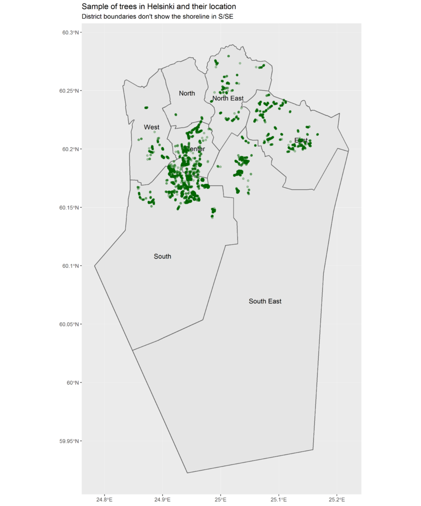
Here we can start to get a general understanding of where Helsinki is as its greenest at street level. The southernmost green points fall on the island of Suomenlinna so imagine that you see the shoreline somewhere above those.

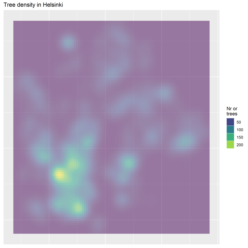
Where are the tree hotspots? A density map reveals that they are not far from the city centre; around Töölö bay and Hietaniemi cemetery, and in Kaivopuisto by the sea.

I was surprised by the number of different tree families, 115! Yet, the top 8 families are far more common than the rest: linden (Tilia), maple (Acer), birch (Betula), elm (Ulmus), rowan (Sorbus), oak (Quercus), pine (Pinia), and alder (Alnus).

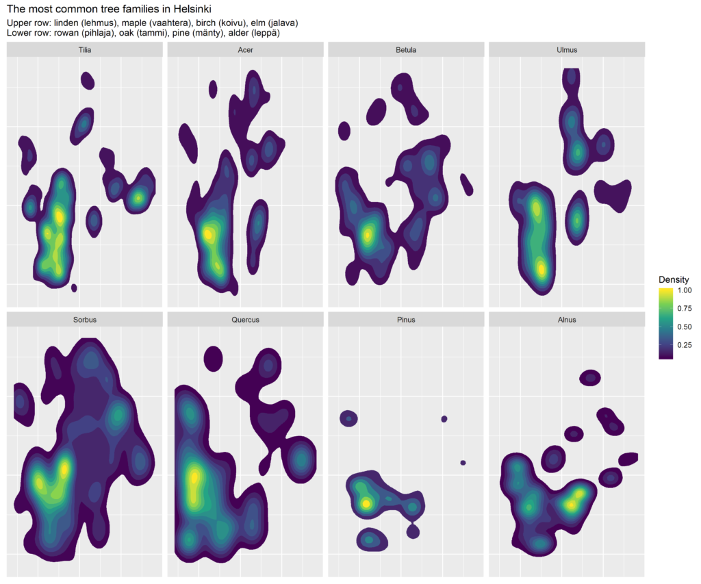
Rowan trees are the most widespread ones whereas pines are very concentrated to SW.

How about the age of the trees? Data does not tell about the age very much at all, but a good proxy is the size.

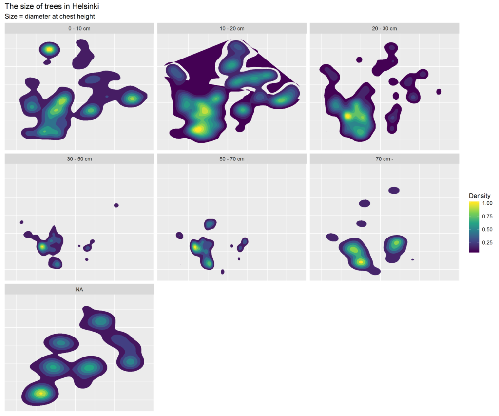
Smallish trees seem to the most widespread. Their density is relatively high especially in the city centre which sort of sounds right; in recent years, Helsinki has been quite busy in rejuvenating its tree population. Note that only about 3% of the trees are missing the size info, i.e. the size is given as a NA.

While at it, I also checked which tree grows closest to where I live, and which one the most far.

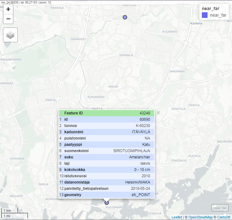
Turns out that the nearest one is 150 m from my home door, on the bank of the Itäväylä highway. An Amelanchier laevis, planted last year.

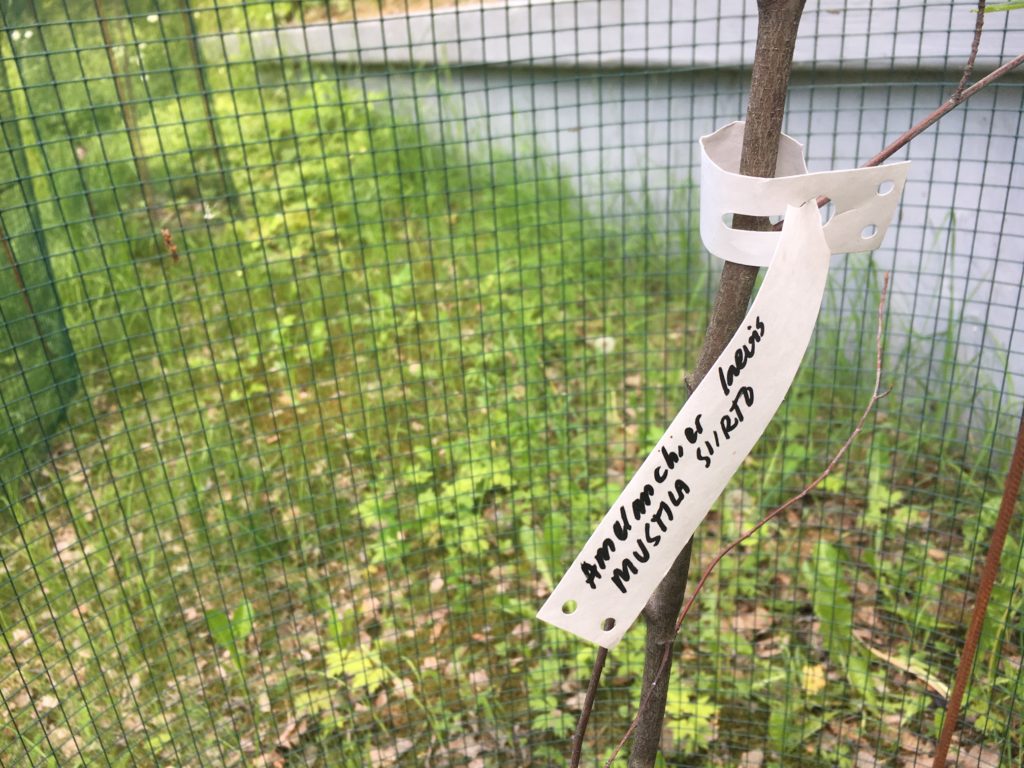
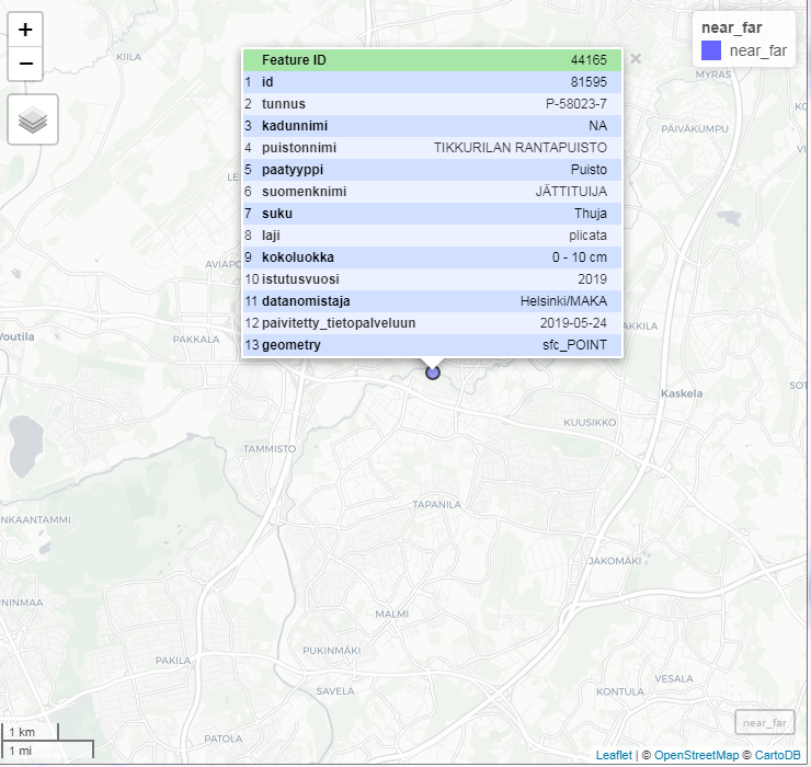
The most remote one on the other hand was planted earlier this year on the southern shore of the Kerava River, 11 km to the North from here. The family? Thuja, my namesake 🙂 More exactly, a Thuja plicata, a Western red cedar.

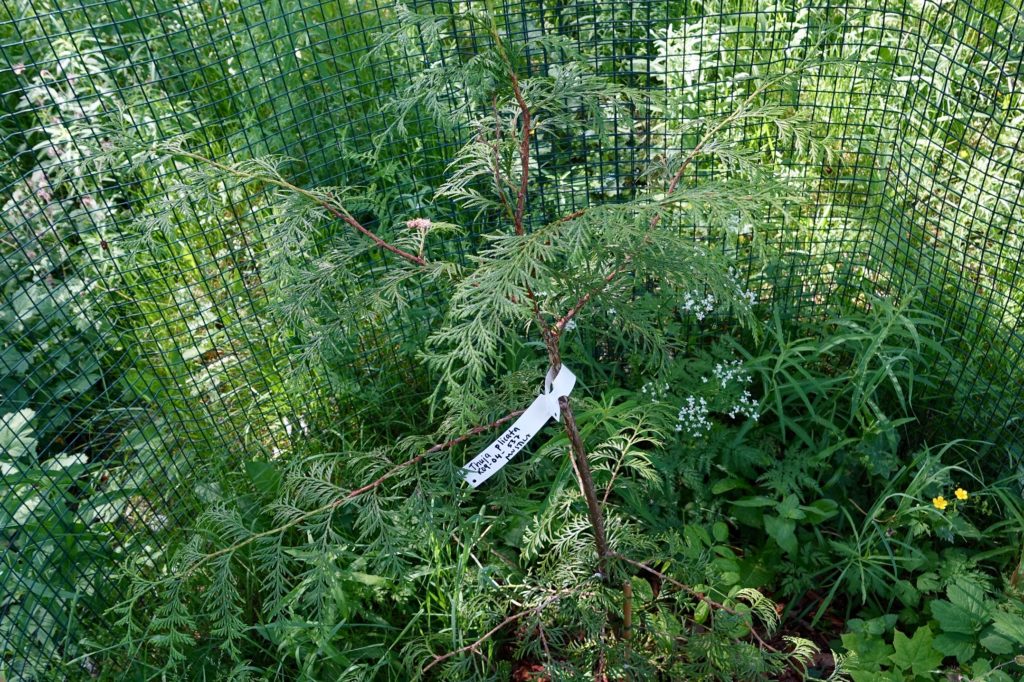
These Thujas can become tall if all goes well. The Finnish name Jättituija (“giant Tuija”) reflects this fact. In North America where the species is native, its wood has been frequently used in e.g. Haida totem poles, few of which I only this week had the chance to see in British Museum, London.

With almost 50K items in the dataset, there is really no easy and practical way to show information from every tree at the same time. Instead, I decided to combine data with another open dataset from Helsinki, Valuable environments in the public areas of the city of Helsinki. This interactive web app shows, which trees are located inside these areas. The bigger the tree (diameter on the chest level), the bigger the circle that points to its location. Be aware that all text in tooltips and pop-up boxes is in Finnish.

R code is available here.

Mapping red-listed rainforest tree species

Rainforest Foundation Norway keeps a red list of tree species. Where do these trees grow?

One of the R packages developed by rOpenSci is rgbif. It’s a handy wrapper to the Global Biodiversity Information Facility API. With geolocation data returned by the query, you can plot points on the world map.

Let’s start with the list. Instead of using R all the way through, I scraped the HTML table rows with the Google Chrome extension Scraper, and saved data as a spreadsheet on Google Drive. This is the way Scraper works.

As I mentioned in my job blog the other day, one of the many good tutorials out there on using Scraper, is by Jens Finnäs.

Data needs some pruning in this exercise. What you need for the GBIF query, is basically just the Latin names. To make things somewhat simpler, I’ll take only the first one mentioned along each species; many have several.

Here is the R code for pruning, and for querying GBIF. The script saves the return data by the tree status, and in two file sets: R data, and GeoJSON. The first ones are used as input for a Shiny web application, where they will be plotted both as an interactive gvisGeoChart by googleVis, and as a static map with the (only slightly modified) gbifmap function from rgbif. The GeoJSON files will be rendered straight from a GitHub Gist. All of this just to demonstrate (foremost to myself!) that there are many ways to plot and serve maps, and that they all have different pros and cons depending on the amount and type of data. The challenge here is that there will be multiple data points on the same geolocation, and the number of different species is rather big too.

Next, the web application. Here is the R code for it, and this is the app itself. The maps served by GitHub: Critically_Endangered, Endangered, Vulnerable, Near_Threatened and Other.

The status Other is named by me. It refers to those rows in the original Foundation table, where no exact two-character status was given.

On the googleVis map, both the size and color of the points reflect the amount of occurrences on that particular location. This is of course repetitive, but I haven’t yet find a better solution. Optimally, the color would tell something else, maybe the species. Yet, the tooltip has this information already, so there you are. Note that the country name in the tooltip comes from a yet another scraped file, originating to Wikipedia. Initially, I had in mind fetching the name by querying the acronym against the DBpedia Linked Data, but reverted to scraping. The magnifying glass is a nifty tool of course, but IMHO doesn’t add much on the informative side.

The static map gives a quick overview of all species and their location. This works OK when the number is relatively small. However, the more variety there is, the harder it is to discern between different colors. Transparency (alpha) does the best it can to show that indeed there are multiple points on the same spot. With my expanded color palette however, the colors became so elusively light that I was forced to reduce transparency. Although you can customize the gbifmap function, with my limited skills I didn’t succeed in passing my own alpha value, so I modified the function accordingly. Note to self: find out the best practise of how this kind of modification should be done.

The GeoJSON maps were a positive surprise. Out of the Gist box, the JavaScript code produces nicely detailed maps, and in hot spots points are clustered. Marker symbols and colors could of course be different across species. Here, I simply use one red park2 marker in all.