Some time ago, I got a hint via Twitter of an online course made at Ohio State University, Data Literacy and Data Visualization, by professor Bear Braumoeller. Halfway through the videos, I can say that the course has been a pleasure, most of the time. One area where Braumoeller shines, is when he explains why he thinks some particular visualization is bad and why, and how it could be made better. I heard his words in my ears when I saw the colourful bubble chart on page 6 in the current Aalto University Magazine.
Now, frankly, I think the Magazine is a great piece of university journalism in Finland. Cool topics, well written, fresh layout. There are few magazines I read from start to finish, and this is one of them.
But the chart, it baffles me.
The chart tries to draw a picture of the University by the year 2016, compared to the present. Bubbles represent a selection of different degree programmes. The legend on the vertical axis tells us that above the horizontal axis, we have programmes that will most probably become bigger, i.e. get proportionally more resources and students than what they do now. Below, less resources, less students.
The horizontal axis is without a legend. Is it a timeline? The first bubble along the axis is Materials Science aka Materiaalitekniikka in Finnish, hanging low on the negative side. Will Materials Science be the first one to see its share diminished? The axes have a color scheme, from yellow via orange to (a rather surprising) black. When I first looked at the horizontal axis, I thought that by every color we pass one year. But that cannot be true because 2016 is only two years ahead. So, I suppose here colors are just, well, colors.
All bubbles are divided in two segments, some of equal size, some not. There is no clue what they mean, and what the coloring stands for, if anything. The biggest bubble at the end of the horizontal axis has a slightly longer label. From it we can see that here we have in fact two programmes, Electrical Engineering & Automation and Computer Science & Engineering. Okay, so does every other bubble comprise of two programmes as well? We don’t know.
By looking more closely at the chart, I came to the conclusion that the size of the bubble reflects the magnitude of change that the individual programmes will face – the percentages given tell the same story. But wait, what is the function of the vertical axis then? The two bubbles below the horizontal axis are levelled, giving the impression that their status will be affected by the same amount. Yet their size differs a lot. Apparently, the vertical axis is not really an axis at all, but a dividing line on a more abstract level.
Citing professor Braumoeller, I have to say that the chart does not make a coherent whole. What could we do to improve it?
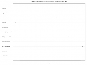
Below is a deadly plain and simple plotchart, done with few lines of R. It is a total bore to look at, but gives a quick overview of the ups and downs.
Disclaimers: Aalto University is my employer. All possible misunderstandings about the data are of course mine.
