M/S Haaga

M/S Haaga

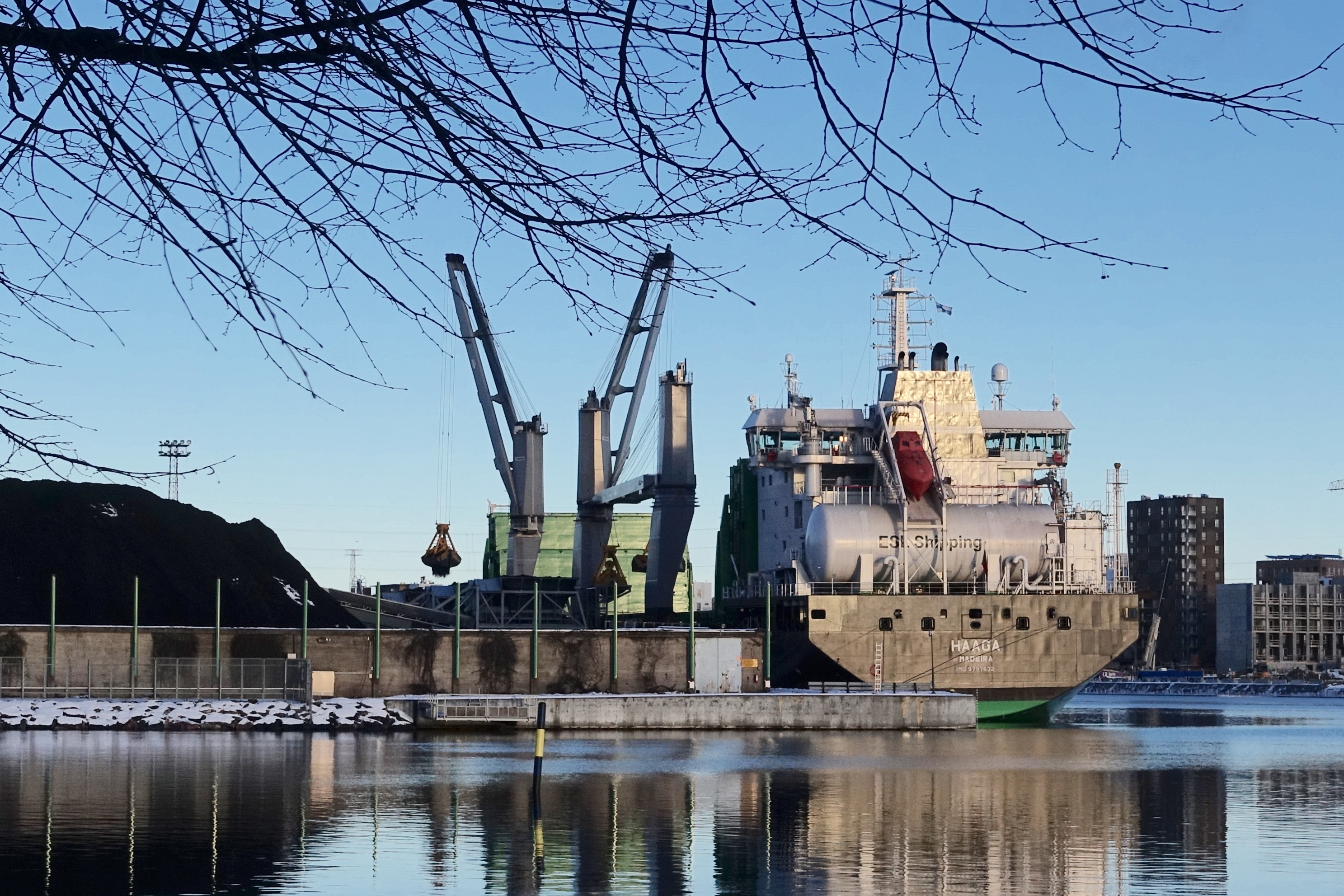
On a sunny +1 C mid-winter Saturday, when the Helsinki metro was having a two-day maintenance break, I walked via Mustikkamaa to Helsinki city center. While passing the Sompasaari area with its 45 year old Hanasaari power plant, I noticed that there was a cargo ship moored at its general berth (I learned new English words while writing this piece), its cranes slowly transporting coal from the ship on land.

It was M/S Haaga, owned by ELS Shipping, a subsidiary of ASPO plc.

ASPO is a four-legged conglomerate with an interesting selection of branches: chemicals, shipping, electronic solutions especially for mobile work, and bakery technologies. The acronym ASPO comes from the Finnish Asunto-osakeyhtiöitten Polttoaine Osuuskunta (Energy coop of housing cooperatives). The company started in the late 1920’s by importing petroleum coke.

The past and present fleet of ELS Shipping carries names that sound familiar to Helsinki city dwellers; they are named after the districts of the city.

M/S Haaga is a 25,600 dwt self-discharging, ice classed, LNG-powered bulk carrier, launched in Nanjing, China on 20th October 2018. The port of registry is Madeira, Portugal, mainly due to its tax benefits I understand.

From China, M/S Haaga arrived to the Baltic Sea through the Northeast Passage (article in Finnish), after having first sailed to Japan for a cargo of raw materials.

Based on information at Marine Traffic and Vessel Tracker, M/S Haaga has been criss-crossing the Baltic region since mid-November 2018. To fill its tanks with liquefied natural gas (LNG), the ship sails to Oxelösund, Sweden. For coal, M/S Haaga heads South-East.

Ust-Luga is an important coal terminal in Russia. According to Wikipedia, the target is high:

As of 2005, the population of Ust-Luga does not exceed 2,000, but the port administration expects it to grow to 34,000 by 2025. This would make Ust-Luga the first new town built in Russia after the fall of the Soviet Union.

Whether M/S Haaga is transporting coal mined in Russia, Poland or some other European country, I don’t know, but Russia is a good candidate. In his book Coal Energy Systems, Bruce G. Miller writes:

Russia’s main coal basins contain coals ranging from Carboniferous to Jurassic in age. Most hard coal reserves are in numerous coalfields in European and central Asian Russia, particularly in the Kuznetsk and Pechora basins and the Russian sector of the Dontesk basin.

The Helsinki area still depends a lot on coal, especially in district heating. However, the aim is to become carbon neutral by 2035.

Energy sources

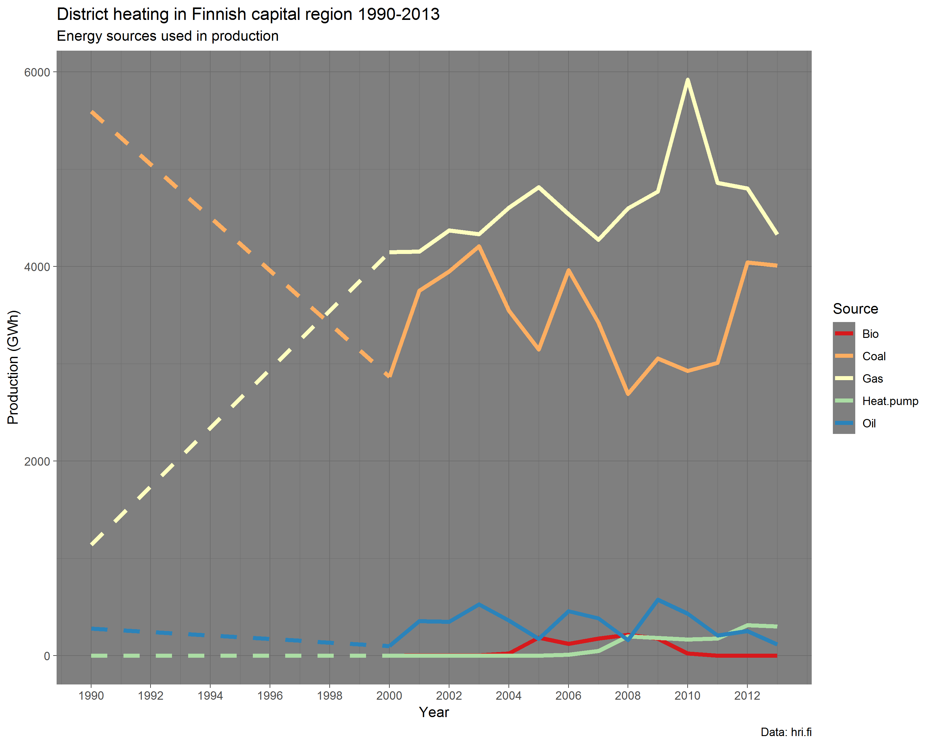
The dashed line denotes the fact that there are no data points between 1990 and 2000. R code.

Our 4-family housing company is one of the customers of district heating of HELEN, the energy company owned by the city of Helsinki.

On average, we consume 180 MWh for heating per year. This means a roughly 13,000 Euro bill. As heat of combustion, hard coal is about 30 MJ/kg. In MWh, 1 tonne of coal is ~8 MWh. Our yearly 180 MWh is thus 180 / 8 = ~22 tonnes. From the 25,600 deadweight tonnage (dwt) of M/S Haaga, that’s less than a 1/1000.

Where is Haaga now? After a one week stay in Helsinki, it is now back to Russia, this time in St. Petersburg.

Death in Finland

In early December, Kieran Healy posted tweets where he presented quite spectacular heatmaps of mortality rates, based on data from The Human Mortality database.

How would the respective Finnish heatmaps look like, I wondered.

Luckily, in PX-WEB API Interface we have a helpful R library to fetch data from Statistics Finland open data API. With the interactive_pxweb() function you navigate in the data hierarchy, select what you want, and then download the data. As as sidekick, for later use, you get a ready-made query. A nice and easy solution.

However, year-by-year data via the API starts only from 1980, so for previous statistics I needed to go elsewhere.

Statistics Finland have digitized all their legacy reports on population shift that include births, marriages, deaths etc. These are available as PDF files at the Doria repository of the National Library of Finland. Initially, to extract numbers from the PDFs, I had high expectations on the pdftools R library but rapidly fell down into the valley of despair. Either the table structure was just too complicated and I got only headers, or the PDF was a scanned picture. Among the former, you could oftentimes manually copy-paste table columns though. So, a few days in a row I was mostly just tap-tapping numbers to an Excel worksheet. Then it suddenly dawned on me that I never actually checked the Mortality database. Would they perhaps have data from Finland? Of course they do! So I ended up combining data from three sources: Mortality.org, my manually entered file, and API.

When data were ready, the graphs were easy to do thanks to Healy’s example code in R. I even copied his color palette and all.

Below are the final heatmaps, covering mortality statistics since 1878. I deliberately left out older years because before 1878, statistics are not available year-by-year but in five-year age groups.

Female mortality in Finland

Male mortality in Finland

For comparison, here is neighbor Sweden.

Female mortality in Sweden

Male mortality in Sweden

What do the graphs show?

Healy explains it best in the legend of his French mortality poster

Mortality rates are calculated for each age in each year and binned by percentile. The darker the color at any particular point, the more people of that age die in that year. The lighter the color, the more people of that age survive in that year.

Historical trends are visible, such as the rapid decrease in infant mortality rates after World War II, as well as increased life expectancy overall. Specific events show up as vertical streaks in the graph. The death toll due to wars in evident for Males. Pandemics are also visible, most notably the 1918 influenza pandemic and the death toll to Smallpox outbreaks after the Franco-Prussian war of 1870.

Diagonal streaks in the data are visible in some parts of the data. These are artifacts due to the estimation of the mortality rate in some years. Single-year-of-age figures prior to 1900 are calculated from five-year age groups, as no single-year data is available in the original mortality tabulations from which the rates were derived.

World War I lasted from 1914 to 1918. However, the peak in 1918 among young Finnish males in particular was mostly caused by the Finnish Civil War. During the same year–perhaps partly assisted by the WWI–the Spanish Flu influenza pandemic caused havoc in all age groups, as Healy points out too.

Winter War 1939-40 and Continuation War 1941-1944 paint dark columns as well.

Tuberculosis was a deadly national disease in Finland until WWII. Infant mortality began to wither around the same time, and better maternity care started to save lives of young women in labor.

Note the coloring in the age groups above 80. It does not claim that, particularly in the past, the older you got the less likely you were to die. On the contrary. There simply did not exist that many people alive in those age groups (who would then die). While preparing the data, I replaced NA values with zero. Perhaps it would’ve been wiser not to do that and let the graph color these missing values differently from the rest of the graph. The mostly zero valued groups now fall into the first bins, i.e. the lowest percentiles which are given the lightest colors from the viridis palette. Anyway, why was this phenomenon missing from the French graph? I suppose because compared to Finland, France is a big country with more than a tenfold population. A lot of people in all age groups.

The lighter diagonal strands are interesting. They look like sunbeams that drill through the dark clouds of death. Unlike in Healy’s case, these cannot be artifacts or at least not similar ones to his, because numbers are not calculated from age groups but are year-by-year. My initial thought was that they reflect the increased birth rate that tends to occur especially after wars; when population grows, the proportion of deaths diminishes. However, we have no population data here so this cannot be true. Yet, they do seem to have their origin around the war years. Did these baby-boomer cohorts get such a favorable start that it shows throughout the rest of their lives?

Although I did some amount of redundant work while I extracted data manually from digitized reports, I don’t regret it. Following the death statistics year by year I had the opportunity to notice gradual changes in terminology, presentation, and typeface. The arrival of the line printer in 1971! Also, there were other intriguing tabulated data in the reports. For example Causes of accidental and violent deaths that was published between 1921 and 1935 at least. Death in this category of the prosperous Finland of today often occur in extreme leisure activities up in the highest mountains and in the deepest caves of the oceans. In the 1920’s the end could arrive in the shape of the hoof of your domestic horse. Yet some things remain. Finns still drink, drive or dive, and die.