The other day I noticed this tweet about Cytoscape’s D3.js Exporter.
Because I am currently learning the basics of D3, this sounded interesting to look at more closely.
Cytoscape is a tool for visualizing networks. While Gephi is well known in this area, Cytoscape is not, at least not for me. The first time I heard of it was while watching Data Literacy and Data Visualization, a great collection of videos I mentioned last time.
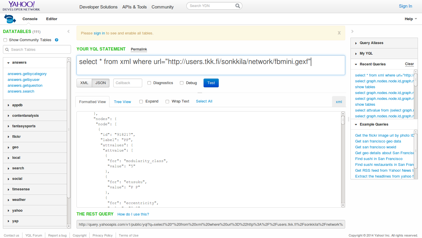
A year ago, I wrote in a brief post, how I put Facebook friends on a network graph – a common visualization those days. How would the same data look like in SVG?
I didn’t want to repeat the whole process, but to continue from the GEXF file. Cytoscape does not support this markup language by Gephi in import. However, another XML-based language, GraphML, is on the list. So, I read the GEXF file back in Gephi, exported in GraphML, and imported that one in Cytoscape.
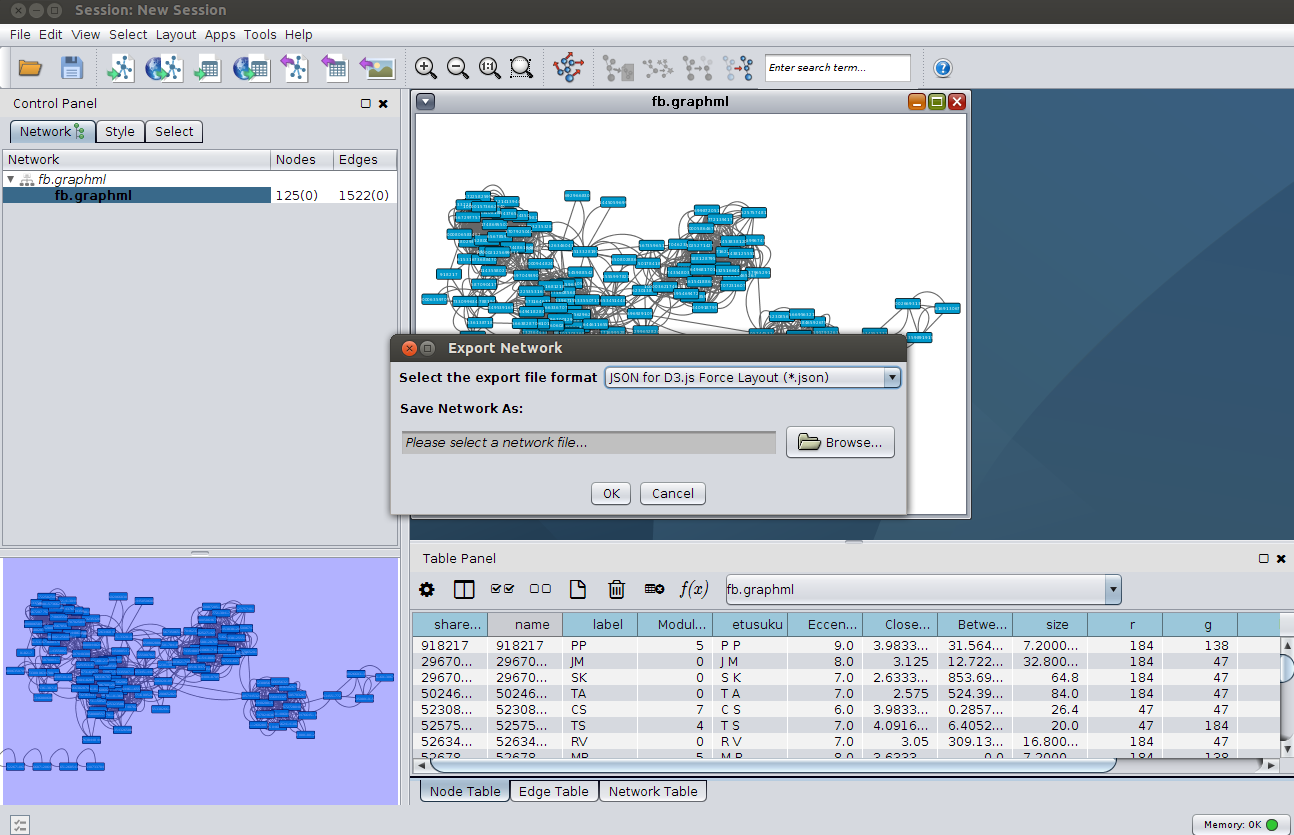
By default, Cytoscape presents the network as a grid. Following the advice from Ohio, I applied the preferred layout (F5). After installing the D3.js Exporter in App Manager, the data was ready for a JSON export.

Mike Bostock, a central figure behind D3, has an extensive collection of examples in his gallery. One of them is on force-directed graphs, and that was exactly what I was after. All I did to get the first version of my D3.js Facebook network, was that I changed the file name in the d3.json() function that imports the data. That was easy!
In this graph, the node labels are numbers and all nodes of the same color and size. Time to change these to something more visually interesting, and perhaps more informative.
Gephi’s community detection algorithm had provided numbers for the nodes, and stored them in the Modularity_Class attribute. This is an obvious choice for the script when it’s time to decide, in which colour the circles ought to be filled. The name of the node should not be the name in my case, but the tiny version of the full name in label. What about the size of the nodes? Of all attributes available, I decided to try Betweenness_Centrality. Note that you will not find this and a couple of other attributes in the original GEXF; I added them this time by letting Gephi calculate the respective values.
{
  "nodes" : [ {
    "id" : "10162",
    "SUID" : 10162,
    "In_Degree" : 16,
    "PageRank" : 0.010341513363002573,
    "Weighted_In_Degree" : 16.0,
    "Weighted_Degree" : 32.0,
    "selected" : false,
    "name" : "100003621746564",
    "Clustering_Coefficient" : 0.44166666,
    "shared_name" : "100003621746564",
    "Betweenness_Centrality" : 1434.8632653485495,
    "Eigenvector_Centrality" : 0.18212450755372586,
    "etusuku" : "J K",
    "g" : 184,
    "b" : 47,
    "Out_Degree" : 16,
    "label" : "JK",
    "size" : 52.0,
    "Modularity_Class" : 4,
    "r" : 47,
    "Weighted_Out_Degree" : 16.0,
    "Degree" : 32,
    "Eccentricity" : 7.0,
    "y" : 111.5109,
    "Closeness_Centrality" : 2.925,
    "x" : 412.6945
  }
The new version shows now the modularity classes in different colors, and the label pops up as a tooltip when you hover of the circle.
The proportional size of the node tells, which of my friends act as “bridges” more than the others do. The normalization is done with a power scale function d3.scale.sqrt(), thanks to Mike’s advice a while back. Contrary to his words though, I put the lower bounds to 2 and also tweaked the data. In some nodes, the value of this attribute is 0.0, and these nodes vanish altogether. Not the best way to deal with the issue I gather. Perhaps I should have left these nodes out of the exercise altogether?