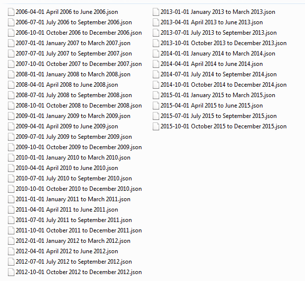
Since few days now, I’ve had my Google search archive with me. In my case, it’s a collection of 38 JSON files, containing search strings and timestamps. The oldest file dates back to mid-2006, which acts as a digital marriage certificate of us, me and the Internet giant.
It took no more than 15 minutes for Google to fulfill my wish to get the archive as a zipped file. For more information on How & Where, see e.g. Google now lets you export your search history.
Now, this whole archive business started when I was led to a very nice blog posting by Lisa Charlotte Rost
.
I find it fascinating, what you can tell about a person just by looking at her searches. Or rather, what kind of narratives s/he builds upon them; to publish all search strings verbatim is not really an option.
Halfway in the 4-week course Intermediate D3 for Data Visualization, the theme is stacked charts. Maybe I could visualize, on a timeline, as a stacked area chart, some aspects of my search activity. But what aspects? What sort of person am I as a searcher?
Quite dull, I have to admit. No major or controversial hobbies, no burning desire to follow latest gadgets, only mildly hypocondriac, not much interest at all in self-help advisory. Wikipedia is probably my number one landing site. Very often I use Google simply as a text corpus, an evidence-based dictionary:”Has this English word/idiom been used in the UK or did I just made it up, or misspelled?” Unlike Lisa, who tells in episode #61 of the Data Stories podcast that now when she lives in a big city, Berlin, she often searches for directions – I do not. Well, compared to Berlin, Helsinki do is small, but we also have a superb web service for guiding us around here, Journey Planner. So instead of a search, I’ll go straight there.
One area of digital life I’ve been increasingly interested in – and what this blog and my job blog reflect, too, I hope – is coding. Note, “coding” not as in building software but as in scripting, mashupping, visualizing. Small-scale, proof-of-concept data wrangling. Learning by doing. Part of it is of course related to my day job at Aalto University. For example, now when we are setting up a CRIS system, I’ve been transforming, with XSLT, legacy publication metadata to XML. It needs to validate against the Elsevier Pure XML Schema before it can be imported.
A few years now, appart XSLT, the other languages I have been writing with, are R and Perl. Unix command line tools I use on a daily basis. Thanks to the D3 course, I’m also slowly starting to get familiar with JavaScript. Python has been on my list a longer time, but since the introductory course I took at CSC – IT Center for Science some time ago, I haven’t really touched it.
I’m not the only one that googles while coding. Mostly it’s about a specific problem: I need to accomplish something but cannot remember or don’t know, how. When you are not a full-time coder, you forget details easily. Or, you get an error message you cannot understand. Whatever.
Are my coding habits visible in the search history? If yes, in what way.
First thing to do with the JSON files, was to merge them into one. For this, I turned to R.
library(jsonlite)

filenames <- list.files("Searches", pattern="*.json", full.names=TRUE)
jsons.as.list <- lapply(filenames, function(f) fromJSON(txt = f))
alljson <- toJSON(jsons.as.list)
write(alljson, file = "g.json")
Then, just as Lisa did, I fired up Google Refine, and opened a new project on g.json.
To do:
- add Boolean value columns for JavaScript, XSLT (including XPath), Python, Perl and R by filtering the query column with the respective search string
- convert Unix timestamps to Date/Time (Epoch time to Date/Time as String). For now, I’m only interested in date, not time of day
- export all Boolean columns and Date to CSV
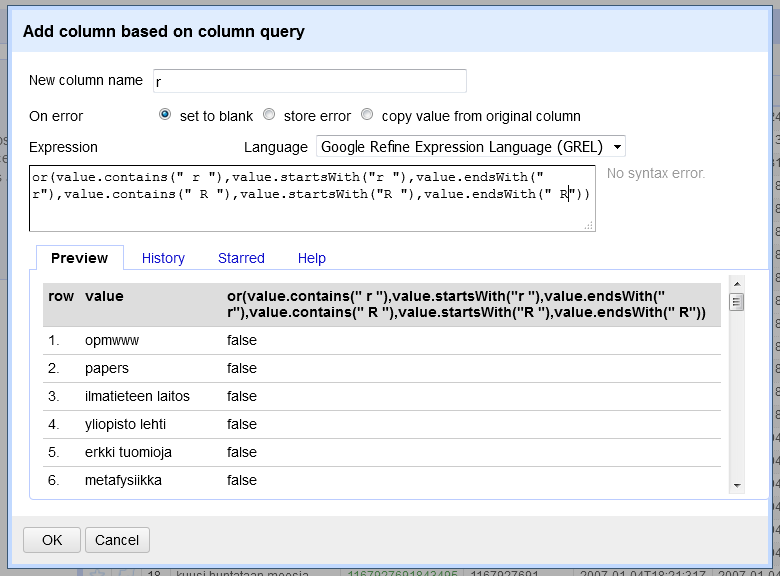
From the language names, R is the most tricky one to filter because it is just one character. Therefore, I need to build a longish Boolean or sentence for that.
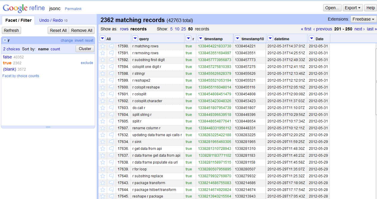
Here I’m ready with R and Date, and checking the results with a text facet on the column r.
Thanks to a clearly commented template by the D3 course leader, Scott Murray, the stacked area chart was easy to do, but only after I had figured out how to process and aggregate yearly counts by language. Guess what – I googled for a hint, and got it. The trick was, while looping over all rows by language, to define an object to store counts by year. Then, for every key (=year), I could push values to the dataset array.
Do the colors of the chart ring a bell? I’m a Wes Anderson fan, and have waited for an excuse to make use of some of the color palette implementations of his films. This 5-color selection represents The Life Aquatic With Steve Zissou. The blues and browns are perhaps a little too close to each other, especially when used as inline font color, but anyway.
Quite an R mountain there to climb, eh? It all started during the ELAG 2012 conference in Palma, Spain. Back then I was still working at the Aalto University Library. I had read a little about R before, but it was the pre-conference track An Introduction to R led by Harrison Dekker, that finally convinced me that I needed to learn this. I guess it was the easiness of installing packages (always a nightmare with Perl), reading in data, and quick plotting.
So what does the big amount of R searches tell? For one thing, it shows my active use of the language. At the same time though, it tells that I’ve needed a lot of help. A lot. I still do.