Category Archives: Diverse coding | Kaikenlaista koodailua

Birds on a map

Lintuatlas aka Finnish Breeding Bird Atlas is the flagship of longitudinal observations on avian fauna in Finland. And it’s not just one atlas but many. The first covers years 1974-79, second 1986-89, and third 2006–2010. Since February this year, the data from the first ones are open. Big news, and asks for an experiment on how to make use of the data.

One of the main ideas behind the Atlases is to give a tool for comparison, to visualize possible shifts in the population. I decided to do a simple old-school web app, a snapshot from a given species: select, and see observations plotted on a map.

The hardest part in the data were the coordinates. How to transform the KKJ Uniform Coordinate System values to something that a layman like me finds more familiar, like ETRS89? After a few hours of head-banging, I had to turn to the data provider. Thanks to advice from Mikko Heikkinen, the wizard behind many a nature-related web application in this country – including the Atlas pages – the batch transformation was easy. Excellent service!.

advice on Lintuatlas coordinates

All that was left was few joins between the datasets, and data was ready for an interactive R Shiny application. To reflect the reliability of observations on one particular area (scale from 1 to 4), I used four data classes from the PuBu ColorBrewer scheme to color the circles.

The application is here, and the code for those of you more inclined to R.

Note that the application is on a freemium Basic account of shinyapps.io so I cannot guarantee its availability. There is a monthly 25 500 hour use limit.

Snow in Lapland

Finnish Meteorological Institute (FMI) Open Data API has been with us for over a year already. Like any other specialist data source, it takes some time before a lay person like me is able to get a grasp on it. Now, thanks to the fmi R package by the collaborative effort of Jussi Jousimo and other active contributors, the road ahead is much easier. A significant leap forward came just before New Year, when Joona Lehtomäki submitted a posting on fmi and FMI observation stations to the rOpengov blog.

Unlike many other Finns, I am relatively novice when it comes to Finnish Lapland. I’ve never been there during summertime, for example, and never farther North than the village of Inari. Yet, I count cross-country skiing in Lapland among the best memories of my adulthood years so far; pure fun in the scorchio April sun, but maybe even more memorable under the slowly shifting colors of the polar night.

Snow is of course a central element in skiing. Although warmer temperatures seem to be catching us up here, there has still been plenty of snow in Lapland during the core winter months. But how much, exactly, and when did it rain, when melt?

I followed Joona’s steps, and queried the FMI API of snow depth observations at three weather stations in Lapland, from the beginning of 2012 to the end of 2014: Kilpisjärvi, Saariselkä and Salla. Note that you have to repeat the query year-wise because the API doesn’t want to return all the years in one go.

Being lazy, I used the get_weather_data utility function by Joona as is, meaning I got more data than I needed. Here I filter it down to time and snow measurements, and also change the column name from ‘measurement’ to ‘snow’

snow.Salla.2014 <- salla.2014 %>%
  filter(variable == "snow") %>%
  mutate(snow = measurement) %>%
  select(time, snow)

and then combine all data rows of one station:

snow.Salla <- rbind(snow.Salla.2012, snow.Salla.2013, snow.Salla.2014)

One of the many interesting new R package suites out there is htmlwidgets. For my experiment of representing time-series and weather stations on a map, dygraphs and leaflet looked particularly useful.

Last time I was in Lapland was in mid-December 2014, in Inari, Saariselkä. BTW, over 40 cm of snow! During some trips I left Endomondo on to gather data about tracks, speed etc. I have to point out that I'm not into fitness gadgets as such, but it's nice to experiment with them. Endomondo is a popular app in its genre. Among other things it lets you export data in a standard GPX format, which is a friendly gesture.

For the sake of testing how to add GeoJSON to a leaflet map, I needed to convert the GPX files to GeoJSON. This turned out to be easy with the ogr2ogr command line tool that comes with the GDAL library, used by the fmi R package too. Here I convert the skiing ("hiihto") route of Dec 14th:

ogr2ogr -f "GeoJSON" hiihto1214.geojson hiihto1214.gpx tracks

One of the many aspects I like about dygraphs is how it lets you zoom into the graph. You can try it yourself in my shiny web application titled (a bit too grandiously I'm afraid) Snow Depth 2012-2014. Double-clicking resets. To demonstrate what one can do with the various options that the R shiny package provides, and how you can bind a value to a dygraphs event - pick a day from the calendar, and notice how it is drawn as a vertical line onto the graph.

The tiny, blue spot on the map denotes my skiing routes in Saariselkä. You have to zoom all the way in to see them properly.

The shiny application R code is here.

Edit 11.1: Winter and snow do not follow calendar years, so added data from the first leg of the 2012 winter period.

Network once again, now with YQL!

While fiddling with the Facebook network, GEXF and JSON parsing I remembered Yahoo! and its YQL Web Services. With it, you can get a JSON-formatted result from any, say, XML file out there. GEXF is XML.

The YQL query language isn’t that handy if you are interested only in a selection of nodes; the XPath filter is only for HTML files, curiosly enough. I wanted the whole story though, so no problem. Here is how the YQL Console shows the result:

YQL Console

With the REST query down below, you can e.g. transfer the JSON result to your local machine, in Unix like curl 'http://query.yahooapis.com/v1/public/yql?q=select%20*%20from%20xml%20where%20url%3D%22http%3A%2F%2Fusers.tkk.fi%2Fsonkkila%2Fnetwork%2Ffbmini.gexf%22&format=json&callback=' > gexf.json

The structure is more deep than in the JSON that the Cytoscape D3.js Exporter returns, but the only bigger change the D3 code needs is to have new references from the links/edges to nodes.

Like the documentation of force.start() says,

On start, the layout initializes various attributes on the associated nodes. The index of each node is computed by iterating over the array, starting at zero.

This is fine, if the source and target attributes in the edge array apply to this. Here, they do not. Instead, the attributes reference the id attribute in the respective nodes. So I needed to change that, and excellent help was available.

So far so good, but using index numbers to access attribute values isn’t pretty and needs to be done differently. Maybe next time.

Deconstructing Facebook network

The other day I noticed this tweet about Cytoscape’s D3.js Exporter.

Because I am currently learning the basics of D3, this sounded interesting to look at more closely.

Cytoscape is a tool for visualizing networks. While Gephi is well known in this area, Cytoscape is not, at least not for me. The first time I heard of it was while watching Data Literacy and Data Visualization, a great collection of videos I mentioned last time.

A year ago, I wrote in a brief post, how I put Facebook friends on a network graph – a common visualization those days. How would the same data look like in SVG?

I didn’t want to repeat the whole process, but to continue from the GEXF file. Cytoscape does not support this markup language by Gephi in import. However, another XML-based language, GraphML, is on the list. So, I read the GEXF file back in Gephi, exported in GraphML, and imported that one in Cytoscape.

By default, Cytoscape presents the network as a grid. Following the advice from Ohio, I applied the preferred layout (F5). After installing the D3.js Exporter in App Manager, the data was ready for a JSON export.

Cytoscape export

Mike Bostock, a central figure behind D3, has an extensive collection of examples in his gallery. One of them is on force-directed graphs, and that was exactly what I was after. All I did to get the first version of my D3.js Facebook network, was that I changed the file name in the d3.json() function that imports the data. That was easy!

In this graph, the node labels are numbers and all nodes of the same color and size. Time to change these to something more visually interesting, and perhaps more informative.

Gephi’s community detection algorithm had provided numbers for the nodes, and stored them in the Modularity_Class attribute. This is an obvious choice for the script when it’s time to decide, in which colour the circles ought to be filled. The name of the node should not be the name in my case, but the tiny version of the full name in label. What about the size of the nodes? Of all attributes available, I decided to try Betweenness_Centrality. Note that you will not find this and a couple of other attributes in the original GEXF; I added them this time by letting Gephi calculate the respective values.

{
  "nodes" : [ {
    "id" : "10162",
    "SUID" : 10162,
    "In_Degree" : 16,
    "PageRank" : 0.010341513363002573,
    "Weighted_In_Degree" : 16.0,
    "Weighted_Degree" : 32.0,
    "selected" : false,
    "name" : "100003621746564",
    "Clustering_Coefficient" : 0.44166666,
    "shared_name" : "100003621746564",
    "Betweenness_Centrality" : 1434.8632653485495,
    "Eigenvector_Centrality" : 0.18212450755372586,
    "etusuku" : "J K",
    "g" : 184,
    "b" : 47,
    "Out_Degree" : 16,
    "label" : "JK",
    "size" : 52.0,
    "Modularity_Class" : 4,
    "r" : 47,
    "Weighted_Out_Degree" : 16.0,
    "Degree" : 32,
    "Eccentricity" : 7.0,
    "y" : 111.5109,
    "Closeness_Centrality" : 2.925,
    "x" : 412.6945
  }

The new version shows now the modularity classes in different colors, and the label pops up as a tooltip when you hover of the circle.

The proportional size of the node tells, which of my friends act as “bridges” more than the others do. The normalization is done with a power scale function d3.scale.sqrt(), thanks to Mike’s advice a while back. Contrary to his words though, I put the lower bounds to 2 and also tweaked the data. In some nodes, the value of this attribute is 0.0, and these nodes vanish altogether. Not the best way to deal with the issue I gather. Perhaps I should have left these nodes out of the exercise altogether?

Thoughts on a bubble chart

Some time ago, I got a hint via Twitter of an online course made at Ohio State University, Data Literacy and Data Visualization, by professor Bear Braumoeller. Halfway through the videos, I can say that the course has been a pleasure, most of the time. One area where Braumoeller shines, is when he explains why he thinks some particular visualization is bad and why, and how it could be made better. I heard his words in my ears when I saw the colourful bubble chart on page 6 in the current Aalto University Magazine.

Now, frankly, I think the Magazine is a great piece of university journalism in Finland. Cool topics, well written, fresh layout. There are few magazines I read from start to finish, and this is one of them.

But the chart, it baffles me.

The chart tries to draw a picture of the University by the year 2016, compared to the present. Bubbles represent a selection of different degree programmes. The legend on the vertical axis tells us that above the horizontal axis, we have programmes that will most probably become bigger, i.e. get proportionally more resources and students than what they do now. Below, less resources, less students.

The horizontal axis is without a legend. Is it a timeline? The first bubble along the axis is Materials Science aka Materiaalitekniikka in Finnish, hanging low on the negative side. Will Materials Science be the first one to see its share diminished? The axes have a color scheme, from yellow via orange to (a rather surprising) black. When I first looked at the horizontal axis, I thought that by every color we pass one year. But that cannot be true because 2016 is only two years ahead. So, I suppose here colors are just, well, colors.

All bubbles are divided in two segments, some of equal size, some not. There is no clue what they mean, and what the coloring stands for, if anything. The biggest bubble at the end of the horizontal axis has a slightly longer label. From it we can see that here we have in fact two programmes, Electrical Engineering & Automation and Computer Science & Engineering. Okay, so does every other bubble comprise of two programmes as well? We don’t know.

By looking more closely at the chart, I came to the conclusion that the size of the bubble reflects the magnitude of change that the individual programmes will face – the percentages given tell the same story. But wait, what is the function of the vertical axis then? The two bubbles below the horizontal axis are levelled, giving the impression that their status will be affected by the same amount. Yet their size differs a lot. Apparently, the vertical axis is not really an axis at all, but a dividing line on a more abstract level.

Citing professor Braumoeller, I have to say that the chart does not make a coherent whole. What could we do to improve it?

Below is a deadly plain and simple plotchart,  done with few lines of R. It is a total bore to look at, but gives a quick overview of the ups and downs.

Dotchart on proposed volume change in some degree programmes at Aalto University from 2014 to 2016

Disclaimers: Aalto University is my employer. All possible misunderstandings about the data are of course mine.

Embedding

Now when the mighty Getty Images stock photo agency allows you to embed their material in blogs like this one, I had to try. There. I found that one by browsing the search result set on authoring.

Back in the 90’s, I wrote a conference paper that carried the title From generic to descriptive markup: implications for the academic author. At that time, SGML was all the rage. I wonder if the paper has gathered any altmetrics according to Altmetric? Let’s see. The badge should pop up on the right, thanks to the WordPress plugin.

[altmetric doi="10.1109/SEDEP.1998.730715" float="right" popover="left"]

Nope. No wonder.

Anyway, to take another example, Community detection in graphs by Santo Fortunato is a proper scientific article, and a much discussed at that, as you see.

[altmetric doi="10.1016/j.physrep.2009.11.002" float="right" popover="left"]

Mapping red-listed rainforest tree species

Rainforest Foundation Norway keeps a red list of tree species. Where do these trees grow?

One of the R packages developed by rOpenSci is rgbif. It’s a handy wrapper to the Global Biodiversity Information Facility API. With geolocation data returned by the query, you can plot points on the world map.

Let’s start with the list. Instead of using R all the way through, I scraped the HTML table rows with the Google Chrome extension Scraper, and saved data as a spreadsheet on Google Drive. This is the way Scraper works.

As I mentioned in my job blog the other day, one of the many good tutorials out there on using Scraper, is by Jens Finnäs.

Data needs some pruning in this exercise. What you need for the GBIF query, is basically just the Latin names. To make things somewhat simpler, I’ll take only the first one mentioned along each species; many have several.

Here is the R code for pruning, and for querying GBIF. The script saves the return data by the tree status, and in two file sets: R data, and GeoJSON. The first ones are used as input for a Shiny web application, where they will be plotted both as an interactive gvisGeoChart by googleVis, and as a static map with the (only slightly modified) gbifmap function from rgbif. The GeoJSON files will be rendered straight from a GitHub Gist. All of this just to demonstrate (foremost to myself!) that there are many ways to plot and serve maps, and that they all have different pros and cons depending on the amount and type of data. The challenge here is that there will be multiple data points on the same geolocation, and the number of different species is rather big too.

Next, the web application. Here is the R code for it, and this is the app itself. The maps served by GitHub: Critically_Endangered, Endangered, Vulnerable, Near_Threatened and Other.

The status Other is named by me. It refers to those rows in the original Foundation table, where no exact two-character status was given.

On the googleVis map, both the size and color of the points reflect the amount of occurrences on that particular location. This is of course repetitive, but I haven’t yet find a better solution. Optimally, the color would tell something else, maybe the species. Yet, the tooltip has this information already, so there you are. Note that the country name in the tooltip comes from a yet another scraped file, originating to Wikipedia. Initially, I had in mind fetching the name by querying the acronym against the DBpedia Linked Data, but reverted to scraping. The magnifying glass is a nifty tool of course, but IMHO doesn’t add much on the informative side.

The static map gives a quick overview of all species and their location. This works OK when the number is relatively small. However, the more variety there is, the harder it is to discern between different colors. Transparency (alpha) does the best it can to show that indeed there are multiple points on the same spot. With my expanded color palette however, the colors became so elusively light that I was forced to reduce transparency. Although you can customize the gbifmap function, with my limited skills I didn’t succeed in passing my own alpha value, so I modified the function accordingly. Note to self: find out the best practise of how this kind of modification should be done.

The GeoJSON maps were a positive surprise. Out of the Gist box, the JavaScript code produces nicely detailed maps, and in hot spots points are clustered. Marker symbols and colors could of course be different across species. Here, I simply use one red park2 marker in all.

Some Europeana AV resources related to Finnish municipalities as RDF triples

In the previous post, I told how I learned to stop being afraid of Europeana and love SPARQL. As a proof, I gathered statistics on how many video resources there are from different Finnish municipalities. Proportionally, taking into account of the number of inhabitants, the #1 video corner in Finland is Saarijärvi. My Finnish readers, please note the EDIT section towards the end of that posting. For some strange reason I first claimed it to be Helsinki. Sorry about that, Saarijärvi.

BTW, did you know that there is a connection between Saarijärvi and Pamela Anderson? I certainly did not.

What is it that is there?

My so-called research problem with Europeana, nicely summarized by Mikko Rinne, was that in most of the cases, the semantic information about the shooting location of the videos was missing. Therefore, I had to query the name of the municipality around several elements like description, title and subject.

The main contributor of Finnish videos in Europeana is KAVA, National Audiovisual Archive of Finland, in cooperation with European Film Gateway. The videos are digitized newsreels from 1943 to 1964, shown at the Elonet site of KAVA. While perusing the site, I noticed that KAVA is currently growdsourcing metadata about Finnish fiction films. This is a wise move. There is only so much resources to put into this kind of work by KAVA itself. Who knows, maybe my exercise is of some help at some stage, although there are strong caveats e.g. due to the clumsy search logic that returns false positives here and there.

There do exists some spatial data too, enriched by Europeana itself I understand. The most interesting metadata element for me was edm:hasMet with the value of GeoNameID of the municipality. The same element is also used for geolocation coordinates, and Europeana offers a neat interactive map interface built upon them.

How can I find out which GeoNameID belongs to which municipality? Luckily, DBpedia has done the job, see e.g. the resource of Saarijärvi and the property list of owl:sameAs.

Some 8% of municipalities lack the ID, but that’s good enough for my purposes. With the list of municipality names, I gathered the IDs by querying the SPARQL endpoint of DBpedia. The names themselves I had downloaded previously from the National Land Survey of Finland via the indispensable R package soRvi. With the IDs at hand, I turned to Europeana again. This time, I was interested in how much geonamed items there were in different categories.

GeoNameID

Europeana resources are divided in four media types: image, sound, text and video. Here I visualize the raw numbers in few separate graphs, roughly based on the number of items. Otherwise it would be difficult to see any nuances between municipalities. The R code of stacked bars is adapted from the Louhos Datavaalit examples. Note that what I did not succeed in doing yet was to sort the bars based on the size of item counts; maybe some misunderstanding from my part on how the factor levels are working.

The first thing you notice is that text items outnumber all others. As far as I know, they consist mainly of newspaper articles digitized by the National Library of Finland. This is no news (pun not intended). Of all newspapers published in Finland 1771-1900, the Library has already digitized the most.

In the third graph, one municipality stands out: Rauma. Quite a lot of images, even more texts. Interesting. I was born in rural Laitila, located some 30 km SE from Rauma, so of course I was keen on knowing what kind of material Europeana has got in such quantities from such a familiar spot. FYI, Rauma was given town rights in 1442. This small coastal municipality is known of its wooden Old Town, a Unesco heritage site.

Rauma turned out to be two-headed. It was not just my childhood neighbour, Finnish Rauma, but also Norwegian Rauma, established in 1964 and named after Rauma River. The reason for false hits was that the GeoNameID of both places has been saved in all Rauma instances. By mistake, I guess. Anyway, Finland brings texts and Norway images – which is probably just right, Norway is so much more gorgeous.

Under CONSTRUCTion (couldn’t resist)

After all Europeana SPARQLing, I decided to try the idea that Mikko had thrown in his blog comment: why not offer links to these resources? Yes, there are false hits – be aware of e.g. Ii, Salo, Rautavaara, Vaala and Kolari for reasons that relate to Finnish language and my REGEX FILTER statements – but the majority should be decent.

Although I’ve been practising SPARQL queries for some time now, I am a complete newbie when it comes to linked data modeling, RDF and all that jazz. BTW the SPARQL package, contributed by a friend of mine, Tomi Kauppinen, et al. has worked like a charm. So, I ventured along with the help (again) of Bob DuCharme’s book and blog. It was actually quite exciting to be able to create new RDF triples with the SPARQL CONSTRUCT statement! Then, when I found rrdf which, out of the box, offers functions to store, combine and save triples, I was ready to try. While at it, I decided to gather data about all AV resources, not just video.

Here they are now, my first RDF triples from my very first in-memory triple store, containing data about Europeana Finnish resources featuring image, sound and video media types. The triples are serialized as RDF/XML and Turtle/N3. RDF/XML was done with the rrdf save.rdf function, and conversion to Turtle/N3 was also easy with the Apache Jena command-line tool rdfcat.

Rauma I left un-tripled – although I could have added an IF function to trap it, and then FILTER out all images and texts.

I would be more than happy if you’d like to comment on anything related to this exercise, especially on the CONSTRUCT part!

The R codes of querying DBpedia and drawing bar charts, and CONSTRUCTing RDF triples.

Videoita Suomen kunnista Europeanassa

Edellisessä postauksessa tein ensimmäisiä hakuja Europeanan SPARQL-palveluun. Kiitos kuuluu Bob DuCharmelle, jonka selkeillä ohjeilla pääsi alkuun. Sittemmin olen tutkinut Europeanaa lisää. Vallan mainiota, että tällainen yhteiseurooppalainen ponnistus on tehty. Rahaa on käytetty hullumminkin. Antoine Isaac ja Bernhard Haslhofer kirjoittavat artikkelissaan Europeana Linked Open Data – data.europeana.eu (PDF):

Europeana is a single access point to millions of books, paintings, films, museum objects and archival records that have been digitized throughout Europe. The data.europeana.eu Linked Open Data pilot dataset contains open metadata on approximately 2.4 million texts, images, videos and sounds gathered by Europeana. All metadata are released under Creative Commons CC0 and therefore dedicated to the public domain. The metadata follow the Europeana Data Model and clients can access data either by dereferencing URIs, downloading data dumps, orexecuting SPARQL queries against the dataset.

Pilotti tarjoaa runsaasti materiaalia mm. SPARQL-kyselyjen treenaamiseen, ei vähiten siksi että metadatamalli on aika mutkikas. Pakko sanoa, että ilman Bobin virtuaalista kannustusta olisin tuskin tohtinut edes yrittää. Kehittäjät tunnustavat tilanteen konferenssiesitelmässä data.europeana.eu, The Europeana Linked Open Data Pilot (Dublin Core and Metadata Applications 2011, The Hague):

Beyond adding extra complexity to the RDF graphs published, the proxy pattern, which was introduced because of the lack of support for named graphs in RDF, is indeed quite a counter-intuitive necessary evil for linked data practitioners — including the authors of this paper […] We were tempted to make the work of linked data consumers easier, at least by copying the statements attached to the provider and Europeana proxies onto the “main” resource for the provided item, so as to allow direct access to these statements—i.e., not mediated through proxies. We decided against it, trying to avoid such data duplication. Feedback from data consumers may yet cause us to re-consider this decision. On the longer term, also, we hope that W3C will soon standardize “named graphs” for RDF. This mechanism would allow EDM to meet the requirements for tracking item data provenance without using proxies. (s. 100)

Named graphs -käsitteestä tarkemmin ks. Wikipedia. Kotimainen esimerkki nimettyjen graafien toteutuksesta on Aalto-yliopiston Linked Open Aalto.

Finlandia-katsaus 263

Otetaan esimerkkivideo, Kansallisen Audiovisuaalisen Arkiston (KAVA) Finlandia-katsaus 263 vuodelta 1955. Europeanan RDF-tietovarastossa siitä on tallennettu metatietoa kahteen ore:Proxy -solmuun. Toisessa on datan toimittajan (provider) eli KAVAn antamaa tietoa, toisessa Europeanan. Europeanan solmusta löytyvät mm. kaikki sen tekemät lisäykset (enrichments) alkuperäiseen metatietoon, kuten linkitykset KAVAn kertomasta dcterms:created -vuosiluvusta Semium-sanastolla ilmaistuun aikaan ja dc:spatial -paikannimestä GeoNames-tietokantaan. Datan alkuperätiedot (provenance) ovat ore:ResourceMap -solmussa.

Missä itse video sitten on? Sen selvittämiseksi pitää käydä koontisolmussa. Niitäkin on kaksi: datan toimittajan ore:Aggregation ja Europeanan edm:EuropeanaAggregation. Esimerkkivideon ore:Aggregation -tiedoista selviää videon kotisivu edm:isShownAt ja MP4-tiedosto edm:isShownBy. edm:EuropeanaAggregation kertoo videon sivun Europeanan web-portaalissa edm:landingPage.

soRvi

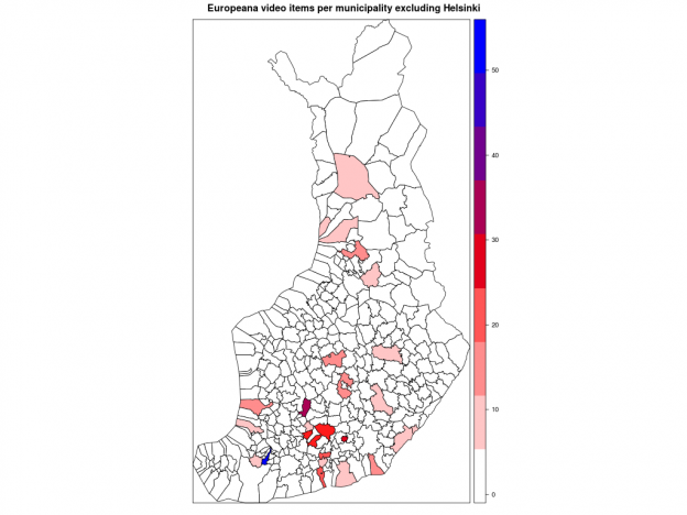
SPARQL-kyselykielen lisäksi olen jo jonkin aikaa opiskellut R-ohjelmointikieltä. Yksi viime vuosien R-tapauksia Suomessa on ollut avoimen datan työkalupakki soRvi. Päätin kokeilla, miten työskentely sillä sujuu. Tavoite pitää olla: Suomen kartta, jossa väri ilmaisee paljonko Europeanassa on kuntiin liittyviä videoita.

Sorvilla saa kätevästi Suomen kuntien nimet ja kuntarajat. Data tulee Maanmittauslaitokselta (MML). Entä Europeana? Miten nimet on siellä esitetty ja missä? Kahlasin portaalin avulla läpi joukon videoita, ja katsoin metatietoelementtejä sivun lähdekoodissa. Esimerkkivideossa Finlandia-katsaus 263 on useampikin pätkä Helsingistä. Helsinki-sana löytyy perusmuodossa kentistä dc:subject ja dc:description, englanninkielisestä käännöksestä. Muutamissa videoissa näkyi dc:spatial ja sen myötä Europeanan lisäämä GeoNameID. Lisäksi nimi voi esiintyä paitsi varsinaisessa otsikossa dc:title myös vaihtoehtoisessa otsikossa dcterms:alternative (en tiedä miksi).

Suomen kuntien nimissä on runsaasti äännevaihtelua ja taipumista. Syntymäkuntani Laitila ei taivu, mutta nykyinen kotikaupunkini Helsinki taipuu. Kun katsoo kuntaluetteloa, silmissä vilisee lahtia, järviä, lampia, koskia ja jokia. Välissä on kuivaakin maata kuten rantoja, saaria, mäkiä ja niemiä. Taipuvia kaikki.

Rajoitin haut nimen perusmuotoon sillä lisäyksellä, että jos säännöllinen lauseke löytää taipumattomien nimien päätteellisiä muotoja (Oulu, Oulun, Oulussa jne.), hyvä niin. Tällä periaatteella on ilmiselvä kääntöpuolensa. Lyhyet kuten Ii ja Salo tulevat tuottamaan vääriä hakutuloksia sekä Suomesta että muista maista. Ii saa omiensa lisäksi myös Iisalmen ja Iitin videopinnat, mikä on ehkä oikein ja kohtuullista kunnalle, jolla on vain kaksi kirjainta. Salo-kirjainyhdistelmää esiintyy paitsi suomessa myös ainakin tanskassa, ranskassa, katalaanissa ja italiassa.

Tein sen minkä voin ja rajasin haun vain niihin videoihin, joiden dc:language on fi. Tämä päätös tiputtaa kuitenkin tuloksesta pois ulkomaista alkuperää olevat videot jotka todella liittyvät Suomeen ja ne, joissa tätä Dublin Core -elementtiä ei ole annettu. Toisaalta suomenruotsalaisten kuntien hakutulos siistiytyy, sillä oletettavasti haaviin ei näin jää Ruotsin samannimisiä kuntia.

Kartalla

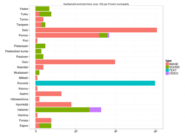
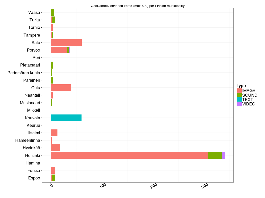
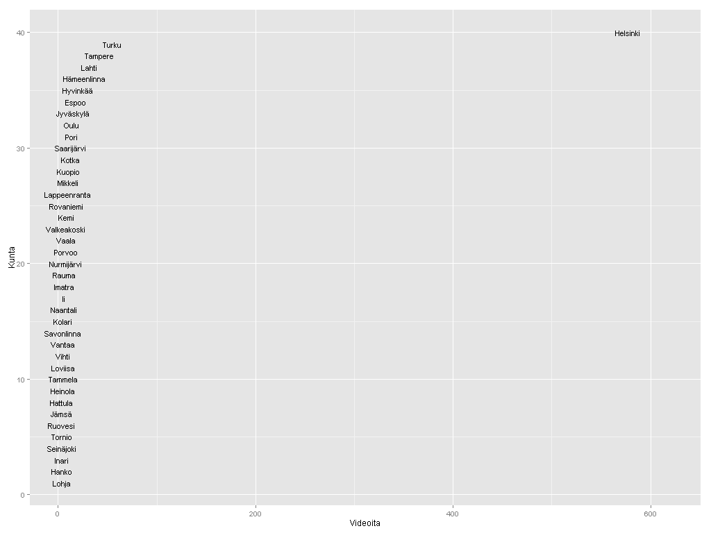
Kuntakartan plottaus absoluuttisilla luvuilla kävi helposti soRvi-blogin esimerkkien avulla. Jouduin tosin jättämään Helsingin kokonaan pois, jotta muut kunnat pääsivät esille. Data vaatisi oikeastaan logaritmisen asteikon; Helsinki poikkeaa niin paljon muista.

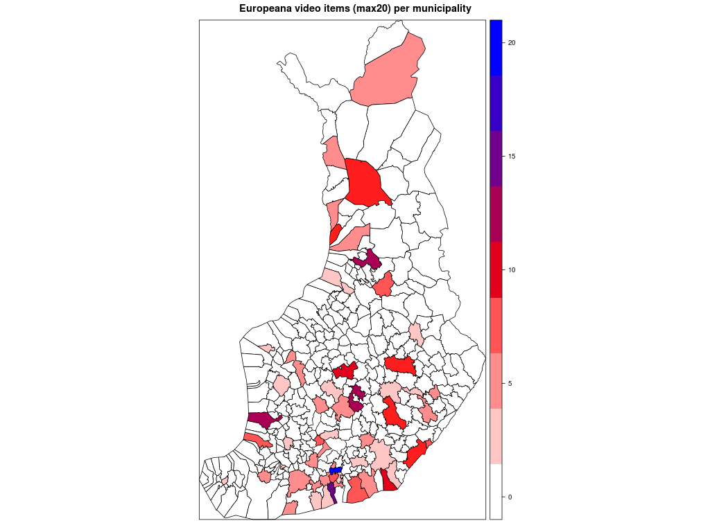
Ensimmäisessä kartassa kunnat ilman Helsinkiä, toisessa ne kunnat joihin liittyviä videoita löytyi enintään 20.

Alla matkin suoraan sitä, miten Datavaalit havainnollisti ahkerimpia sosiaalisen median käyttäjiä.

Kärkikolmikko ei yllätä: Helsinki, Turku ja Tampere. Ystävämme Ii yltää 25 ensimmäisen joukkoon. Pääkaupunkiseudun nykyisistä isoista kaupungeista Vantaalla näyttäisi olevan videoita vain muutama. Vantaasta tuli kuitenkin kunnan nimi vasta 1970-luvulla, ja uusimmat Europeanan videot ovat nähtävästi 1960-luvulta. Vantaa viittaakin näissä Vantaanjokeen. Hyvinkään lukua selittää mm. Kone Oyj ja Herlinin suku. Tunisian presidentti Bourgiba vieraili 1960-luvun alussa Herlineillä.

Suhteellista

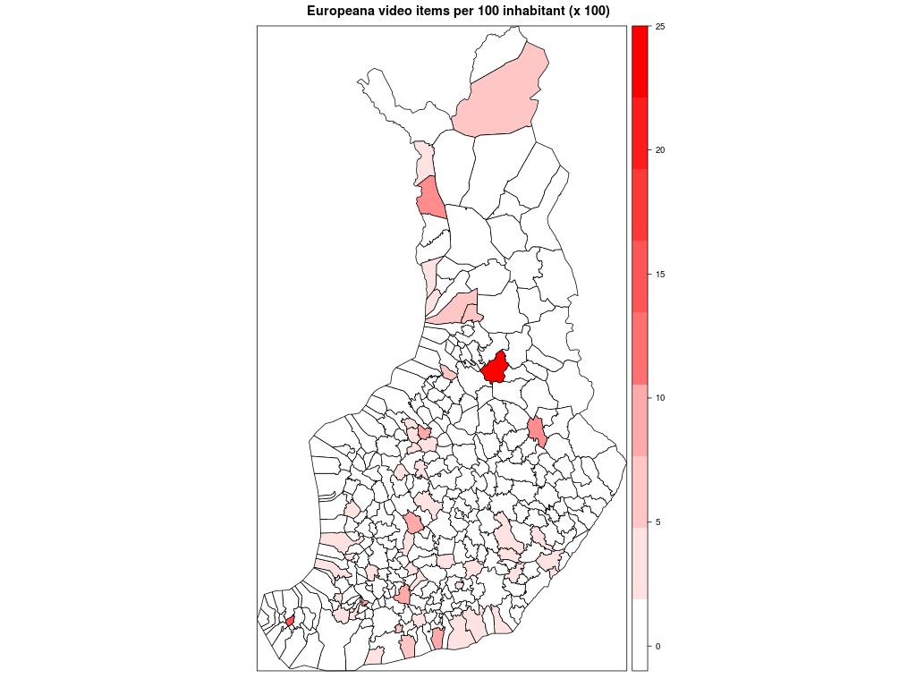
Seuraavaksi suhteutin videoiden määrän kunnan asukaslukuun. Sorvi tarjoaa valmiin funktion, joka hakee asukasluvut suoraan Tilastokeskuksesta. Vuoden 2013 alusta lukien kuntien määrä väheni vajaalla 20:lla kuntaliitosten myötä. Kunnat ja kuntarajat kuvaavat tässä kuitenkin mennyttä aikaa, vuotta 2012. Lisäsin entisille kunnille asukasmäärän käsin, mutta niiden kuntien lukuun en koskenut, joihin nämä kunnat yhdistettiin.

Nyt erottuvat suuruusjärjestyksessä Vaala, Sund, Kolari, Rautavaara ja Helsinki. Moni on kuitenkin väärä positiivinen. Kai Sundström -nimistä henkilöä videoitiin kahteen otteeseen 1940-luvulla. Näin ollen algoritmini antoi kaksi videopistettä pienelle ahvenanmaalaiselle Sundin kunnalle. Kolarin asema johtuu vain ja ainoastaan otsikoista Kolari Helsingissä. Tapio Rautavaara taas oli 50-luvulla julkisuuden henkilö monella alalla, itse Rautavaaran kunnasta ei videoita löydy. Mutta entä Vaala? Tämä reilun 3000 asukkaan kunta Kainuussa on vanhaa asutusaluetta, mutta sen lisäksi myös sukunimikaima elokuvaohjaaja Valentin Vaalalle.

Sivumennen sanoen opin Wikipediasta, että sana vaala liittyy sekin veteen. Englanninkielinen Wikipedia-artikkeli mainitsee, että se on the phase in a river just before rapids.

Helsinki on siis väkilukuunkin suhteutettuna videoykkönen. Seuraavana tulevat oikeat videokunnat Karjalohja ja Vihanti. Suomi-Filmi videouutisoi näistä kunnista politiikan ja talouden näkökulmasta. Pääministeri Edwin Linkomiehen kesäpaikka oli Karjalohjalla, ja Vihantiin rakennettiin 1950-luvun alussa valtion toimesta rautatie. Outokumpu Oyj perusti Vihantiin sinkkirikastekaivoksen. Kaivos toimi vuosina 1954-1992, tietää Wikipedia ja jatkaa:

Kaivoksen tuotantorakennukset purettiin pari vuotta myöhemmin ja kaivostorni räjäytettiin. Myös kaivokselta Vihannin asemalle vienyt junarata on purettu Vihannin päässä olevaa 1,5 kilometrin pituista vetoraidepätkää lukuunottamatta. Kaivoksen toimistorakennukset säilytettiin. Osa kaivosalueesta on aidattu sortumavaaran vuoksi.

Vihannin kuntaa ei enää ole. Se liitettiin vuoden 2013 alusta Raaheen.

Paikan haku

GeoNames-tietokanta vaikuttaa lupaavalta. Ajattelin jo nyt hyödyntää geonames R-kirjastoa kuntien GeoNameID:n selvittämiseen, mutta en päässyt alkua pidemmälle. Palvelu kyllä vastaa ja palauttaa dataa. Liikaakin, aloittelijalle. Kysely on ilmeisesti rakennettava hyvinkin yksityiskohtaisesti kohdistumaan vain tietyntyyppisiin taajamiin.

Yritin myös ujuttaa SPARQL-kyselyyn soRvin tarjoamia MML:n kuntakoordinaatteja. Europeanan SPARQL-editorissa on valmis esimerkki Time enrichment statements produced by Europeana for provided objects. Se antaa kuitenkin ymmärtää, että metatieto-rikastukset mm. ajalle ja paikalle olisivat toistaiseksi haettavissa vain yleisellä merkkijonohaulla, joten luovutin.

Tuore Europeana Business Plan 2013 kertoo tammikuun tilanteen paikkatiedoista. Ne löytyvät 27.5 prosentissa kaikesta aineistosta.

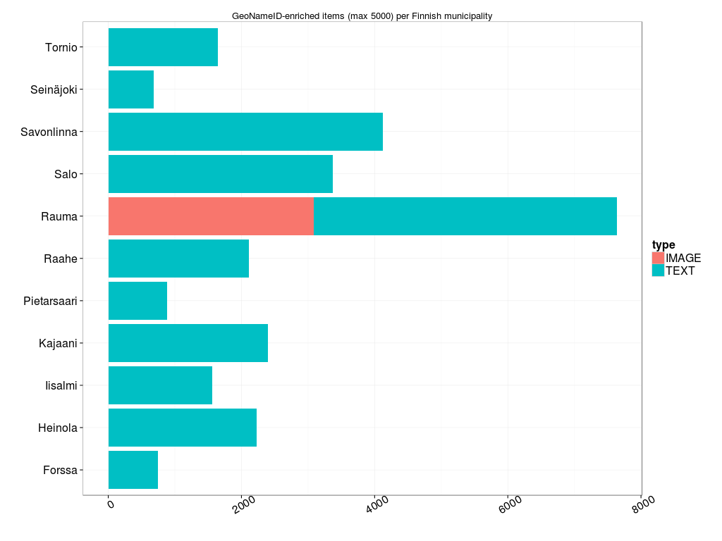
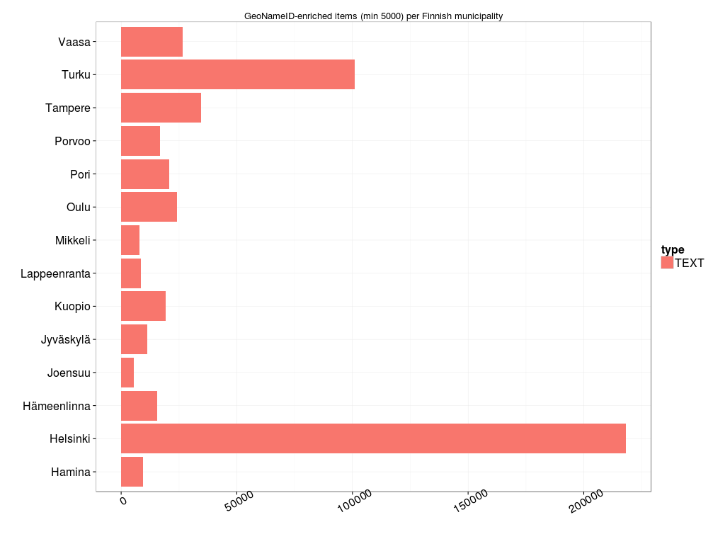
Paljonko Europeanassa sitten on Suomen GeoNameID:llä <http://sws.geonames.org/660013/> varustettuja RDF-kolmikkoja resurssityypeittäin (image, sound, text, video) ja lähteittäin? Kopioi tästä kysely, liimaa SPARQL-editoriin ja lähetä.

Dataa ja videonauhaa

Linkitetty avoin data on Europeana-pilotti. Datanarkkarille se tarjoaa mahdollisuuden ynnäillä vaikka tilastoja, mutta ne ovat vain sivutuote. Datan päätarkoitus on kypsyttää ideoita verkkopalveluiksi. Liikkuvalla kuvalla ja äänellä on kysyntää. Niitä aiotaankin saada lisää, linjaa Business Plan:

Actively pursue both large and small institutions to contribute AV material through national aggregators or audiovisual projects. AV material currently makes up less than 3% of the database, while research shows that this material gets most attention from end-users. (s. 9)

R-koodi.

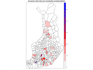
EDIT 16.3.: Missä mahtoivat silmäni olla, kun katsoin asukaslukuun suhteutettua tilastoa? En osaa selittää. Oli miten oli, Helsinki ei suinkaan ole videoykkönen vaan Saarijärvi! Lisäksi Vihannin ja Karjalohjan ohittavat Aura, Ruovesi, Halsua ja Tammela. Aura on tosin siinä ja siinä, koska toinen kahdesta videosta liittyy Teuvo Auraan.

Europeana and Saxon-CE

Time to celebrate! Today is the International Open Data Day, and yesterday Michael Kay tweeted about the open source version of Saxon-CE (XSLT 2.0 in the browser).

Thanks to Bob DuCharme’s recent blog post, I managed to query the Europeana SPARQL endpoint on a selection of audio files from Finland. The collection belongs to Svenska Litteratursällskapet i Finland, and it contains interviews of Finland-Swedish people at different ages. The query result is downloaded as XML. With this page you can test how Saxon-CE renders the file in your browser. Have a look at the source code. The XSL file is only slightly modified from the Saxon-CE Book List sample application, and CSS is untouched.