Discussion on diabetes

A tweet by Peter Grabitz got my attention the other day.

Tweet

This is worth of a brief investigation. It’s seldom you start an altmetrics project from a topic.

One obvious choice for getting article ID’s is either Web of Science or Scopus, but to go down that path you obviously need to have access to them to start with. Another solution is to query the PubMed API for a list of PMID’s.

Thanks to the helpful posting Hacking on the Pubmed API by Fred Trotter, you are led to the PubMed Advanced Search page. There, you can define your search with a MeSH topic, and filter articles by the publication year.

PubMed advanced search

PubMed knows of 4890 articles on diabetes mellitus, published this year.

As Fred explains, by URLencoding this Search details string and joining it to the base URL, you are ready to approach the API.

If you are familiar with R, here is one solution. From 4890 articles, Altmetric had metrics on 505, based on PMID. Note that there are probably also mentions that use the DOI.

The Altmetric result dataset is on Figshare.

About 43000 results

Since few days now, I’ve had my Google search archive with me. In my case, it’s a collection of 38 JSON files, containing search strings and timestamps. The oldest file dates back to mid-2006, which acts as a digital marriage certificate of us, me and the Internet giant.

JSON files of Google search archive

It took no more than 15 minutes for Google to fulfill my wish to get the archive as a zipped file. For more information on How & Where, see e.g. Google now lets you export your search history.

Now, this whole archive business started when I was led to a very nice blog posting by Lisa Charlotte Rost
.

Tweet about Lisa Charlotte Rost

I find it fascinating, what you can tell about a person just by looking at her searches. Or rather, what kind of narratives s/he builds upon them; to publish all search strings verbatim is not really an option.

Halfway in the 4-week course Intermediate D3 for Data Visualization, the theme is stacked charts. Maybe I could visualize, on a timeline, as a stacked area chart, some aspects of my search activity. But what aspects? What sort of person am I as a searcher?

Quite dull, I have to admit. No major or controversial hobbies, no burning desire to follow latest gadgets, only mildly hypocondriac, not much interest at all in self-help advisory. Wikipedia is probably my number one landing site. Very often I use Google simply as a text corpus, an evidence-based dictionary:”Has this English word/idiom been used in the UK or did I just made it up, or misspelled?” Unlike Lisa, who tells in episode #61 of the Data Stories podcast that now when she lives in a big city, Berlin, she often searches for directions – I do not. Well, compared to Berlin, Helsinki do is small, but we also have a superb web service for guiding us around here, Journey Planner. So instead of a search, I’ll go straight there.

One area of digital life I’ve been increasingly interested in – and what this blog and my job blog reflect, too, I hope – is coding. Note, “coding” not as in building software but as in scripting, mashupping, visualizing. Small-scale, proof-of-concept data wrangling. Learning by doing. Part of it is of course related to my day job at Aalto University. For example, now when we are setting up a CRIS system, I’ve been transforming, with XSLT, legacy publication metadata to XML. It needs to validate against the Elsevier Pure XML Schema before it can be imported.

A few years now, appart XSLT, the other languages I have been writing with, are R and Perl. Unix command line tools I use on a daily basis. Thanks to the D3 course, I’m also slowly starting to get familiar with JavaScript. Python has been on my list a longer time, but since the introductory course I took at CSC – IT Center for Science some time ago, I haven’t really touched it.

I’m not the only one that googles while coding. Mostly it’s about a specific problem: I need to accomplish something but cannot remember or don’t know, how. When you are not a full-time coder, you forget details easily. Or, you get an error message you cannot understand. Whatever.

Are my coding habits visible in the search history? If yes, in what way.

First thing to do with the JSON files, was to merge them into one. For this, I turned to R.

library(jsonlite)
 
filenames <- list.files("Searches", pattern="*.json", full.names=TRUE)
jsons.as.list <- lapply(filenames, function(f) fromJSON(txt = f))
alljson <- toJSON(jsons.as.list)
write(alljson, file = "g.json")

Then, just as Lisa did, I fired up Google Refine, and opened a new project on g.json.

To do:

  • add Boolean value columns for JavaScript, XSLT (including XPath), Python, Perl and R by filtering the query column with the respective search string
  • convert Unix timestamps to Date/Time (Epoch time to Date/Time as String). For now, I’m only interested in date, not time of day
  • export all Boolean columns and Date to CSV

Google Refine new column

From the language names, R is the most tricky one to filter because it is just one character. Therefore, I need to build a longish Boolean or sentence for that.

Google Refine text facet

Here I’m ready with R and Date, and checking the results with a text facet on the column r.

Thanks to a clearly commented template by the D3 course leader, Scott Murray, the stacked area chart was easy to do, but only after I had figured out how to process and aggregate yearly counts by language. Guess what – I googled for a hint, and got it. The trick was, while looping over all rows by language, to define an object to store counts by year. Then, for every key (=year), I could push values to the dataset array.

Do the colors of the chart ring a bell? I’m a Wes Anderson fan, and have waited for an excuse to make use of some of the color palette implementations of his films. This 5-color selection represents The Life Aquatic With Steve Zissou. The blues and browns are perhaps a little too close to each other, especially when used as inline font color, but anyway.

Quite an R mountain there to climb, eh? It all started during the ELAG 2012 conference in Palma, Spain. Back then I was still working at the Aalto University Library. I had read a little about R before, but it was the pre-conference track An Introduction to R led by Harrison Dekker, that finally convinced me that I needed to learn this. I guess it was the easiness of installing packages (always a nightmare with Perl), reading in data, and quick plotting.

So what does the big amount of R searches tell? For one thing, it shows my active use of the language. At the same time though, it tells that I’ve needed a lot of help. A lot. I still do.

2015 on 1917

Kulosaari (Brändö in Swedish), an 1,8 square km island in Helsinki, detached itself from the Helsinki parish in early 1920’s, and became an independent municipality. The history of Kulosaari is an interesting chapter of Finnish National Romantic architecture and semi-urban development. It all began in 1907 when the company AB Brändö Villastad (Wikipage in Finnish) was established – but that’s another story. In 1949, the island was annexed again by Helsinki. Today, Kulosaari is cut in half by one of the busiest highways in Finland. The idealistic, tranquil village community is long gone. Since late 1997, Kulosaari has been my home suburb.

One of the open datasets provided by Helsinki Region Infoshare, is a scanned map of Kulosaari from 1917. Or rather, a scheme which became reality only in a limited extent. As long as I’ve known a little about what georeferencing is all about – thanks to the excellent Coursera MOOC Maps and the Geospatial Revolution by Dr. Anthony C. Robinson – I’ve had in mind to work with that map some day. That day dawned when I happened to read the blog posting Using custom tiles in an RStudio Leaflet map by Kyle Walker.

Unlike Kyle, I haven’t got any historical data to render upon the 1917 map but instead, there are a number of present day datasets available, courtesy of the City of Helsinki, e.g. roadmap and 3D models of buildings. How does the highway look like on top of the map? What about buildings and their whereabouts today? Note that I don’t aim particularly high here, or to more than two dimensions anyway; my intention is just to get an idea of how the face of the island has changed.

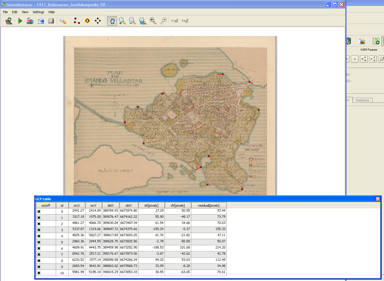
Georeferencing with QGIS is fun. I’m sure there are many good introductions out there in various languages. For Finnish speakers, I can recommend this one (PDF) by Latuviitta, a GIS treasure chamber.

georeferencing

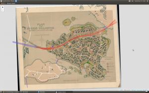
The devil is in the detail, and I know I could’ve done more with the control points, but that’s a start. When QGIS was done with number-crunching, the result looked like this when I adjusted transparence for an easier quality check.

qgistransparence

Not bad. Maybe hanging a tad high, but will do.

Next, I basically just followed Kyle’s footsteps and made tiles with the OSGeo4W shell. I even used the same five zoom layers than he. Then I uploaded the whole directory structure with PNG files (~300 MB) to my web domain where this blog resides, too.

Roadmap data is available both in ESRI Shapefile and Google KML. I downloaded the zipped Shapefile, unzipped it, and imported as new vector layer to QGIS. After some googling I found help on how to select an area – Kulosaari main island in my case – by rectangle, how to merge selected features, and how to save the selection as a new Shapefile.

Then, to RStudio and some R code.

In Kulosaari, there are 23 different kind of roads. Even steps (porras) and boat docks (venelaituri) are categorized as part of the city roadmap.

> unique(streets$Vaylatyypp)

 [1] "Asuntokatu"                             "Paikallinen kokoojakatu"                    
 [3] "Huoltoajo sallittu"                     "Moottoriväyläramppi"                        
 [5] "Alueellinen kokoojakatu"                "Silta tai ylikulku (katuverkolla)"          
 [7] "Moottoriväylä"                          "Pääkatu"                                    
 [9] "Silta tai ylikulku (jalkakäytävä, pyörä "Alikulku (jalkakäytävä, pyörätie)"          
[11] "Jalkakäytävä"                           "Porras"                                     
[13] "Yhdistetty jalkakäytävä ja pyörätie"    "Puistotie (hiekka)"                         
[15] "Ulkoilureitti"                          "Puistokäytävä (hiekka)"                     
[17] "Puistokäytävä (päällystetty)"           "Venelaituri"                                
[19] "Polku"                                  "Suojatie"                                   
[21] "Väylälinkki"                            "Pyöräkaista"                                
[23] "Pyörätie"                                  

From these, I extracted motorways, bridges, paths, steps, parkways, streets allowed for service drive, and underpasses.

Working with the 3D data wasn’t quite as easy (no surprise). By far the biggest challenge turned to be computing resources.

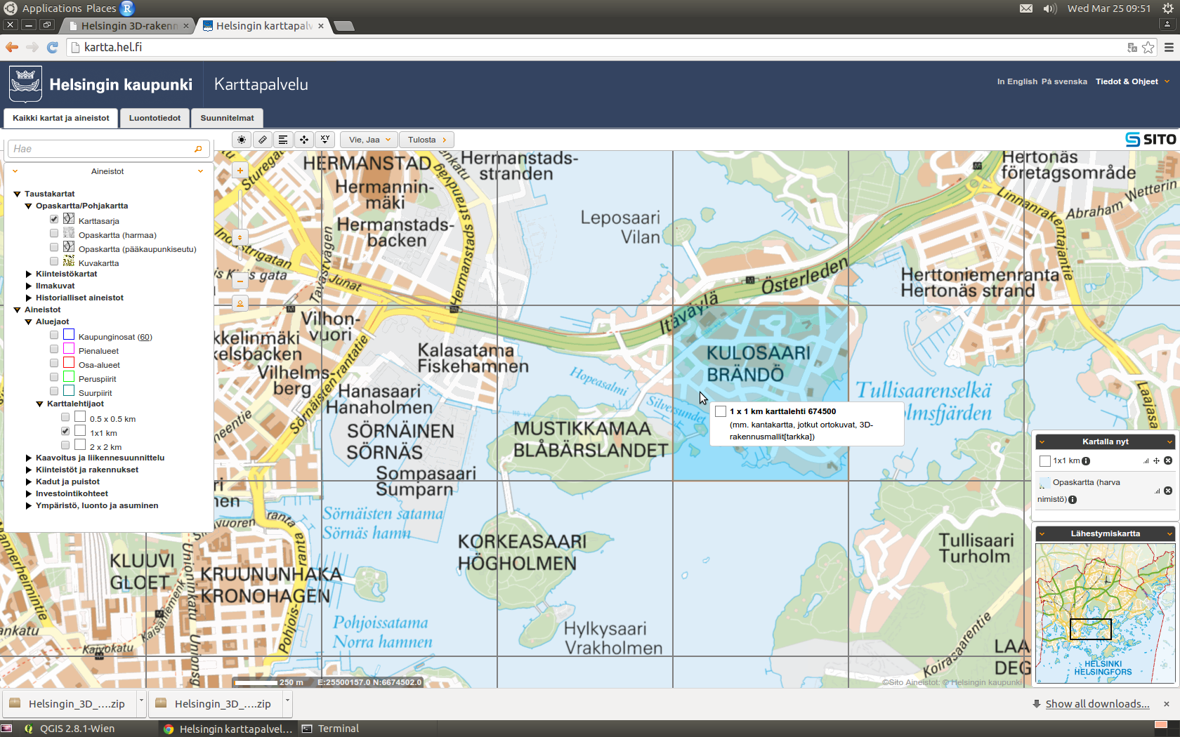
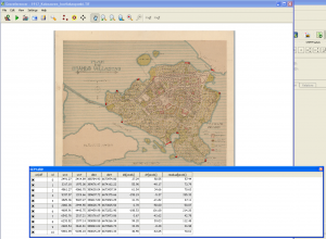
I decided to work with KMZ (zipped KML) files. The documentation explained that the data is divided into 1 x 1 km grids, and that the numbering of the grids follows the one used by Helsingin karttapalvelu (map service). The screenshot below shows one of the four grids I was mainly interested in: 675499 (NW), 674499 (SW), 675500 (NE) and 674500 (SE). These would leave out outer tips of the island in the East, and bring in a chunk of the Kivinokka recreation area in the North.

kartta.hel.fi

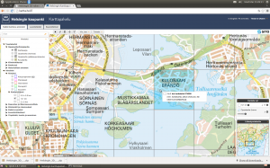
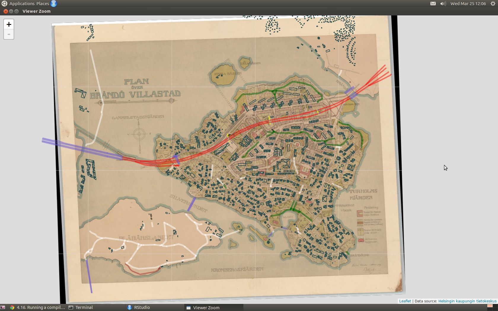
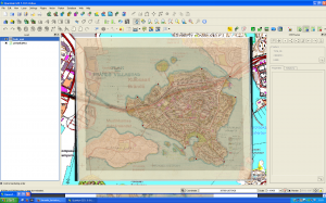
First I had in mind to continue using Shapefiles: imported one KML file to QGIS, saved as Shapefile, and added it as a polygon to the leaflet map. It worked, but I noticed that RStudio started to slow down immediately, and that the map in the Viewer became seemingly harder to manipulate. How about GeoJSON instead? Well, the file size do was reduced but still too much data. Still, I succeeded in getting all on the map, of which this screenshot acts as the evidence:

roadmap and 3D buildings

However, where I failed was to get the map transformed to a web page from the RStudio GUI. The problem: default Pandoc memory options.

Stack space overflow: current size 16777216 bytes.
Use `+RTS -Ksize -RTS' to increase it.
Error: pandoc document conversion failed with error 2

People seem to get over this situation by adding an appropiate command to the YAML metadata block of the RMarkdown file, but I’m not dealing with RMarkdown here. Couldn’t get the option work from the .Rprofile file either.

Anyway, here is the map without the buildings, so far: there is the motorway/highway (red), few bridges (blue), sandy parkways (green) here and there, a couple of underpasses (yellow), streets for service drive only (white) – and one path (brown) on the Southern coast of the neighbour island Mustikkamaa, as unbuilt as in 1917.

Note that interactivity in the map is limited to zooming and panning. No popups, for example.

I’ve heard many stories of the time when the highway was built. One detail mentioned by a neighbour is also visible on the map: it reduced the size of the big Storaängen outdoor sports area on the Southern side of the highway. The sports area is accessible from the Hertonäs Boulevarden – now Kulosaaren puistotie – by an underpass.

EDIT 26.3.2015: Thanks to the helpful comment by Yihui Xie, I realized that there is in fact several options to do a standalone HTML file from the RStudio GUI. With File > Compile Notebook... the result was combiled without problems, and now all buildings are rendered in the leaflet too. The file is a whopping 7 MB and therefore slow in its turns, but at least all data are now there. As a bonus, the R code is included as well! RStudios capabilities don’t stop to amaze me.

Birds on a map

Lintuatlas aka Finnish Breeding Bird Atlas is the flagship of longitudinal observations on avian fauna in Finland. And it’s not just one atlas but many. The first covers years 1974-79, second 1986-89, and third 2006–2010. Since February this year, the data from the first ones are open. Big news, and asks for an experiment on how to make use of the data.

One of the main ideas behind the Atlases is to give a tool for comparison, to visualize possible shifts in the population. I decided to do a simple old-school web app, a snapshot from a given species: select, and see observations plotted on a map.

The hardest part in the data were the coordinates. How to transform the KKJ Uniform Coordinate System values to something that a layman like me finds more familiar, like ETRS89? After a few hours of head-banging, I had to turn to the data provider. Thanks to advice from Mikko Heikkinen, the wizard behind many a nature-related web application in this country – including the Atlas pages – the batch transformation was easy. Excellent service!.

advice on Lintuatlas coordinates

All that was left was few joins between the datasets, and data was ready for an interactive R Shiny application. To reflect the reliability of observations on one particular area (scale from 1 to 4), I used four data classes from the PuBu ColorBrewer scheme to color the circles.

The application is here, and the code for those of you more inclined to R.

Note that the application is on a freemium Basic account of shinyapps.io so I cannot guarantee its availability. There is a monthly 25 500 hour use limit.

Snow in Lapland

Finnish Meteorological Institute (FMI) Open Data API has been with us for over a year already. Like any other specialist data source, it takes some time before a lay person like me is able to get a grasp on it. Now, thanks to the fmi R package by the collaborative effort of Jussi Jousimo and other active contributors, the road ahead is much easier. A significant leap forward came just before New Year, when Joona Lehtomäki submitted a posting on fmi and FMI observation stations to the rOpengov blog.

Unlike many other Finns, I am relatively novice when it comes to Finnish Lapland. I’ve never been there during summertime, for example, and never farther North than the village of Inari. Yet, I count cross-country skiing in Lapland among the best memories of my adulthood years so far; pure fun in the scorchio April sun, but maybe even more memorable under the slowly shifting colors of the polar night.

Snow is of course a central element in skiing. Although warmer temperatures seem to be catching us up here, there has still been plenty of snow in Lapland during the core winter months. But how much, exactly, and when did it rain, when melt?

I followed Joona’s steps, and queried the FMI API of snow depth observations at three weather stations in Lapland, from the beginning of 2012 to the end of 2014: Kilpisjärvi, Saariselkä and Salla. Note that you have to repeat the query year-wise because the API doesn’t want to return all the years in one go.

Being lazy, I used the get_weather_data utility function by Joona as is, meaning I got more data than I needed. Here I filter it down to time and snow measurements, and also change the column name from ‘measurement’ to ‘snow’

snow.Salla.2014 <- salla.2014 %>%
  filter(variable == "snow") %>%
  mutate(snow = measurement) %>%
  select(time, snow)

and then combine all data rows of one station:

snow.Salla <- rbind(snow.Salla.2012, snow.Salla.2013, snow.Salla.2014)

One of the many interesting new R package suites out there is htmlwidgets. For my experiment of representing time-series and weather stations on a map, dygraphs and leaflet looked particularly useful.

Last time I was in Lapland was in mid-December 2014, in Inari, Saariselkä. BTW, over 40 cm of snow! During some trips I left Endomondo on to gather data about tracks, speed etc. I have to point out that I'm not into fitness gadgets as such, but it's nice to experiment with them. Endomondo is a popular app in its genre. Among other things it lets you export data in a standard GPX format, which is a friendly gesture.

For the sake of testing how to add GeoJSON to a leaflet map, I needed to convert the GPX files to GeoJSON. This turned out to be easy with the ogr2ogr command line tool that comes with the GDAL library, used by the fmi R package too. Here I convert the skiing ("hiihto") route of Dec 14th:

ogr2ogr -f "GeoJSON" hiihto1214.geojson hiihto1214.gpx tracks

One of the many aspects I like about dygraphs is how it lets you zoom into the graph. You can try it yourself in my shiny web application titled (a bit too grandiously I'm afraid) Snow Depth 2012-2014. Double-clicking resets. To demonstrate what one can do with the various options that the R shiny package provides, and how you can bind a value to a dygraphs event - pick a day from the calendar, and notice how it is drawn as a vertical line onto the graph.

The tiny, blue spot on the map denotes my skiing routes in Saariselkä. You have to zoom all the way in to see them properly.

The shiny application R code is here.

Edit 11.1: Winter and snow do not follow calendar years, so added data from the first leg of the 2012 winter period.

Network once again, now with YQL!

While fiddling with the Facebook network, GEXF and JSON parsing I remembered Yahoo! and its YQL Web Services. With it, you can get a JSON-formatted result from any, say, XML file out there. GEXF is XML.

The YQL query language isn’t that handy if you are interested only in a selection of nodes; the XPath filter is only for HTML files, curiosly enough. I wanted the whole story though, so no problem. Here is how the YQL Console shows the result:

YQL Console

With the REST query down below, you can e.g. transfer the JSON result to your local machine, in Unix like curl 'http://query.yahooapis.com/v1/public/yql?q=select%20*%20from%20xml%20where%20url%3D%22http%3A%2F%2Fusers.tkk.fi%2Fsonkkila%2Fnetwork%2Ffbmini.gexf%22&format=json&callback=' > gexf.json

The structure is more deep than in the JSON that the Cytoscape D3.js Exporter returns, but the only bigger change the D3 code needs is to have new references from the links/edges to nodes.

Like the documentation of force.start() says,

On start, the layout initializes various attributes on the associated nodes. The index of each node is computed by iterating over the array, starting at zero.

This is fine, if the source and target attributes in the edge array apply to this. Here, they do not. Instead, the attributes reference the id attribute in the respective nodes. So I needed to change that, and excellent help was available.

So far so good, but using index numbers to access attribute values isn’t pretty and needs to be done differently. Maybe next time.

Deconstructing Facebook network

The other day I noticed this tweet about Cytoscape’s D3.js Exporter.

Because I am currently learning the basics of D3, this sounded interesting to look at more closely.

Cytoscape is a tool for visualizing networks. While Gephi is well known in this area, Cytoscape is not, at least not for me. The first time I heard of it was while watching Data Literacy and Data Visualization, a great collection of videos I mentioned last time.

A year ago, I wrote in a brief post, how I put Facebook friends on a network graph – a common visualization those days. How would the same data look like in SVG?

I didn’t want to repeat the whole process, but to continue from the GEXF file. Cytoscape does not support this markup language by Gephi in import. However, another XML-based language, GraphML, is on the list. So, I read the GEXF file back in Gephi, exported in GraphML, and imported that one in Cytoscape.

By default, Cytoscape presents the network as a grid. Following the advice from Ohio, I applied the preferred layout (F5). After installing the D3.js Exporter in App Manager, the data was ready for a JSON export.

Cytoscape export

Mike Bostock, a central figure behind D3, has an extensive collection of examples in his gallery. One of them is on force-directed graphs, and that was exactly what I was after. All I did to get the first version of my D3.js Facebook network, was that I changed the file name in the d3.json() function that imports the data. That was easy!

In this graph, the node labels are numbers and all nodes of the same color and size. Time to change these to something more visually interesting, and perhaps more informative.

Gephi’s community detection algorithm had provided numbers for the nodes, and stored them in the Modularity_Class attribute. This is an obvious choice for the script when it’s time to decide, in which colour the circles ought to be filled. The name of the node should not be the name in my case, but the tiny version of the full name in label. What about the size of the nodes? Of all attributes available, I decided to try Betweenness_Centrality. Note that you will not find this and a couple of other attributes in the original GEXF; I added them this time by letting Gephi calculate the respective values.

{
  "nodes" : [ {
    "id" : "10162",
    "SUID" : 10162,
    "In_Degree" : 16,
    "PageRank" : 0.010341513363002573,
    "Weighted_In_Degree" : 16.0,
    "Weighted_Degree" : 32.0,
    "selected" : false,
    "name" : "100003621746564",
    "Clustering_Coefficient" : 0.44166666,
    "shared_name" : "100003621746564",
    "Betweenness_Centrality" : 1434.8632653485495,
    "Eigenvector_Centrality" : 0.18212450755372586,
    "etusuku" : "J K",
    "g" : 184,
    "b" : 47,
    "Out_Degree" : 16,
    "label" : "JK",
    "size" : 52.0,
    "Modularity_Class" : 4,
    "r" : 47,
    "Weighted_Out_Degree" : 16.0,
    "Degree" : 32,
    "Eccentricity" : 7.0,
    "y" : 111.5109,
    "Closeness_Centrality" : 2.925,
    "x" : 412.6945
  }

The new version shows now the modularity classes in different colors, and the label pops up as a tooltip when you hover of the circle.

The proportional size of the node tells, which of my friends act as “bridges” more than the others do. The normalization is done with a power scale function d3.scale.sqrt(), thanks to Mike’s advice a while back. Contrary to his words though, I put the lower bounds to 2 and also tweaked the data. In some nodes, the value of this attribute is 0.0, and these nodes vanish altogether. Not the best way to deal with the issue I gather. Perhaps I should have left these nodes out of the exercise altogether?

Thoughts on a bubble chart

Some time ago, I got a hint via Twitter of an online course made at Ohio State University, Data Literacy and Data Visualization, by professor Bear Braumoeller. Halfway through the videos, I can say that the course has been a pleasure, most of the time. One area where Braumoeller shines, is when he explains why he thinks some particular visualization is bad and why, and how it could be made better. I heard his words in my ears when I saw the colourful bubble chart on page 6 in the current Aalto University Magazine.

Now, frankly, I think the Magazine is a great piece of university journalism in Finland. Cool topics, well written, fresh layout. There are few magazines I read from start to finish, and this is one of them.

But the chart, it baffles me.

The chart tries to draw a picture of the University by the year 2016, compared to the present. Bubbles represent a selection of different degree programmes. The legend on the vertical axis tells us that above the horizontal axis, we have programmes that will most probably become bigger, i.e. get proportionally more resources and students than what they do now. Below, less resources, less students.

The horizontal axis is without a legend. Is it a timeline? The first bubble along the axis is Materials Science aka Materiaalitekniikka in Finnish, hanging low on the negative side. Will Materials Science be the first one to see its share diminished? The axes have a color scheme, from yellow via orange to (a rather surprising) black. When I first looked at the horizontal axis, I thought that by every color we pass one year. But that cannot be true because 2016 is only two years ahead. So, I suppose here colors are just, well, colors.

All bubbles are divided in two segments, some of equal size, some not. There is no clue what they mean, and what the coloring stands for, if anything. The biggest bubble at the end of the horizontal axis has a slightly longer label. From it we can see that here we have in fact two programmes, Electrical Engineering & Automation and Computer Science & Engineering. Okay, so does every other bubble comprise of two programmes as well? We don’t know.

By looking more closely at the chart, I came to the conclusion that the size of the bubble reflects the magnitude of change that the individual programmes will face – the percentages given tell the same story. But wait, what is the function of the vertical axis then? The two bubbles below the horizontal axis are levelled, giving the impression that their status will be affected by the same amount. Yet their size differs a lot. Apparently, the vertical axis is not really an axis at all, but a dividing line on a more abstract level.

Citing professor Braumoeller, I have to say that the chart does not make a coherent whole. What could we do to improve it?

Below is a deadly plain and simple plotchart,  done with few lines of R. It is a total bore to look at, but gives a quick overview of the ups and downs.

Dotchart on proposed volume change in some degree programmes at Aalto University from 2014 to 2016

Disclaimers: Aalto University is my employer. All possible misunderstandings about the data are of course mine.

Embedding

Now when the mighty Getty Images stock photo agency allows you to embed their material in blogs like this one, I had to try. There. I found that one by browsing the search result set on authoring.

Back in the 90’s, I wrote a conference paper that carried the title From generic to descriptive markup: implications for the academic author. At that time, SGML was all the rage. I wonder if the paper has gathered any altmetrics according to Altmetric? Let’s see. The badge should pop up on the right, thanks to the WordPress plugin.

[altmetric doi="10.1109/SEDEP.1998.730715" float="right" popover="left"]

Nope. No wonder.

Anyway, to take another example, Community detection in graphs by Santo Fortunato is a proper scientific article, and a much discussed at that, as you see.

[altmetric doi="10.1016/j.physrep.2009.11.002" float="right" popover="left"]