Tag Archives: R

2015 on 1917

Kulosaari (Brändö in Swedish), an 1,8 square km island in Helsinki, detached itself from the Helsinki parish in early 1920’s, and became an independent municipality. The history of Kulosaari is an interesting chapter of Finnish National Romantic architecture and semi-urban development. It all began in 1907 when the company AB Brändö Villastad (Wikipage in Finnish) was established – but that’s another story. In 1949, the island was annexed again by Helsinki. Today, Kulosaari is cut in half by one of the busiest highways in Finland. The idealistic, tranquil village community is long gone. Since late 1997, Kulosaari has been my home suburb.

One of the open datasets provided by Helsinki Region Infoshare, is a scanned map of Kulosaari from 1917. Or rather, a scheme which became reality only in a limited extent. As long as I’ve known a little about what georeferencing is all about – thanks to the excellent Coursera MOOC Maps and the Geospatial Revolution by Dr. Anthony C. Robinson – I’ve had in mind to work with that map some day. That day dawned when I happened to read the blog posting Using custom tiles in an RStudio Leaflet map by Kyle Walker.

Unlike Kyle, I haven’t got any historical data to render upon the 1917 map but instead, there are a number of present day datasets available, courtesy of the City of Helsinki, e.g. roadmap and 3D models of buildings. How does the highway look like on top of the map? What about buildings and their whereabouts today? Note that I don’t aim particularly high here, or to more than two dimensions anyway; my intention is just to get an idea of how the face of the island has changed.

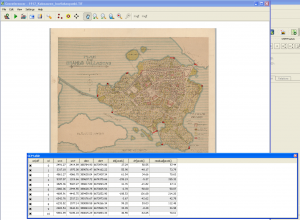
Georeferencing with QGIS is fun. I’m sure there are many good introductions out there in various languages. For Finnish speakers, I can recommend this one (PDF) by Latuviitta, a GIS treasure chamber.

georeferencing

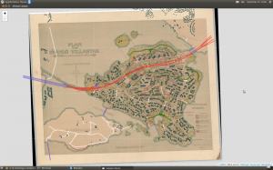
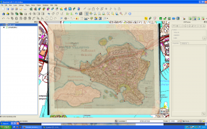
The devil is in the detail, and I know I could’ve done more with the control points, but that’s a start. When QGIS was done with number-crunching, the result looked like this when I adjusted transparence for an easier quality check.

qgistransparence

Not bad. Maybe hanging a tad high, but will do.

Next, I basically just followed Kyle’s footsteps and made tiles with the OSGeo4W shell. I even used the same five zoom layers than he. Then I uploaded the whole directory structure with PNG files (~300 MB) to my web domain where this blog resides, too.

Roadmap data is available both in ESRI Shapefile and Google KML. I downloaded the zipped Shapefile, unzipped it, and imported as new vector layer to QGIS. After some googling I found help on how to select an area – Kulosaari main island in my case – by rectangle, how to merge selected features, and how to save the selection as a new Shapefile.

Then, to RStudio and some R code.

In Kulosaari, there are 23 different kind of roads. Even steps (porras) and boat docks (venelaituri) are categorized as part of the city roadmap.

> unique(streets$Vaylatyypp)

 [1] "Asuntokatu"                             "Paikallinen kokoojakatu"                    
 [3] "Huoltoajo sallittu"                     "Moottoriväyläramppi"                        
 [5] "Alueellinen kokoojakatu"                "Silta tai ylikulku (katuverkolla)"          
 [7] "Moottoriväylä"                          "Pääkatu"                                    
 [9] "Silta tai ylikulku (jalkakäytävä, pyörä "Alikulku (jalkakäytävä, pyörätie)"          
[11] "Jalkakäytävä"                           "Porras"                                     
[13] "Yhdistetty jalkakäytävä ja pyörätie"    "Puistotie (hiekka)"                         
[15] "Ulkoilureitti"                          "Puistokäytävä (hiekka)"                     
[17] "Puistokäytävä (päällystetty)"           "Venelaituri"                                
[19] "Polku"                                  "Suojatie"                                   
[21] "Väylälinkki"                            "Pyöräkaista"                                
[23] "Pyörätie"                                  

From these, I extracted motorways, bridges, paths, steps, parkways, streets allowed for service drive, and underpasses.

Working with the 3D data wasn’t quite as easy (no surprise). By far the biggest challenge turned to be computing resources.

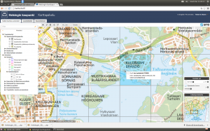
I decided to work with KMZ (zipped KML) files. The documentation explained that the data is divided into 1 x 1 km grids, and that the numbering of the grids follows the one used by Helsingin karttapalvelu (map service). The screenshot below shows one of the four grids I was mainly interested in: 675499 (NW), 674499 (SW), 675500 (NE) and 674500 (SE). These would leave out outer tips of the island in the East, and bring in a chunk of the Kivinokka recreation area in the North.

kartta.hel.fi

First I had in mind to continue using Shapefiles: imported one KML file to QGIS, saved as Shapefile, and added it as a polygon to the leaflet map. It worked, but I noticed that RStudio started to slow down immediately, and that the map in the Viewer became seemingly harder to manipulate. How about GeoJSON instead? Well, the file size do was reduced but still too much data. Still, I succeeded in getting all on the map, of which this screenshot acts as the evidence:

roadmap and 3D buildings

However, where I failed was to get the map transformed to a web page from the RStudio GUI. The problem: default Pandoc memory options.

Stack space overflow: current size 16777216 bytes.
Use `+RTS -Ksize -RTS' to increase it.
Error: pandoc document conversion failed with error 2

People seem to get over this situation by adding an appropiate command to the YAML metadata block of the RMarkdown file, but I’m not dealing with RMarkdown here. Couldn’t get the option work from the .Rprofile file either.

Anyway, here is the map without the buildings, so far: there is the motorway/highway (red), few bridges (blue), sandy parkways (green) here and there, a couple of underpasses (yellow), streets for service drive only (white) – and one path (brown) on the Southern coast of the neighbour island Mustikkamaa, as unbuilt as in 1917.

Note that interactivity in the map is limited to zooming and panning. No popups, for example.

I’ve heard many stories of the time when the highway was built. One detail mentioned by a neighbour is also visible on the map: it reduced the size of the big Storaängen outdoor sports area on the Southern side of the highway. The sports area is accessible from the Hertonäs Boulevarden – now Kulosaaren puistotie – by an underpass.

EDIT 26.3.2015: Thanks to the helpful comment by Yihui Xie, I realized that there is in fact several options to do a standalone HTML file from the RStudio GUI. With File > Compile Notebook... the result was combiled without problems, and now all buildings are rendered in the leaflet too. The file is a whopping 7 MB and therefore slow in its turns, but at least all data are now there. As a bonus, the R code is included as well! RStudios capabilities don’t stop to amaze me.
Birds on a map

Lintuatlas aka Finnish Breeding Bird Atlas is the flagship of longitudinal observations on avian fauna in Finland. And it’s not just one atlas but many. The first covers years 1974-79, second 1986-89, and third 2006–2010. Since February this year, the data from the first ones are open. Big news, and asks for an experiment on how to make use of the data.

One of the main ideas behind the Atlases is to give a tool for comparison, to visualize possible shifts in the population. I decided to do a simple old-school web app, a snapshot from a given species: select, and see observations plotted on a map.

The hardest part in the data were the coordinates. How to transform the KKJ Uniform Coordinate System values to something that a layman like me finds more familiar, like ETRS89? After a few hours of head-banging, I had to turn to the data provider. Thanks to advice from Mikko Heikkinen, the wizard behind many a nature-related web application in this country – including the Atlas pages – the batch transformation was easy. Excellent service!.

advice on Lintuatlas coordinates

All that was left was few joins between the datasets, and data was ready for an interactive R Shiny application. To reflect the reliability of observations on one particular area (scale from 1 to 4), I used four data classes from the PuBu ColorBrewer scheme to color the circles.

The application is here, and the code for those of you more inclined to R.

Note that the application is on a freemium Basic account of shinyapps.io so I cannot guarantee its availability. There is a monthly 25 500 hour use limit.

Snow in Lapland

Finnish Meteorological Institute (FMI) Open Data API has been with us for over a year already. Like any other specialist data source, it takes some time before a lay person like me is able to get a grasp on it. Now, thanks to the fmi R package by the collaborative effort of Jussi Jousimo and other active contributors, the road ahead is much easier. A significant leap forward came just before New Year, when Joona Lehtomäki submitted a posting on fmi and FMI observation stations to the rOpengov blog.

Unlike many other Finns, I am relatively novice when it comes to Finnish Lapland. I’ve never been there during summertime, for example, and never farther North than the village of Inari. Yet, I count cross-country skiing in Lapland among the best memories of my adulthood years so far; pure fun in the scorchio April sun, but maybe even more memorable under the slowly shifting colors of the polar night.

Snow is of course a central element in skiing. Although warmer temperatures seem to be catching us up here, there has still been plenty of snow in Lapland during the core winter months. But how much, exactly, and when did it rain, when melt?

I followed Joona’s steps, and queried the FMI API of snow depth observations at three weather stations in Lapland, from the beginning of 2012 to the end of 2014: Kilpisjärvi, Saariselkä and Salla. Note that you have to repeat the query year-wise because the API doesn’t want to return all the years in one go.

Being lazy, I used the get_weather_data utility function by Joona as is, meaning I got more data than I needed. Here I filter it down to time and snow measurements, and also change the column name from ‘measurement’ to ‘snow’

snow.Salla.2014 <- salla.2014 %>%
  filter(variable == "snow") %>%
  mutate(snow = measurement) %>%
  select(time, snow)

and then combine all data rows of one station:

snow.Salla <- rbind(snow.Salla.2012, snow.Salla.2013, snow.Salla.2014)

One of the many interesting new R package suites out there is htmlwidgets. For my experiment of representing time-series and weather stations on a map, dygraphs and leaflet looked particularly useful.

Last time I was in Lapland was in mid-December 2014, in Inari, Saariselkä. BTW, over 40 cm of snow! During some trips I left Endomondo on to gather data about tracks, speed etc. I have to point out that I'm not into fitness gadgets as such, but it's nice to experiment with them. Endomondo is a popular app in its genre. Among other things it lets you export data in a standard GPX format, which is a friendly gesture.

For the sake of testing how to add GeoJSON to a leaflet map, I needed to convert the GPX files to GeoJSON. This turned out to be easy with the ogr2ogr command line tool that comes with the GDAL library, used by the fmi R package too. Here I convert the skiing ("hiihto") route of Dec 14th:

ogr2ogr -f "GeoJSON" hiihto1214.geojson hiihto1214.gpx tracks

One of the many aspects I like about dygraphs is how it lets you zoom into the graph. You can try it yourself in my shiny web application titled (a bit too grandiously I'm afraid) Snow Depth 2012-2014. Double-clicking resets. To demonstrate what one can do with the various options that the R shiny package provides, and how you can bind a value to a dygraphs event - pick a day from the calendar, and notice how it is drawn as a vertical line onto the graph.

The tiny, blue spot on the map denotes my skiing routes in Saariselkä. You have to zoom all the way in to see them properly.

The shiny application R code is here.

Edit 11.1: Winter and snow do not follow calendar years, so added data from the first leg of the 2012 winter period.

Thoughts on a bubble chart

Some time ago, I got a hint via Twitter of an online course made at Ohio State University, Data Literacy and Data Visualization, by professor Bear Braumoeller. Halfway through the videos, I can say that the course has been a pleasure, most of the time. One area where Braumoeller shines, is when he explains why he thinks some particular visualization is bad and why, and how it could be made better. I heard his words in my ears when I saw the colourful bubble chart on page 6 in the current Aalto University Magazine.

Now, frankly, I think the Magazine is a great piece of university journalism in Finland. Cool topics, well written, fresh layout. There are few magazines I read from start to finish, and this is one of them.

But the chart, it baffles me.

The chart tries to draw a picture of the University by the year 2016, compared to the present. Bubbles represent a selection of different degree programmes. The legend on the vertical axis tells us that above the horizontal axis, we have programmes that will most probably become bigger, i.e. get proportionally more resources and students than what they do now. Below, less resources, less students.

The horizontal axis is without a legend. Is it a timeline? The first bubble along the axis is Materials Science aka Materiaalitekniikka in Finnish, hanging low on the negative side. Will Materials Science be the first one to see its share diminished? The axes have a color scheme, from yellow via orange to (a rather surprising) black. When I first looked at the horizontal axis, I thought that by every color we pass one year. But that cannot be true because 2016 is only two years ahead. So, I suppose here colors are just, well, colors.

All bubbles are divided in two segments, some of equal size, some not. There is no clue what they mean, and what the coloring stands for, if anything. The biggest bubble at the end of the horizontal axis has a slightly longer label. From it we can see that here we have in fact two programmes, Electrical Engineering & Automation and Computer Science & Engineering. Okay, so does every other bubble comprise of two programmes as well? We don’t know.

By looking more closely at the chart, I came to the conclusion that the size of the bubble reflects the magnitude of change that the individual programmes will face – the percentages given tell the same story. But wait, what is the function of the vertical axis then? The two bubbles below the horizontal axis are levelled, giving the impression that their status will be affected by the same amount. Yet their size differs a lot. Apparently, the vertical axis is not really an axis at all, but a dividing line on a more abstract level.

Citing professor Braumoeller, I have to say that the chart does not make a coherent whole. What could we do to improve it?

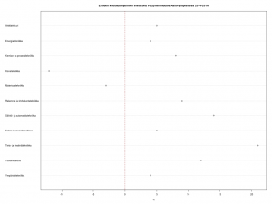
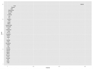
Below is a deadly plain and simple plotchart,  done with few lines of R. It is a total bore to look at, but gives a quick overview of the ups and downs.

Dotchart on proposed volume change in some degree programmes at Aalto University from 2014 to 2016

Disclaimers: Aalto University is my employer. All possible misunderstandings about the data are of course mine.

Mapping red-listed rainforest tree species

Rainforest Foundation Norway keeps a red list of tree species. Where do these trees grow?

One of the R packages developed by rOpenSci is rgbif. It’s a handy wrapper to the Global Biodiversity Information Facility API. With geolocation data returned by the query, you can plot points on the world map.

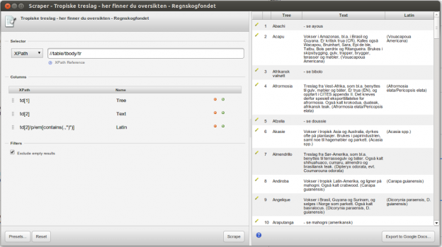
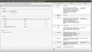
Let’s start with the list. Instead of using R all the way through, I scraped the HTML table rows with the Google Chrome extension Scraper, and saved data as a spreadsheet on Google Drive. This is the way Scraper works.

As I mentioned in my job blog the other day, one of the many good tutorials out there on using Scraper, is by Jens Finnäs.

Data needs some pruning in this exercise. What you need for the GBIF query, is basically just the Latin names. To make things somewhat simpler, I’ll take only the first one mentioned along each species; many have several.

Here is the R code for pruning, and for querying GBIF. The script saves the return data by the tree status, and in two file sets: R data, and GeoJSON. The first ones are used as input for a Shiny web application, where they will be plotted both as an interactive gvisGeoChart by googleVis, and as a static map with the (only slightly modified) gbifmap function from rgbif. The GeoJSON files will be rendered straight from a GitHub Gist. All of this just to demonstrate (foremost to myself!) that there are many ways to plot and serve maps, and that they all have different pros and cons depending on the amount and type of data. The challenge here is that there will be multiple data points on the same geolocation, and the number of different species is rather big too.

Next, the web application. Here is the R code for it, and this is the app itself. The maps served by GitHub: Critically_Endangered, Endangered, Vulnerable, Near_Threatened and Other.

The status Other is named by me. It refers to those rows in the original Foundation table, where no exact two-character status was given.

On the googleVis map, both the size and color of the points reflect the amount of occurrences on that particular location. This is of course repetitive, but I haven’t yet find a better solution. Optimally, the color would tell something else, maybe the species. Yet, the tooltip has this information already, so there you are. Note that the country name in the tooltip comes from a yet another scraped file, originating to Wikipedia. Initially, I had in mind fetching the name by querying the acronym against the DBpedia Linked Data, but reverted to scraping. The magnifying glass is a nifty tool of course, but IMHO doesn’t add much on the informative side.

The static map gives a quick overview of all species and their location. This works OK when the number is relatively small. However, the more variety there is, the harder it is to discern between different colors. Transparency (alpha) does the best it can to show that indeed there are multiple points on the same spot. With my expanded color palette however, the colors became so elusively light that I was forced to reduce transparency. Although you can customize the gbifmap function, with my limited skills I didn’t succeed in passing my own alpha value, so I modified the function accordingly. Note to self: find out the best practise of how this kind of modification should be done.

The GeoJSON maps were a positive surprise. Out of the Gist box, the JavaScript code produces nicely detailed maps, and in hot spots points are clustered. Marker symbols and colors could of course be different across species. Here, I simply use one red park2 marker in all.

Videoita Suomen kunnista Europeanassa

Edellisessä postauksessa tein ensimmäisiä hakuja Europeanan SPARQL-palveluun. Kiitos kuuluu Bob DuCharmelle, jonka selkeillä ohjeilla pääsi alkuun. Sittemmin olen tutkinut Europeanaa lisää. Vallan mainiota, että tällainen yhteiseurooppalainen ponnistus on tehty. Rahaa on käytetty hullumminkin. Antoine Isaac ja Bernhard Haslhofer kirjoittavat artikkelissaan Europeana Linked Open Data – data.europeana.eu (PDF):

Europeana is a single access point to millions of books, paintings, films, museum objects and archival records that have been digitized throughout Europe. The data.europeana.eu Linked Open Data pilot dataset contains open metadata on approximately 2.4 million texts, images, videos and sounds gathered by Europeana. All metadata are released under Creative Commons CC0 and therefore dedicated to the public domain. The metadata follow the Europeana Data Model and clients can access data either by dereferencing URIs, downloading data dumps, orexecuting SPARQL queries against the dataset.

Pilotti tarjoaa runsaasti materiaalia mm. SPARQL-kyselyjen treenaamiseen, ei vähiten siksi että metadatamalli on aika mutkikas. Pakko sanoa, että ilman Bobin virtuaalista kannustusta olisin tuskin tohtinut edes yrittää. Kehittäjät tunnustavat tilanteen konferenssiesitelmässä data.europeana.eu, The Europeana Linked Open Data Pilot (Dublin Core and Metadata Applications 2011, The Hague):

Beyond adding extra complexity to the RDF graphs published, the proxy pattern, which was introduced because of the lack of support for named graphs in RDF, is indeed quite a counter-intuitive necessary evil for linked data practitioners — including the authors of this paper […] We were tempted to make the work of linked data consumers easier, at least by copying the statements attached to the provider and Europeana proxies onto the “main” resource for the provided item, so as to allow direct access to these statements—i.e., not mediated through proxies. We decided against it, trying to avoid such data duplication. Feedback from data consumers may yet cause us to re-consider this decision. On the longer term, also, we hope that W3C will soon standardize “named graphs” for RDF. This mechanism would allow EDM to meet the requirements for tracking item data provenance without using proxies. (s. 100)

Named graphs -käsitteestä tarkemmin ks. Wikipedia. Kotimainen esimerkki nimettyjen graafien toteutuksesta on Aalto-yliopiston Linked Open Aalto.

Finlandia-katsaus 263

Otetaan esimerkkivideo, Kansallisen Audiovisuaalisen Arkiston (KAVA) Finlandia-katsaus 263 vuodelta 1955. Europeanan RDF-tietovarastossa siitä on tallennettu metatietoa kahteen ore:Proxy -solmuun. Toisessa on datan toimittajan (provider) eli KAVAn antamaa tietoa, toisessa Europeanan. Europeanan solmusta löytyvät mm. kaikki sen tekemät lisäykset (enrichments) alkuperäiseen metatietoon, kuten linkitykset KAVAn kertomasta dcterms:created -vuosiluvusta Semium-sanastolla ilmaistuun aikaan ja dc:spatial -paikannimestä GeoNames-tietokantaan. Datan alkuperätiedot (provenance) ovat ore:ResourceMap -solmussa.

Missä itse video sitten on? Sen selvittämiseksi pitää käydä koontisolmussa. Niitäkin on kaksi: datan toimittajan ore:Aggregation ja Europeanan edm:EuropeanaAggregation. Esimerkkivideon ore:Aggregation -tiedoista selviää videon kotisivu edm:isShownAt ja MP4-tiedosto edm:isShownBy. edm:EuropeanaAggregation kertoo videon sivun Europeanan web-portaalissa edm:landingPage.

soRvi

SPARQL-kyselykielen lisäksi olen jo jonkin aikaa opiskellut R-ohjelmointikieltä. Yksi viime vuosien R-tapauksia Suomessa on ollut avoimen datan työkalupakki soRvi. Päätin kokeilla, miten työskentely sillä sujuu. Tavoite pitää olla: Suomen kartta, jossa väri ilmaisee paljonko Europeanassa on kuntiin liittyviä videoita.

Sorvilla saa kätevästi Suomen kuntien nimet ja kuntarajat. Data tulee Maanmittauslaitokselta (MML). Entä Europeana? Miten nimet on siellä esitetty ja missä? Kahlasin portaalin avulla läpi joukon videoita, ja katsoin metatietoelementtejä sivun lähdekoodissa. Esimerkkivideossa Finlandia-katsaus 263 on useampikin pätkä Helsingistä. Helsinki-sana löytyy perusmuodossa kentistä dc:subject ja dc:description, englanninkielisestä käännöksestä. Muutamissa videoissa näkyi dc:spatial ja sen myötä Europeanan lisäämä GeoNameID. Lisäksi nimi voi esiintyä paitsi varsinaisessa otsikossa dc:title myös vaihtoehtoisessa otsikossa dcterms:alternative (en tiedä miksi).

Suomen kuntien nimissä on runsaasti äännevaihtelua ja taipumista. Syntymäkuntani Laitila ei taivu, mutta nykyinen kotikaupunkini Helsinki taipuu. Kun katsoo kuntaluetteloa, silmissä vilisee lahtia, järviä, lampia, koskia ja jokia. Välissä on kuivaakin maata kuten rantoja, saaria, mäkiä ja niemiä. Taipuvia kaikki.

Rajoitin haut nimen perusmuotoon sillä lisäyksellä, että jos säännöllinen lauseke löytää taipumattomien nimien päätteellisiä muotoja (Oulu, Oulun, Oulussa jne.), hyvä niin. Tällä periaatteella on ilmiselvä kääntöpuolensa. Lyhyet kuten Ii ja Salo tulevat tuottamaan vääriä hakutuloksia sekä Suomesta että muista maista. Ii saa omiensa lisäksi myös Iisalmen ja Iitin videopinnat, mikä on ehkä oikein ja kohtuullista kunnalle, jolla on vain kaksi kirjainta. Salo-kirjainyhdistelmää esiintyy paitsi suomessa myös ainakin tanskassa, ranskassa, katalaanissa ja italiassa.

Tein sen minkä voin ja rajasin haun vain niihin videoihin, joiden dc:language on fi. Tämä päätös tiputtaa kuitenkin tuloksesta pois ulkomaista alkuperää olevat videot jotka todella liittyvät Suomeen ja ne, joissa tätä Dublin Core -elementtiä ei ole annettu. Toisaalta suomenruotsalaisten kuntien hakutulos siistiytyy, sillä oletettavasti haaviin ei näin jää Ruotsin samannimisiä kuntia.

Kartalla

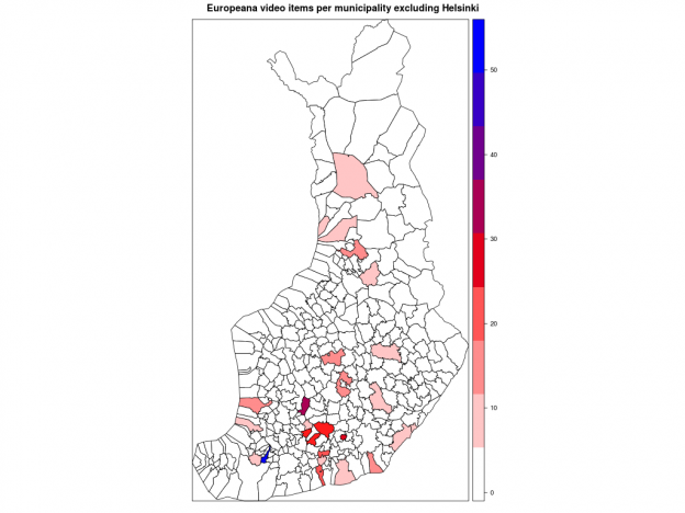
Kuntakartan plottaus absoluuttisilla luvuilla kävi helposti soRvi-blogin esimerkkien avulla. Jouduin tosin jättämään Helsingin kokonaan pois, jotta muut kunnat pääsivät esille. Data vaatisi oikeastaan logaritmisen asteikon; Helsinki poikkeaa niin paljon muista.

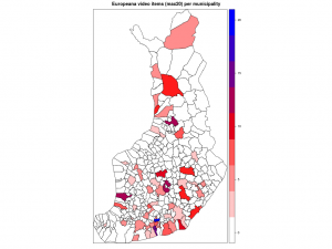
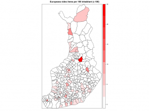
Ensimmäisessä kartassa kunnat ilman Helsinkiä, toisessa ne kunnat joihin liittyviä videoita löytyi enintään 20.

Alla matkin suoraan sitä, miten Datavaalit havainnollisti ahkerimpia sosiaalisen median käyttäjiä.

Kärkikolmikko ei yllätä: Helsinki, Turku ja Tampere. Ystävämme Ii yltää 25 ensimmäisen joukkoon. Pääkaupunkiseudun nykyisistä isoista kaupungeista Vantaalla näyttäisi olevan videoita vain muutama. Vantaasta tuli kuitenkin kunnan nimi vasta 1970-luvulla, ja uusimmat Europeanan videot ovat nähtävästi 1960-luvulta. Vantaa viittaakin näissä Vantaanjokeen. Hyvinkään lukua selittää mm. Kone Oyj ja Herlinin suku. Tunisian presidentti Bourgiba vieraili 1960-luvun alussa Herlineillä.

Suhteellista

Seuraavaksi suhteutin videoiden määrän kunnan asukaslukuun. Sorvi tarjoaa valmiin funktion, joka hakee asukasluvut suoraan Tilastokeskuksesta. Vuoden 2013 alusta lukien kuntien määrä väheni vajaalla 20:lla kuntaliitosten myötä. Kunnat ja kuntarajat kuvaavat tässä kuitenkin mennyttä aikaa, vuotta 2012. Lisäsin entisille kunnille asukasmäärän käsin, mutta niiden kuntien lukuun en koskenut, joihin nämä kunnat yhdistettiin.

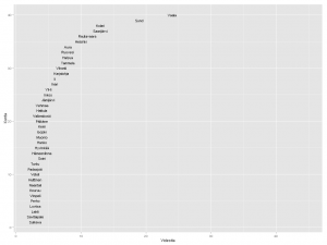
Nyt erottuvat suuruusjärjestyksessä Vaala, Sund, Kolari, Rautavaara ja Helsinki. Moni on kuitenkin väärä positiivinen. Kai Sundström -nimistä henkilöä videoitiin kahteen otteeseen 1940-luvulla. Näin ollen algoritmini antoi kaksi videopistettä pienelle ahvenanmaalaiselle Sundin kunnalle. Kolarin asema johtuu vain ja ainoastaan otsikoista Kolari Helsingissä. Tapio Rautavaara taas oli 50-luvulla julkisuuden henkilö monella alalla, itse Rautavaaran kunnasta ei videoita löydy. Mutta entä Vaala? Tämä reilun 3000 asukkaan kunta Kainuussa on vanhaa asutusaluetta, mutta sen lisäksi myös sukunimikaima elokuvaohjaaja Valentin Vaalalle.

Sivumennen sanoen opin Wikipediasta, että sana vaala liittyy sekin veteen. Englanninkielinen Wikipedia-artikkeli mainitsee, että se on the phase in a river just before rapids.

Helsinki on siis väkilukuunkin suhteutettuna videoykkönen. Seuraavana tulevat oikeat videokunnat Karjalohja ja Vihanti. Suomi-Filmi videouutisoi näistä kunnista politiikan ja talouden näkökulmasta. Pääministeri Edwin Linkomiehen kesäpaikka oli Karjalohjalla, ja Vihantiin rakennettiin 1950-luvun alussa valtion toimesta rautatie. Outokumpu Oyj perusti Vihantiin sinkkirikastekaivoksen. Kaivos toimi vuosina 1954-1992, tietää Wikipedia ja jatkaa:

Kaivoksen tuotantorakennukset purettiin pari vuotta myöhemmin ja kaivostorni räjäytettiin. Myös kaivokselta Vihannin asemalle vienyt junarata on purettu Vihannin päässä olevaa 1,5 kilometrin pituista vetoraidepätkää lukuunottamatta. Kaivoksen toimistorakennukset säilytettiin. Osa kaivosalueesta on aidattu sortumavaaran vuoksi.

Vihannin kuntaa ei enää ole. Se liitettiin vuoden 2013 alusta Raaheen.

Paikan haku

GeoNames-tietokanta vaikuttaa lupaavalta. Ajattelin jo nyt hyödyntää geonames R-kirjastoa kuntien GeoNameID:n selvittämiseen, mutta en päässyt alkua pidemmälle. Palvelu kyllä vastaa ja palauttaa dataa. Liikaakin, aloittelijalle. Kysely on ilmeisesti rakennettava hyvinkin yksityiskohtaisesti kohdistumaan vain tietyntyyppisiin taajamiin.

Yritin myös ujuttaa SPARQL-kyselyyn soRvin tarjoamia MML:n kuntakoordinaatteja. Europeanan SPARQL-editorissa on valmis esimerkki Time enrichment statements produced by Europeana for provided objects. Se antaa kuitenkin ymmärtää, että metatieto-rikastukset mm. ajalle ja paikalle olisivat toistaiseksi haettavissa vain yleisellä merkkijonohaulla, joten luovutin.

Tuore Europeana Business Plan 2013 kertoo tammikuun tilanteen paikkatiedoista. Ne löytyvät 27.5 prosentissa kaikesta aineistosta.

Paljonko Europeanassa sitten on Suomen GeoNameID:llä <http://sws.geonames.org/660013/> varustettuja RDF-kolmikkoja resurssityypeittäin (image, sound, text, video) ja lähteittäin? Kopioi tästä kysely, liimaa SPARQL-editoriin ja lähetä.

Dataa ja videonauhaa

Linkitetty avoin data on Europeana-pilotti. Datanarkkarille se tarjoaa mahdollisuuden ynnäillä vaikka tilastoja, mutta ne ovat vain sivutuote. Datan päätarkoitus on kypsyttää ideoita verkkopalveluiksi. Liikkuvalla kuvalla ja äänellä on kysyntää. Niitä aiotaankin saada lisää, linjaa Business Plan:

Actively pursue both large and small institutions to contribute AV material through national aggregators or audiovisual projects. AV material currently makes up less than 3% of the database, while research shows that this material gets most attention from end-users. (s. 9)

R-koodi.

EDIT 16.3.: Missä mahtoivat silmäni olla, kun katsoin asukaslukuun suhteutettua tilastoa? En osaa selittää. Oli miten oli, Helsinki ei suinkaan ole videoykkönen vaan Saarijärvi! Lisäksi Vihannin ja Karjalohjan ohittavat Aura, Ruovesi, Halsua ja Tammela. Aura on tosin siinä ja siinä, koska toinen kahdesta videosta liittyy Teuvo Auraan.

Millä Suomi twiittaa?

Vielä kerran suomenruotsalaisen ja suomalaisen tweettailun eroista ja yhtäläisyyksistä.

Twitter-klienttien Top4-järjestys on sama, mutta suomenruotsalaisilla Twitter for iPhone on selvästi suositumpi kuin TweetDeck. Suomenkielisten käyttämien klienttien kirjo taas on paljon suurempi. Testaillaanko siellä enemmän uutta? Jaetaan aineistoa enemmän suoraan muista lähteistä? Vertailuaineistojen koko on sama (n. 12000 tweettiä), mutta aineistot eivät ole täysin vertailukelpoisia keskenään, koska suomalaisia on 20 enemmän. Mitä enemmän ihmisiä, sitä enemmän erilaisia klienttejä, luultavasti.

Suomalaisten Top 5:

  1. Twitter.com
  2. Twitter for iPhone
  3. TweetDeck
  4. Twitter for iPad
  5. Tweet Button (suomenruotsalaisilla 8.)

ja suomenruotsalaisten:

  1. Twitter.com
  2. Twitter for iPhone
  3. TweetDeck
  4. Twitter for iPad
  5. Twitter for Android (suomalaisilla 9.)

Pistekaavioiden ulkoasussa on runsaasti toivomisen varaa, mutta yleiskuva erottunee: suomalaiset (PDF) ja suomenruotsalaiset (PDF). R-koodi klienttitiedon hakuun ja käsittelyyn.

Top twittrare

Här är svenskfinlands bästa twittrare, meddelade Yle X3M idag. Fint! För jämförelsens skull bedrev jag nu lite hembakad text mining också med tweeps av de här 80 personer. Urvalets storlek är detsamma som förr: 200 per person.

AFAIK så finns det ingen officiell Twitter list. Därför kunde jag inte direkt använda den gamla koden utan måste först plocka ut namn ur den ovannämda websidan.

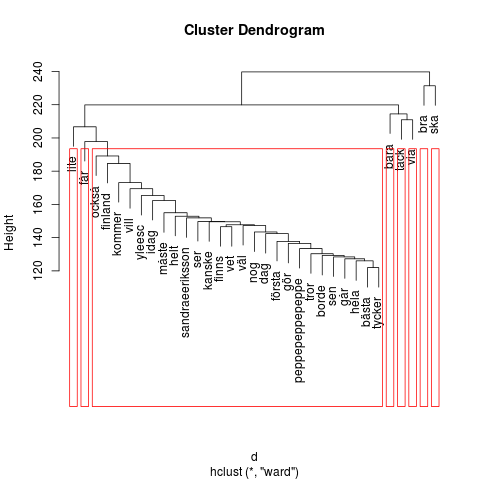
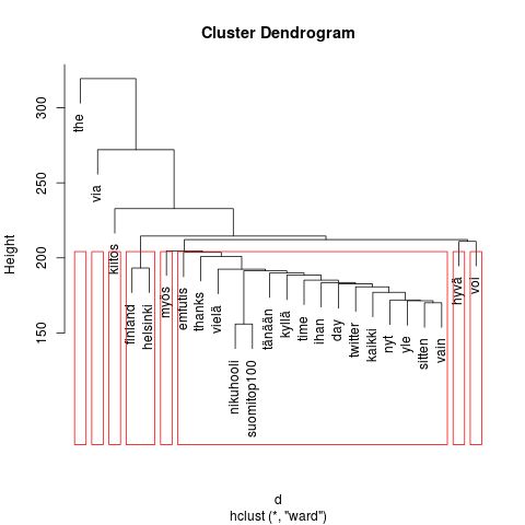
Klustren ser en smula olika ut här än i den finska. Med mina helt amatörmässiga 3D text mining glasögon kan jag urskilja en aning mera variation i ordförråd. Men, det kan helt enkelt bero på hur det svenska språket är uppbyggt (och hur R och dess tm paket manipulerar text), och inte säga någonting alls om våra inhemska, svenskspråkiga Twitter-vänner. Artiga och vänliga tweeps här också.

Två personer tycks vara särskilt flitigt refererade, vilket tyder också på aktivt personligt twittrande: Peppe Öhman (peppepeppepeppe) och Sandra Eriksson (sandraeeriksson).

Keskiraskas louhinta

Eiliseen verrattuna levyn nurkalla on nyt melkein 50 kertaa isompi otos, reilut 20000 tweettiä. Jokaiselta listan jäseneltä 200, hänen omalta aikajanaltaan. GET statuses/user_timeline -API-määrittely lupaa maksimiksi 3200 per nenä, mutta silloin mukana voivat olla (paluuformaatista riippuen) myös ns. natiivit retweettaukset. Annoin ne tulla mukaan.

En viitsinyt koputella tweetkattoa, vielä. Pöytäkoneella oli jo tekemistä tämänkin tekstikorpuksen käsittelyn kanssa. Erityisen hidas oli stopwordien poisto-operaatio.

Käyttäjänimistä on jäljellä enää listan perustaja Niku Hooli, mikä ei yllätä; lista on uusi juttu, ja siitä ja sen perustajasta on tietysti (re)tweetattu paljon. Sitä en sen sijaan ymmärrä, miksi the keikkuu edelleen mukana ja huipulla, vaikka lisäsin sen stopword-listaan. Täytyy joskus kaivella lisää.

Tuloksesta voi varovaisesti piirtää kuvaa yhteisöstä, jonka aktiivisimmat sanankäyttäjät ovat kohteliaita, kilttejä ja ajan hermolla. Sosiaalisen median käytäntöjen ammattilaisia.

Koodinpätkästä puuttuu louhintaosuus. Se on sama kuin ennenkin.