Death in Finland

In early December, Kieran Healy posted tweets where he presented quite spectacular heatmaps of mortality rates, based on data from The Human Mortality database.

How would the respective Finnish heatmaps look like, I wondered.

Luckily, in PX-WEB API Interface we have a helpful R library to fetch data from Statistics Finland open data API. With the interactive_pxweb() function you navigate in the data hierarchy, select what you want, and then download the data. As as sidekick, for later use, you get a ready-made query. A nice and easy solution.

However, year-by-year data via the API starts only from 1980, so for previous statistics I needed to go elsewhere.

Statistics Finland have digitized all their legacy reports on population shift that include births, marriages, deaths etc. These are available as PDF files at the Doria repository of the National Library of Finland. Initially, to extract numbers from the PDFs, I had high expectations on the pdftools R library but rapidly fell down into the valley of despair. Either the table structure was just too complicated and I got only headers, or the PDF was a scanned picture. Among the former, you could oftentimes manually copy-paste table columns though. So, a few days in a row I was mostly just tap-tapping numbers to an Excel worksheet. Then it suddenly dawned on me that I never actually checked the Mortality database. Would they perhaps have data from Finland? Of course they do! So I ended up combining data from three sources: Mortality.org, my manually entered file, and API.

When data were ready, the graphs were easy to do thanks to Healy’s example code in R. I even copied his color palette and all.

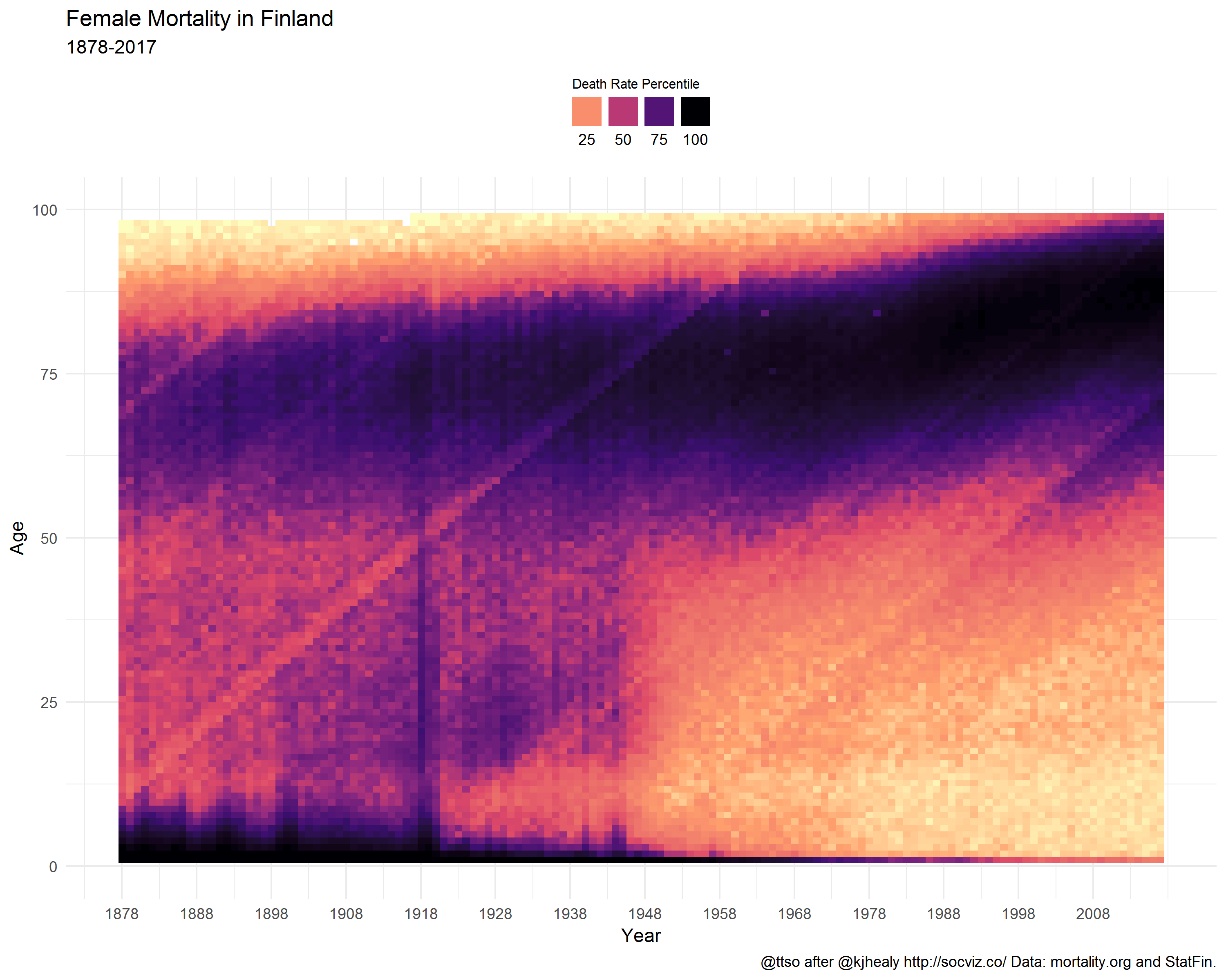
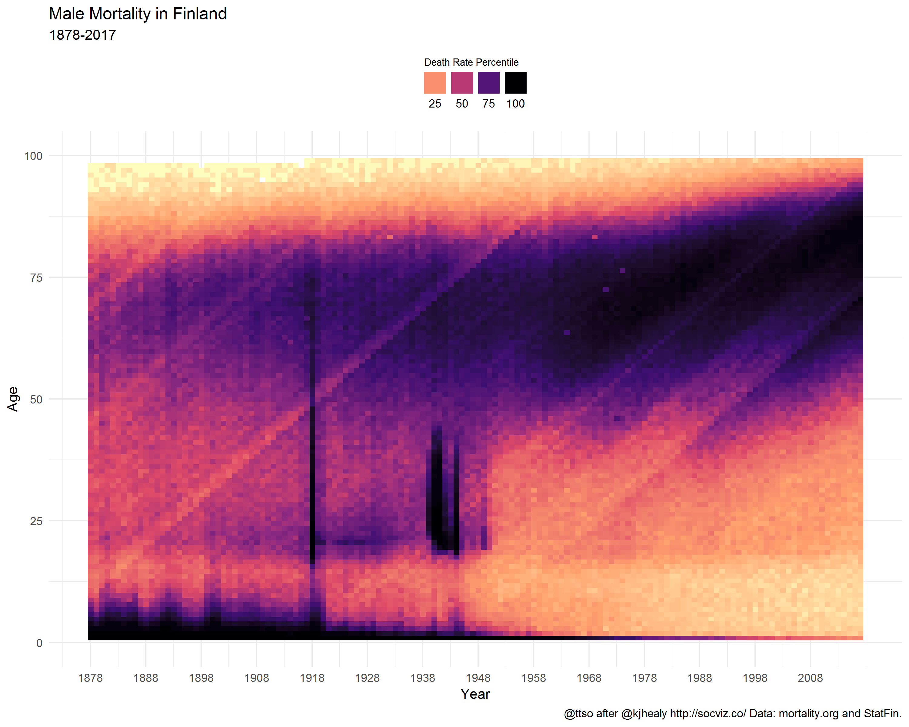
Below are the final heatmaps, covering mortality statistics since 1878. I deliberately left out older years because before 1878, statistics are not available year-by-year but in five-year age groups.

Female mortality in Finland

Male mortality in Finland

For comparison, here is neighbor Sweden.

Female mortality in Sweden

Male mortality in Sweden

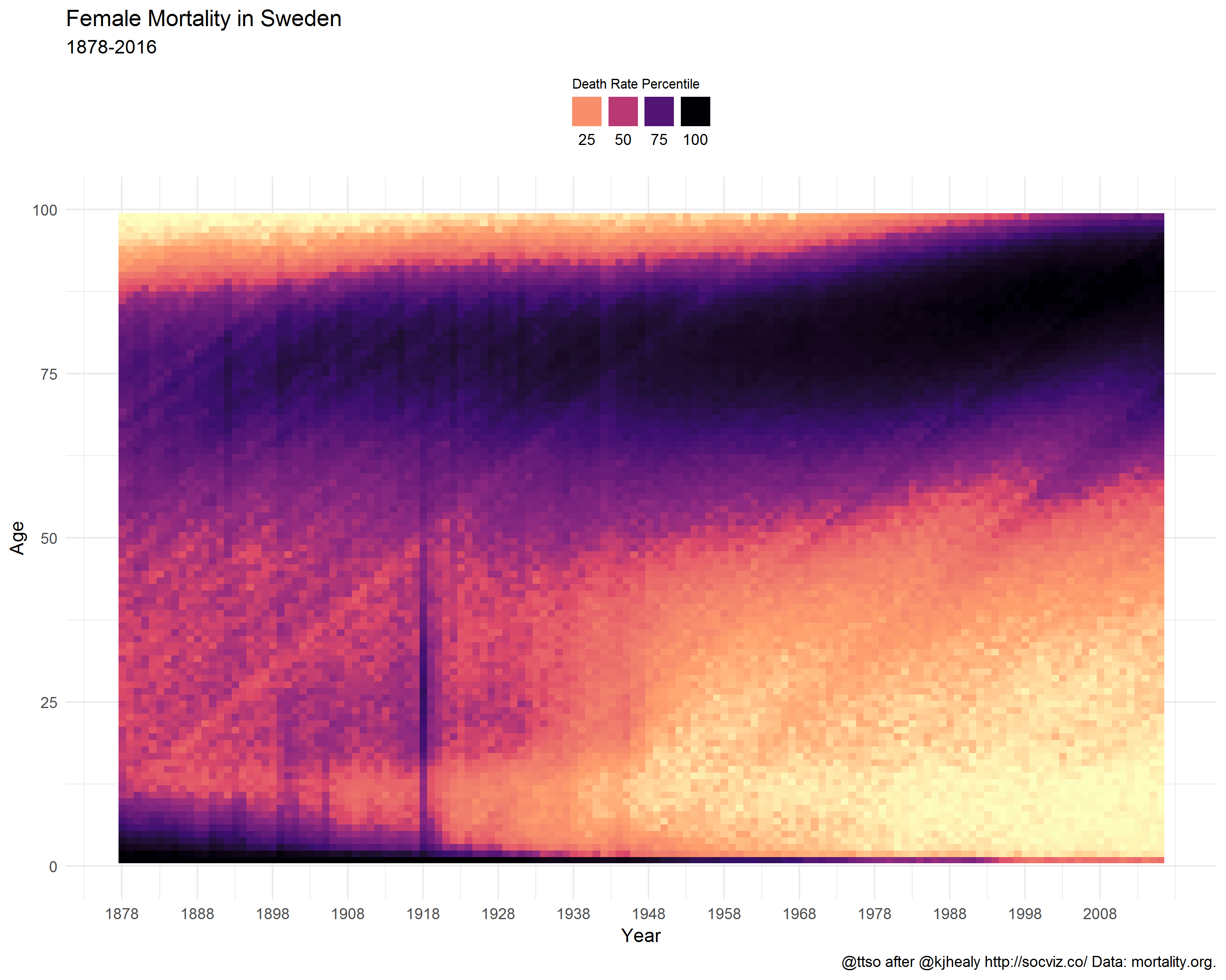
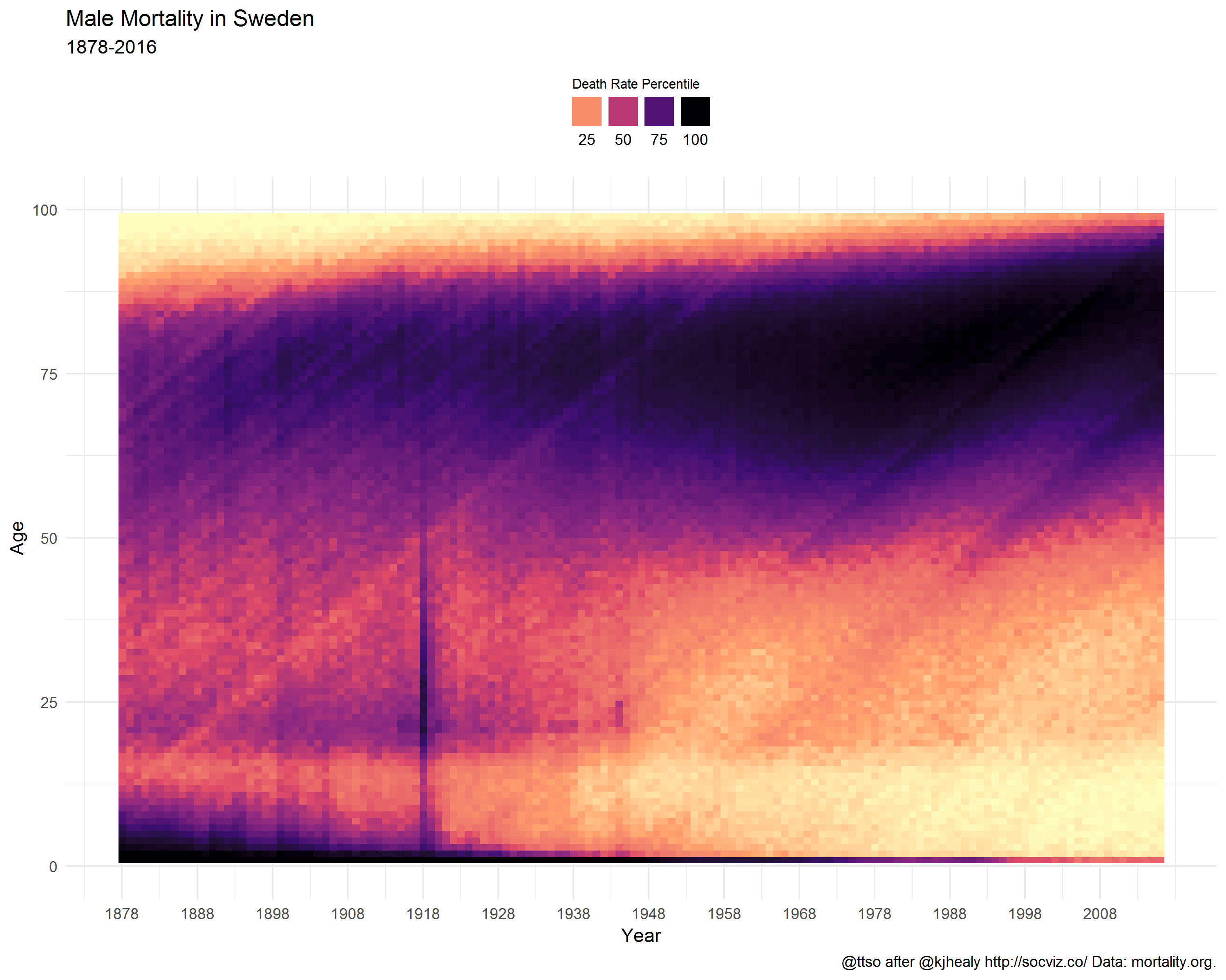
What do the graphs show?

Healy explains it best in the legend of his French mortality poster

Mortality rates are calculated for each age in each year and binned by percentile. The darker the color at any particular point, the more people of that age die in that year. The lighter the color, the more people of that age survive in that year.

Historical trends are visible, such as the rapid decrease in infant mortality rates after World War II, as well as increased life expectancy overall. Specific events show up as vertical streaks in the graph. The death toll due to wars in evident for Males. Pandemics are also visible, most notably the 1918 influenza pandemic and the death toll to Smallpox outbreaks after the Franco-Prussian war of 1870.

Diagonal streaks in the data are visible in some parts of the data. These are artifacts due to the estimation of the mortality rate in some years. Single-year-of-age figures prior to 1900 are calculated from five-year age groups, as no single-year data is available in the original mortality tabulations from which the rates were derived.

World War I lasted from 1914 to 1918. However, the peak in 1918 among young Finnish males in particular was mostly caused by the Finnish Civil War. During the same year–perhaps partly assisted by the WWI–the Spanish Flu influenza pandemic caused havoc in all age groups, as Healy points out too.

Winter War 1939-40 and Continuation War 1941-1944 paint dark columns as well.

Tuberculosis was a deadly national disease in Finland until WWII. Infant mortality began to wither around the same time, and better maternity care started to save lives of young women in labor.

Note the coloring in the age groups above 80. It does not claim that, particularly in the past, the older you got the less likely you were to die. On the contrary. There simply did not exist that many people alive in those age groups (who would then die). While preparing the data, I replaced NA values with zero. Perhaps it would’ve been wiser not to do that and let the graph color these missing values differently from the rest of the graph. The mostly zero valued groups now fall into the first bins, i.e. the lowest percentiles which are given the lightest colors from the viridis palette. Anyway, why was this phenomenon missing from the French graph? I suppose because compared to Finland, France is a big country with more than a tenfold population. A lot of people in all age groups.

The lighter diagonal strands are interesting. They look like sunbeams that drill through the dark clouds of death. Unlike in Healy’s case, these cannot be artifacts or at least not similar ones to his, because numbers are not calculated from age groups but are year-by-year. My initial thought was that they reflect the increased birth rate that tends to occur especially after wars; when population grows, the proportion of deaths diminishes. However, we have no population data here so this cannot be true. Yet, they do seem to have their origin around the war years. Did these baby-boomer cohorts get such a favorable start that it shows throughout the rest of their lives?

Although I did some amount of redundant work while I extracted data manually from digitized reports, I don’t regret it. Following the death statistics year by year I had the opportunity to notice gradual changes in terminology, presentation, and typeface. The arrival of the line printer in 1971! Also, there were other intriguing tabulated data in the reports. For example Causes of accidental and violent deaths that was published between 1921 and 1935 at least. Death in this category of the prosperous Finland of today often occur in extreme leisure activities up in the highest mountains and in the deepest caves of the oceans. In the 1920’s the end could arrive in the shape of the hoof of your domestic horse. Yet some things remain. Finns still drink, drive or dive, and die.

Streets of Helsinki

Helsinki streets on a map

Walking is fun, and there are always new ways to move forward, literally. Some people (not unlike me) have had this silly idea to walk all the streets of Helsinki, in alphabetical order. Johannes Laitila is one of them, and his blog is a good read (in Finnish). Recently Sanna Hellström, the head of Korkeasaari Zoo and former member of Helsinki City Council, mentioned in Twitter that since last fall, she had started to follow in Johannes’ footsteps.

Sanna’s tweet made me think about the size of her plan.

Spatial data of addresses of Helsinki are available from the city’s WFS API, via e.g. the key data site of Helsinki Region Infoshare. Of course addresses are not quite the same thing as streets but will do. Because addresses can refer to almost anything urban, I filtered them with a list of Official street names, the domain name of which tells something about the pragmatism of my home city; the name translates to Plans for cleaning.

The number of unique address names in my filtered data is 3788. The total sum of the geographical distances of individual addresses is 783 km (486 miles). There are some caveats though. Firstly, not all streets are populated by addresses from start to finish. In my home suburb Kulosaari for example, the two longest streets are Kulosaarentie and Kulosaaren puistotie. However, the former starts as a motorway exit road and meets its first address only after a few hundred meters. The latter is equally without addresses a long stretch from both ends. Secondly, distances are not calculated by the street level, so the meters you walk are bound to be more than what the figure says, except in those rare cases where the street forms a straight line.

Anyway, let’s assume a very rough error rate of 20 km to end up to a convenient total length of 800 km. To put that in perspective, Sodankylä, the venue for the legendary annual Midnight Sun Film Festival in Finnish Lapland, is about 800 km North from Helsinki. Given a modest rate of 5 km walking per day, starting about now, I’d reach Sodankylä in time for the next festival. In Helsinki, were I to walk one or two streets every weekend, the project of Walking Them All would be finished in 15 years.

What does Helsinki look like, street-wise?

The opening state of the interactive web app hkistreets that marks the first and last address on every street, shows how the bulk of them is spread along the North-South axis. Helsinki sits on a tip of a peninsula with a slight bending towards right. This North-Eastern area is fairly new. In 2009, a slice of Sipoo was annexed in Helsinki.

Notice the few markers above the sea. Helsinki occupies 315 islands, and from these, a couple have got an address which reveals that there’s something else on the island than just summer cottages, if anything. Rysäkari for example, the most Southern island, is a former military base, and a future tourist attraction (news in Finnish).

Most of the streets of Helsinki can be walked in 5 minutes if you are in a hurry; over 90% are under 500 m (1640 feet). 6% have only one address which means that they are an obscure lot. Either the street do is short or in fact it is some other place of interest (to be cleaned) like the centrally located square Paasikivenaukio 2 with the 40 ton granite statue of the former President of Finland Juho Kusti Paasikivi. 2% are under 1 km, and 0.9% between 1 and 3 km.

Only two streets in Helsinki are longer than 3 km. Mannerheimintie is a giant, almost 14 km, and known to all, whereas Jollaksentie (5 km) in South-East is a less visited suburban stretch. At the end of it, you are close to the last big unbuilt island of Helsinki, Villinki.

Google Street View does not cover all coordinates in Helsinki, as neat as it would be – sometimes because my coordinates are too far from streets – so popup links will often hit a black screen. Technically, I guess I could scrape all targets beforehand and only serve those that have something to look at, but Google TOS might not like it so I’ll let that idea be.

The R source code is available at Github.

Consuming IFTTTed Twitter favs

‪I consider my Twitter favourites to be mainly bookmarks although endorsements happen too. Liking comes from Instagram and Facebook but because my social media communities do not really overlap, I sometimes want to send digital respect in Twitter too. I’ve tried to unlearn the classic liking in Twitter and instead reply or retweet, but old habits – you know.‬

‪There’s little point in bookmarking if you cannot find your bookmarks afterwards. The official Twitter archive that I unzip to my private website few times a year, does not include favourites, which is a pity. The archive looks nice out of the box, and there is a search facility. ‬

‪Since late 2013, I have an active IFTTT rule that writes metadata of the favourited tweet to a Google spreadsheet. IFTTT is a nifty concept but oftentimes there are delays and other hickups. ‬

‪My husband and I lunch together several times a week. Instead of emailing, phoning or IM’ing the usual 5 minutes and I’m there bye message, I had this idea of enhanced automation with IFTTT. Whenever I entered the inner circle around our regular meeting point, IFTTT sent me an email announcing Entered the area. This caused a predefined email rule to trigger which forwarded the message to the receiver. Basta! At first this simple digital helper was fun, but as soon as it didn’t deliver, trust started to erode rapidly.

– Where are you? Didn’t you get the message?
– What message?

Sometimes the email came doubled, sometimes it arrived the next day (or never). After few months I had to deactivate the rule.‬

‪With tweets it’s not so critical. In the beginning I checked few times that the spreadsheet do was populated, but then I let it be. From time to time Google (or IFTTT) opens up a new document but fortunately keeps the original file name, just adds a version number.‬

IFTTT rule
IFTTT rule

‪I appreciate Google’s back office services but don’t often use their user interfaces. Besides, my IFTTT’ed archive does not include the tweet status text, so without some preprocessing the archive is useless anyhow. In theory I could get the text by building calls myself to the Twitter API with the Google Query Language, or become a member of the seemingly happy TAGS community. TAGS is a long-lasting and sensible tool by Martin Hawksey. But what would blogging be without the NIH spirit, so here we go.‬

‪Because I have access to a shinyapps.io instance, I made a searchable tweet interface as an R Shiny web app. For that I needed to‬

  • Install googlesheets and twitterR
  • Collect information on my tweet sheets‬, and download all data‬ in them
  • Expand short URLs‬
  • Fetch the Twitter status from the API‬
  • Write a row to the latest sheet to denote where to start next time‬
  • Build the Shiny app‬

The app acts now as a searchable table to my favourite tweets. While at it, I also plotted statistics on timeline.

Here is the app. The R code for gathering all data is in GitHub, likewise the code how I built the app.

A Finnish alien

On 17th April 1929, Aimo August Sonkkila, brother of my late grandpa, left Finland to London. He was 30 years old, son of a farmer in the then rural Laitila municipality in SW Finland.

In London, Aimo embarked S/S Orvieto. His target destination was Brisbane, Australia.

The same year, 589 males in his age emigrated. 11 of them were from the countryside of the same province, Turun ja Porin lääni.

ShipSpotting.com
© Gordy

The first stop was Gibraltar. Then, via Toulon and Neapel, over the Mediterranean Sea to Port Said, Egypt. From there via Suez Canal to Colombo, Sri Lanka. Finally, on the horizon, the West coast of Australia, Fremantle! But the trip was not over yet. Following the Australian coastline, Orvieto visited Adelaide and Melbourne before reaching Brisbane.

I haven’t found the date of the departure, so Orvieto’s exact travel time is unknown. Unlike the newspaper archive provided by National Library of Australia from where I found the route, the British Newspaper Archive is subscription-based. An unfortunate show-stopper for a random visitor like me, although I can understand the monetizing idea.

Anyway, there are hints that the voyage lasted several weeks, which is what you would expect, really. If we trust the computations of Wolfram Alpha, the travel time would’ve been around two weeks, had Orvieto managed 25 knots. Orvieto’s speed, however, was only 18 knots. Yet the globe-shaped map that Wolfram Alpha serves, wakes suspicions. Maybe they use a straight line of distance? In any case, given the fair number of waypoints on route, let us imagine a rough travelling time of one month.

As it happens, Orvieto’s voyage became one of its last ones. The ship was taken out of business in 1930.

Aimo travelled in the 3rd class with roughly 550 other passengers, whereas the 1st class only occupied 75. Among these lucky ones were few celebrities and other prominent figures, featured by The West Australian the day after Orvieto’s arrival to the Australian continent. Onboard was also mail and cargo.

On 28th May, Orvieto docked Fremantle. From the Incoming passenger list, on row 692, we find Aimo. A search by Sonkkila hits 0 because the name is mistyped as M. Sonkkilla. A non-English person, misspellings were to follow Aimo the rest of his life. In the scanned bundle of official records of him, Amio comes up just as often as Aimo. Maybe not a big deal. In Australia, with a hint of Italian, that version was perhaps more practical anyway.

Why did Aimo emigrate? We can only guess. Was he adventurous? Driven to believe in juicy stories of easy money, or official promises on steady income? Had someone he knew and emigrated before him, sent assuring letters to homeland, making him decide to follow suite? As a son of a farmer, he had prospects of taking care of the farm after his father. But, he was not the only son – always a problematic situation. Besides, what if farming was not something he looked forward to? Both push and pull may have played a role here.

We know now that 1929 was the year when Great Depression started. Still, it is difficult to judge in what way and how soon, individual lives are affected by economic fluctuations of such a global scale.

Emigration from Finland was by no means a sudden fad. Previously, the obvious target for the majority of people had been the North American continent. The Immigration Act of 1924 drastically changed this. People were still let in, but in much less quantities than earlier. Very much like in Europe at the moment, both the US and Canada had switched to a selective immigration policy.

This sankey diagram tries to visualize where Finns left between 1900 and 1945, aggregated over decades. Data come from Institute of Migration (Emigration 1870-1945). Note that all targets are not mutually exclusive. Between 1900 and 1923, Americas was recorded as one entity, but from then on, as separate countries. In addition, during that same period, statistics from other countries are scarce. [A technical side note: with Firefox, the diagram may appear very small. Chrome and Internet Explorer don’t have this issue.]

Life in Australia proved a challenging endeavour for Aimo, to say the least. The records are fragmented and don’t reveal much, but it is fairly easy to imagine what is in the gaps.

Work as a miner was incredibly tough. Some of it is captured in The Diminishing Sugar-Miners of Mount Isa, Australia by Greg Watson, linked to by Institute of Migration. I wonder if Aimo had any realistic idea beforehand what it was to be like. Yet, with his modest background, he had not much choice once he had arrived.

Then, after 12 laborious years, Second World War.

On 12th April 1942, Aimo is arrested in Townsville. He is still a Finnish citizen, and because Finland is Axis-aligned, he is a member of the enemy. The rest of the year Aimo would stay in an internment camp at Gaythorne (Enoggera), Brisbane. However, on the application by the Mt Isa Mining Company, his employer, he is allowed to work. Between a rock and a hard place is an idiom that must have been coined by Aimo himself.

At some stage, Aimo had married Impi Rapp. That’s basically all I know about her, the name. Few years after WWII, a son is born. His life would become totally different from that of his parents.

Finger print

National Archives of Australia, NAA: BP25/1, SONKKILA A A FINNISH. Digital copy, page 31

R code of the diagram is available here.

Seven Brothers

A movie that I’ve never seen myself but what apparently forms a Christmas Eve tradition in the US, inspired David Robinson to write a thorough and illustrative blog post about its network of characters. Like some commentators have already mentioned, his analysis is particularly interesting e.g. because of the way he parses and processes raw text with R.

I wanted to replicate David’s take. For it, I needed material that’s more familiar.

One of the well known group of characters in Finnish pre-1900 fiction is Seven Brothers by Aleksis Kivi. Published in 1870, the book is already copyright free, and available in plain text from Project Gutenberg.

Brothers form a tight group but how tight, actually? With whom did they speak? What else is there to find with some quick R plotting?

First I needed a list of all characters that say something.

In the text, dialog is marked by uppercase letters with a trailing full stop. Thanks to a compact synopsis I found (in Finnish) I noticed that the A-Z character class wouldn’t suffice in filtering all names.

names <- data_frame(raw = raw) %>%
  filter(grepl('^[A-ZÄÖ-]+\\.', raw)) %>%
  separate(raw, c("speaker","text"), sep = "\\.", extra = "drop") %>%
  group_by(speaker) %>%
  summarize(name = speaker[1]) %>%
  select(name)

Some of the names referred to a group of people (e.g. VELJEKSET) or other non-person (the false positive DAMAGE), so I excluded them. I also found one typo; KERO is not some person but in fact EERO.

This data frame I then wrote to file, added manually some descriptive text in English with help of the above mentioned synopsis, and read in again. Later on in the process, this information would be joined with the rest of the processed data.

Next, with some minor modifications to David’s script, the main parsing process.

What the script does is that it filters all-blank rows; detects rows that mark the beginning of a new chapter (luku in Finnish); keeps a cumulative count of chapters; separates the name of the speaker from the first line of his/her dialog; groups by chapter, and finally summarizes – which I found interesting, because I’d thought that summarize() would be of use only with numerical values.

lines <- data_frame(raw = raw) %>%
  filter(raw != "") %>%
  mutate(is_chap = str_detect(raw, " LUKU"),
         chapter = cumsum(is_chap)) %>%
  filter(!is_chap) %>%
  mutate(raw_speaker = gsub("^([A-ZÄÖ-]+)(\\.)(.*)", "\\1%\\3", raw, perl=TRUE)) %>%
  separate(raw_speaker, c("speaker", "dialogue"), sep = "%", extra = "drop", 
           fill = "left") %>%
  group_by(chapter, line = cumsum(!is.na(speaker))) %>%
  summarize(name = speaker[1], dialogue = str_c(dialogue, collapse = " "))

Inner_join()‘ing lines with names.df by their common variable name, only the relevant rows are kept.

lines <- lines %>%
  inner_join(names.df) %>%
  mutate(character = paste0(name, " (", type, ")"))

How much do the brothers speak across the chapters?

by_name_chap <- lines %>%
  count(chapter, character)

ggplot(by_name_chap, aes(x=character, y=dialogs, fill=character))+
  geom_bar(stat = "identity") +
  facet_grid(. ~ chapter) +
  coord_flip() +
  theme(legend.position="none") 

From the facetted bar chart we’ll notice that Juhani, the oldest brother, is also the most talkative one. He remains silent only in the very last chapter, the epilogue.

Facetted bar chart

Whenever we have a matrix, it’s worth trying to cluster it.

– says David, so let’s follow his advice.

Cluster dendrogram

Brothers are mostly together, which is not a surprise. Lauri does not talk much, and Timo has got his own chapter. These facts might have influenced to their having a separate branch each. The few other people that have a say in the book, form their own hierarchies.

Next David shows how this ordered tree can be transformed to a scatterplot. What a neat way to make a timeline! Because of the great number of different permutations of pairs, his example movie is visually more interesting in this respect than Seven Brothers. Still, even here the plot acts nicely as a snapshot of the storyline.

Scatterplot as a timeline

The network graph of brothers and their allies does not reveal anything overly exciting. This part of the analysis I took merely as an exercise in plotting the network with the new geomnet R package.

# Adjacency matrix
cooccur <- name_chap_matrix %*% t(name_chap_matrix)

library(igraph)

# Define network from the matrix, plus few attributes
g <- graph.adjacency(cooccur, weighted = TRUE, mode = "undirected", diag = FALSE)
V(g)$lec_community <- as.character(leading.eigenvector.community(g)$membership)
V(g)$centrality <- igraph::betweenness(g, directed = F)
E(g)$weight <- runif(ecount(g))
V(g)$Label <- V(g)$name

# Plot network 
library(geomnet)

# From the igraph object, two dataframes: vertices and edges, respectively
gV <- get.data.frame(g, what=c("vertices"))
gE <- get.data.frame(g, what=c("edges"))

# Merge edges and vertices
gnet <- merge(
  gE, gV,
  by.x = "from", by.y = "Label", all = TRUE
)

# Add a new variable, a pretty-print variant of names
gnet$shortname <- sapply(gnet$name, function(x) {
  n <- strsplit(x, " \\(")[[1]][1]
  nwords <- strsplit(n, "\\-")[[1]]
  paste0(substring(nwords, 1, 1),
         tolower(substring(nwords, 2)),
         collapse = "-")
})

# Colour palette from Wes Anderson's movie Castell Cavalcanti
# https://github.com/karthik/wesanderson/blob/master/R/colors.R
wesanderson.cavalcanti <- c("#D8B70A", "#02401B", "#A2A475", "#81A88D", "#972D15")

p <- ggplot(data = gnet,
            aes(from_id = from, to_id = to)) +
  geom_net(
    ecolour = "lightyellow", # edge colour
    aes(
      colour = lec_community, 
      group = lec_community,
      fontsize = 6,
      linewidth = weight * 10 / 5 + 0.2,
      size = centrality,
      label = shortname
    ),
    show.legend = F,
    vjust = -0.75, alpha = 0.4,
    layout = 'fruchtermanreingold'
  )

p + theme_net() +
  theme(panel.background = element_rect(fill = "gray90"),
        plot.margin = unit(c(1, 1, 1, 1), "lines")) +
  scale_color_manual(values = wesanderson.cavalcanti[1:length(unique(gnet$lec_community))]) +
  guides(linetype = FALSE)

The community detection algorithm of igraph found four communities. In the network graph, these are shown with different colours. Most of the characters in Seven Brothers belong to the same community, but there are few loners.

The size of the node tells about the centrality of the person. Timo seems to be influential, probably because he is the only one from the brothers that shares a chapter with his wife and maid.

The thicker the edge, i.e. the line connecting two nodes, the more weight there is. I assume that here weight is simply a measure of co-appearance.

Network graph

Discussion on diabetes

A tweet by Peter Grabitz got my attention the other day.

Tweet

This is worth of a brief investigation. It’s seldom you start an altmetrics project from a topic.

One obvious choice for getting article ID’s is either Web of Science or Scopus, but to go down that path you obviously need to have access to them to start with. Another solution is to query the PubMed API for a list of PMID’s.

Thanks to the helpful posting Hacking on the Pubmed API by Fred Trotter, you are led to the PubMed Advanced Search page. There, you can define your search with a MeSH topic, and filter articles by the publication year.

PubMed advanced search

PubMed knows of 4890 articles on diabetes mellitus, published this year.

As Fred explains, by URLencoding this Search details string and joining it to the base URL, you are ready to approach the API.

If you are familiar with R, here is one solution. From 4890 articles, Altmetric had metrics on 505, based on PMID. Note that there are probably also mentions that use the DOI.

The Altmetric result dataset is on Figshare.

About 43000 results

Since few days now, I’ve had my Google search archive with me. In my case, it’s a collection of 38 JSON files, containing search strings and timestamps. The oldest file dates back to mid-2006, which acts as a digital marriage certificate of us, me and the Internet giant.

JSON files of Google search archive

It took no more than 15 minutes for Google to fulfill my wish to get the archive as a zipped file. For more information on How & Where, see e.g. Google now lets you export your search history.

Now, this whole archive business started when I was led to a very nice blog posting by Lisa Charlotte Rost
.

Tweet about Lisa Charlotte Rost

I find it fascinating, what you can tell about a person just by looking at her searches. Or rather, what kind of narratives s/he builds upon them; to publish all search strings verbatim is not really an option.

Halfway in the 4-week course Intermediate D3 for Data Visualization, the theme is stacked charts. Maybe I could visualize, on a timeline, as a stacked area chart, some aspects of my search activity. But what aspects? What sort of person am I as a searcher?

Quite dull, I have to admit. No major or controversial hobbies, no burning desire to follow latest gadgets, only mildly hypocondriac, not much interest at all in self-help advisory. Wikipedia is probably my number one landing site. Very often I use Google simply as a text corpus, an evidence-based dictionary:”Has this English word/idiom been used in the UK or did I just made it up, or misspelled?” Unlike Lisa, who tells in episode #61 of the Data Stories podcast that now when she lives in a big city, Berlin, she often searches for directions – I do not. Well, compared to Berlin, Helsinki do is small, but we also have a superb web service for guiding us around here, Journey Planner. So instead of a search, I’ll go straight there.

One area of digital life I’ve been increasingly interested in – and what this blog and my job blog reflect, too, I hope – is coding. Note, “coding” not as in building software but as in scripting, mashupping, visualizing. Small-scale, proof-of-concept data wrangling. Learning by doing. Part of it is of course related to my day job at Aalto University. For example, now when we are setting up a CRIS system, I’ve been transforming, with XSLT, legacy publication metadata to XML. It needs to validate against the Elsevier Pure XML Schema before it can be imported.

A few years now, appart XSLT, the other languages I have been writing with, are R and Perl. Unix command line tools I use on a daily basis. Thanks to the D3 course, I’m also slowly starting to get familiar with JavaScript. Python has been on my list a longer time, but since the introductory course I took at CSC – IT Center for Science some time ago, I haven’t really touched it.

I’m not the only one that googles while coding. Mostly it’s about a specific problem: I need to accomplish something but cannot remember or don’t know, how. When you are not a full-time coder, you forget details easily. Or, you get an error message you cannot understand. Whatever.

Are my coding habits visible in the search history? If yes, in what way.

First thing to do with the JSON files, was to merge them into one. For this, I turned to R.

library(jsonlite)
 
filenames <- list.files("Searches", pattern="*.json", full.names=TRUE)
jsons.as.list <- lapply(filenames, function(f) fromJSON(txt = f))
alljson <- toJSON(jsons.as.list)
write(alljson, file = "g.json")

Then, just as Lisa did, I fired up Google Refine, and opened a new project on g.json.

To do:

  • add Boolean value columns for JavaScript, XSLT (including XPath), Python, Perl and R by filtering the query column with the respective search string
  • convert Unix timestamps to Date/Time (Epoch time to Date/Time as String). For now, I’m only interested in date, not time of day
  • export all Boolean columns and Date to CSV

Google Refine new column

From the language names, R is the most tricky one to filter because it is just one character. Therefore, I need to build a longish Boolean or sentence for that.

Google Refine text facet

Here I’m ready with R and Date, and checking the results with a text facet on the column r.

Thanks to a clearly commented template by the D3 course leader, Scott Murray, the stacked area chart was easy to do, but only after I had figured out how to process and aggregate yearly counts by language. Guess what – I googled for a hint, and got it. The trick was, while looping over all rows by language, to define an object to store counts by year. Then, for every key (=year), I could push values to the dataset array.

Do the colors of the chart ring a bell? I’m a Wes Anderson fan, and have waited for an excuse to make use of some of the color palette implementations of his films. This 5-color selection represents The Life Aquatic With Steve Zissou. The blues and browns are perhaps a little too close to each other, especially when used as inline font color, but anyway.

Quite an R mountain there to climb, eh? It all started during the ELAG 2012 conference in Palma, Spain. Back then I was still working at the Aalto University Library. I had read a little about R before, but it was the pre-conference track An Introduction to R led by Harrison Dekker, that finally convinced me that I needed to learn this. I guess it was the easiness of installing packages (always a nightmare with Perl), reading in data, and quick plotting.

So what does the big amount of R searches tell? For one thing, it shows my active use of the language. At the same time though, it tells that I’ve needed a lot of help. A lot. I still do.

2015 on 1917

Kulosaari (Brändö in Swedish), an 1,8 square km island in Helsinki, detached itself from the Helsinki parish in early 1920’s, and became an independent municipality. The history of Kulosaari is an interesting chapter of Finnish National Romantic architecture and semi-urban development. It all began in 1907 when the company AB Brändö Villastad (Wikipage in Finnish) was established – but that’s another story. In 1949, the island was annexed again by Helsinki. Today, Kulosaari is cut in half by one of the busiest highways in Finland. The idealistic, tranquil village community is long gone. Since late 1997, Kulosaari has been my home suburb.

One of the open datasets provided by Helsinki Region Infoshare, is a scanned map of Kulosaari from 1917. Or rather, a scheme which became reality only in a limited extent. As long as I’ve known a little about what georeferencing is all about – thanks to the excellent Coursera MOOC Maps and the Geospatial Revolution by Dr. Anthony C. Robinson – I’ve had in mind to work with that map some day. That day dawned when I happened to read the blog posting Using custom tiles in an RStudio Leaflet map by Kyle Walker.

Unlike Kyle, I haven’t got any historical data to render upon the 1917 map but instead, there are a number of present day datasets available, courtesy of the City of Helsinki, e.g. roadmap and 3D models of buildings. How does the highway look like on top of the map? What about buildings and their whereabouts today? Note that I don’t aim particularly high here, or to more than two dimensions anyway; my intention is just to get an idea of how the face of the island has changed.

Georeferencing with QGIS is fun. I’m sure there are many good introductions out there in various languages. For Finnish speakers, I can recommend this one (PDF) by Latuviitta, a GIS treasure chamber.

georeferencing

The devil is in the detail, and I know I could’ve done more with the control points, but that’s a start. When QGIS was done with number-crunching, the result looked like this when I adjusted transparence for an easier quality check.

qgistransparence

Not bad. Maybe hanging a tad high, but will do.

Next, I basically just followed Kyle’s footsteps and made tiles with the OSGeo4W shell. I even used the same five zoom layers than he. Then I uploaded the whole directory structure with PNG files (~300 MB) to my web domain where this blog resides, too.

Roadmap data is available both in ESRI Shapefile and Google KML. I downloaded the zipped Shapefile, unzipped it, and imported as new vector layer to QGIS. After some googling I found help on how to select an area – Kulosaari main island in my case – by rectangle, how to merge selected features, and how to save the selection as a new Shapefile.

Then, to RStudio and some R code.

In Kulosaari, there are 23 different kind of roads. Even steps (porras) and boat docks (venelaituri) are categorized as part of the city roadmap.

> unique(streets$Vaylatyypp)

 [1] "Asuntokatu"                             "Paikallinen kokoojakatu"                    
 [3] "Huoltoajo sallittu"                     "Moottoriväyläramppi"                        
 [5] "Alueellinen kokoojakatu"                "Silta tai ylikulku (katuverkolla)"          
 [7] "Moottoriväylä"                          "Pääkatu"                                    
 [9] "Silta tai ylikulku (jalkakäytävä, pyörä "Alikulku (jalkakäytävä, pyörätie)"          
[11] "Jalkakäytävä"                           "Porras"                                     
[13] "Yhdistetty jalkakäytävä ja pyörätie"    "Puistotie (hiekka)"                         
[15] "Ulkoilureitti"                          "Puistokäytävä (hiekka)"                     
[17] "Puistokäytävä (päällystetty)"           "Venelaituri"                                
[19] "Polku"                                  "Suojatie"                                   
[21] "Väylälinkki"                            "Pyöräkaista"                                
[23] "Pyörätie"                                  

From these, I extracted motorways, bridges, paths, steps, parkways, streets allowed for service drive, and underpasses.

Working with the 3D data wasn’t quite as easy (no surprise). By far the biggest challenge turned to be computing resources.

I decided to work with KMZ (zipped KML) files. The documentation explained that the data is divided into 1 x 1 km grids, and that the numbering of the grids follows the one used by Helsingin karttapalvelu (map service). The screenshot below shows one of the four grids I was mainly interested in: 675499 (NW), 674499 (SW), 675500 (NE) and 674500 (SE). These would leave out outer tips of the island in the East, and bring in a chunk of the Kivinokka recreation area in the North.

kartta.hel.fi

First I had in mind to continue using Shapefiles: imported one KML file to QGIS, saved as Shapefile, and added it as a polygon to the leaflet map. It worked, but I noticed that RStudio started to slow down immediately, and that the map in the Viewer became seemingly harder to manipulate. How about GeoJSON instead? Well, the file size do was reduced but still too much data. Still, I succeeded in getting all on the map, of which this screenshot acts as the evidence:

roadmap and 3D buildings

However, where I failed was to get the map transformed to a web page from the RStudio GUI. The problem: default Pandoc memory options.

Stack space overflow: current size 16777216 bytes.
Use `+RTS -Ksize -RTS' to increase it.
Error: pandoc document conversion failed with error 2

People seem to get over this situation by adding an appropiate command to the YAML metadata block of the RMarkdown file, but I’m not dealing with RMarkdown here. Couldn’t get the option work from the .Rprofile file either.

Anyway, here is the map without the buildings, so far: there is the motorway/highway (red), few bridges (blue), sandy parkways (green) here and there, a couple of underpasses (yellow), streets for service drive only (white) – and one path (brown) on the Southern coast of the neighbour island Mustikkamaa, as unbuilt as in 1917.

Note that interactivity in the map is limited to zooming and panning. No popups, for example.

I’ve heard many stories of the time when the highway was built. One detail mentioned by a neighbour is also visible on the map: it reduced the size of the big Storaängen outdoor sports area on the Southern side of the highway. The sports area is accessible from the Hertonäs Boulevarden – now Kulosaaren puistotie – by an underpass.

EDIT 26.3.2015: Thanks to the helpful comment by Yihui Xie, I realized that there is in fact several options to do a standalone HTML file from the RStudio GUI. With File > Compile Notebook... the result was combiled without problems, and now all buildings are rendered in the leaflet too. The file is a whopping 7 MB and therefore slow in its turns, but at least all data are now there. As a bonus, the R code is included as well! RStudios capabilities don’t stop to amaze me.

Birds on a map

Lintuatlas aka Finnish Breeding Bird Atlas is the flagship of longitudinal observations on avian fauna in Finland. And it’s not just one atlas but many. The first covers years 1974-79, second 1986-89, and third 2006–2010. Since February this year, the data from the first ones are open. Big news, and asks for an experiment on how to make use of the data.

One of the main ideas behind the Atlases is to give a tool for comparison, to visualize possible shifts in the population. I decided to do a simple old-school web app, a snapshot from a given species: select, and see observations plotted on a map.

The hardest part in the data were the coordinates. How to transform the KKJ Uniform Coordinate System values to something that a layman like me finds more familiar, like ETRS89? After a few hours of head-banging, I had to turn to the data provider. Thanks to advice from Mikko Heikkinen, the wizard behind many a nature-related web application in this country – including the Atlas pages – the batch transformation was easy. Excellent service!.

advice on Lintuatlas coordinates

All that was left was few joins between the datasets, and data was ready for an interactive R Shiny application. To reflect the reliability of observations on one particular area (scale from 1 to 4), I used four data classes from the PuBu ColorBrewer scheme to color the circles.

The application is here, and the code for those of you more inclined to R.

Note that the application is on a freemium Basic account of shinyapps.io so I cannot guarantee its availability. There is a monthly 25 500 hour use limit.